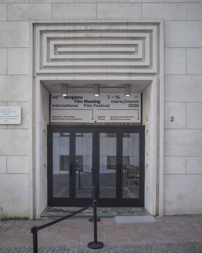
44th Bergamo Film Meeting
Source: luigistanga.com Photo: Luigi Stanga. License: All Rights Reserved.
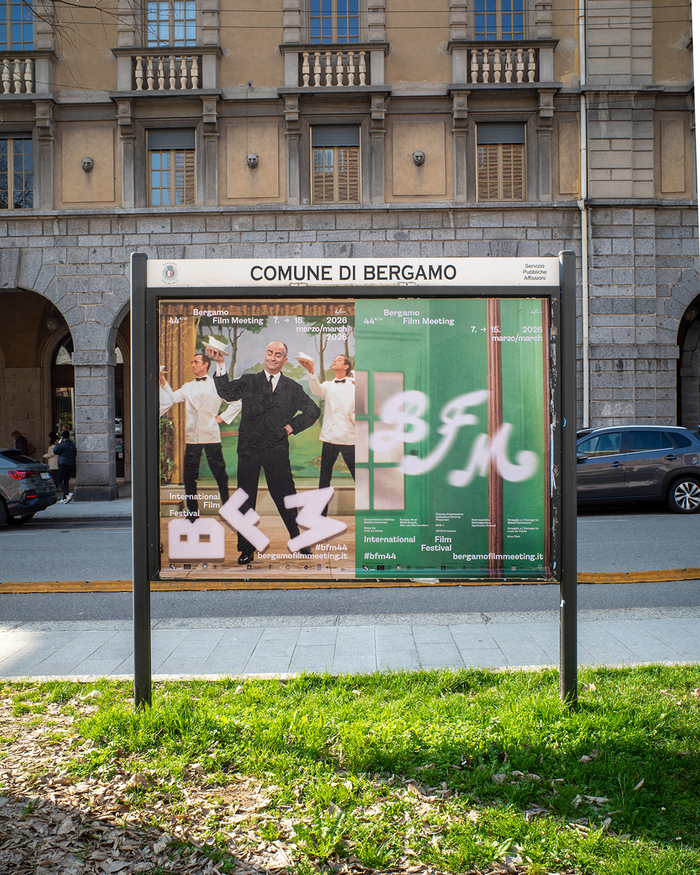
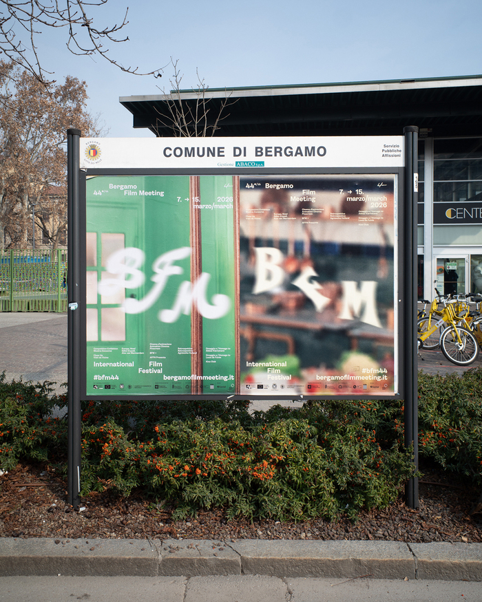
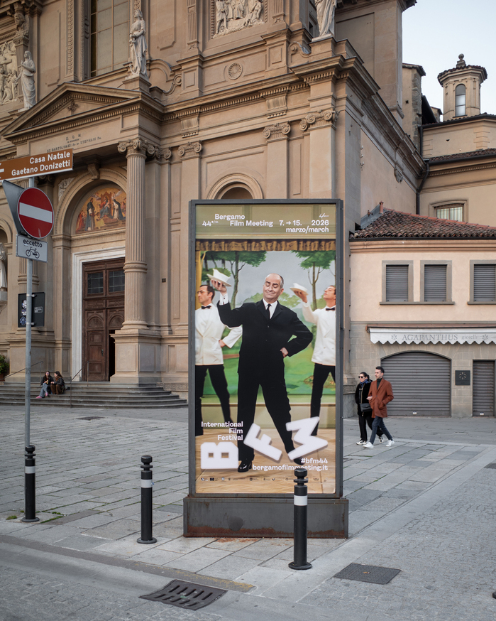
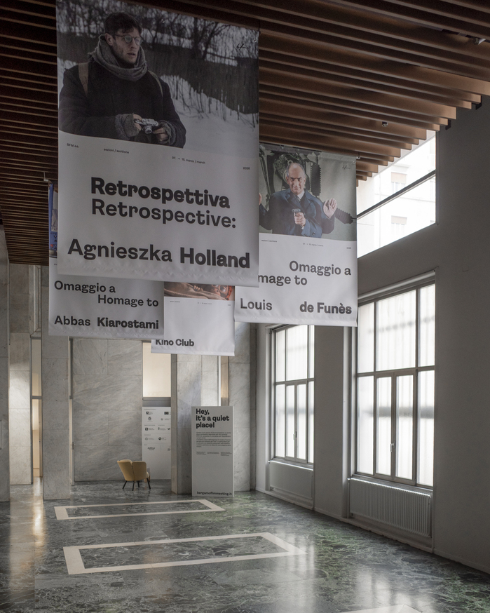
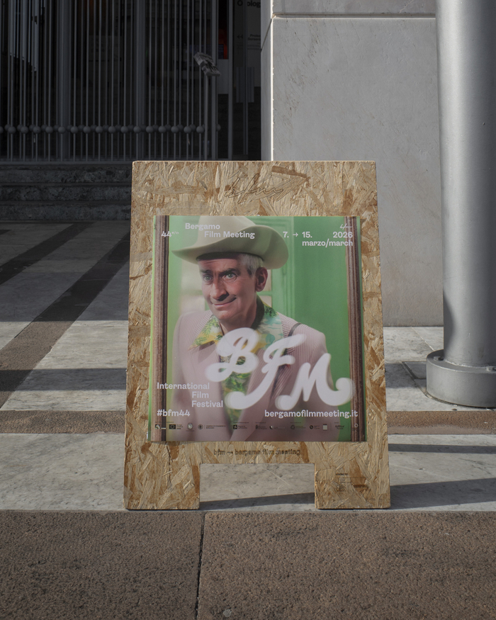
Bergamo Film Meeting (BFM) is one of the most established and recognisable fixtures on the Italian festival circuit. For 44 years, every March, it has brought thousands of filmgoers to Bergamo for nine days of screenings, more than 160 films, and a programme that brings together archives, new visions, talks and critical discussion. The festival’s 44th edition moves between two very different cinematic worlds – Abbas Kiarostami and Louis de Funès – reaffirming BFM as a space where eras, languages and ways of seeing cinema continue to coexist.
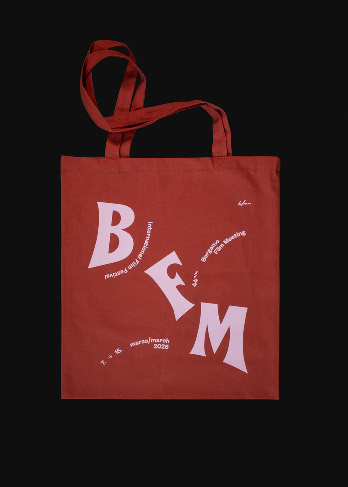
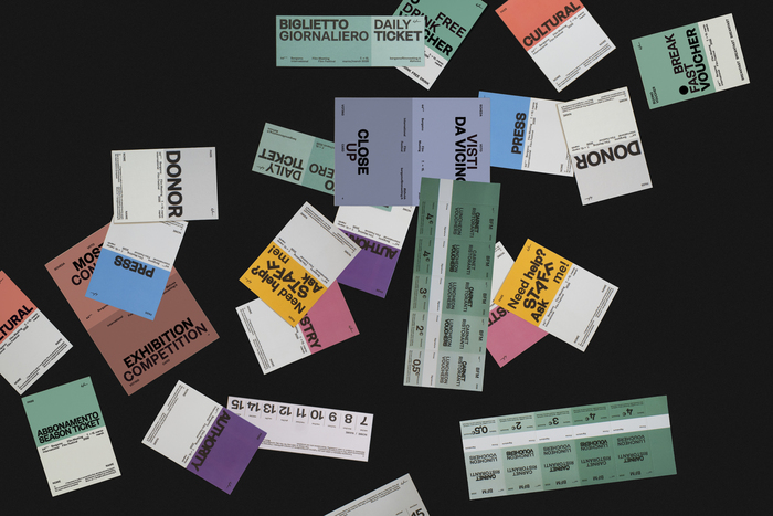
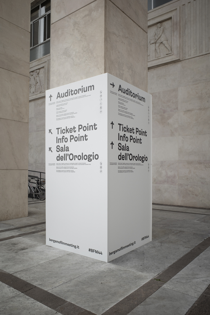
For the past ten years, I have worked with Studio Suq on the festival’s identity. The brief has always been very clear: cinema must remain at the centre. The project always develops on two levels: on the one hand, the image itself; on the other, lettering, conceived as a parallel visual layer made up only of colour and text, capable of extending across all the materials the festival requires.
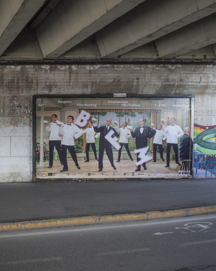
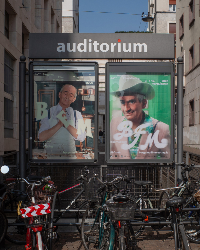
For the identity of BFM44, I began precisely at that threshold between cinema and graphic design, focusing on what introduced the films: title sequences, posters, lettering, and the way typography entered the scene before the narrative. Watching Louis de Funès’ films, what stood out was an extraordinary graphic vitality: heterogeneous typefaces, bright colours, animated lettering, titles conceived as true visual spectacles.
The main spark came from L’aile ou la cuisse (1976). What interested me was the visual energy of its opening sequence: a small choreography of objects, artificial colours, rhythm, theatricality and exuberant typography. It was exactly the kind of language I was looking for. From that came a very simple question: what happens when opening titles stop being a reference and become a system? The idea was to turn that vocabulary into a visual identity for the festival.
The most interesting challenge was to create an identity that would be recognisable without ever repeating itself. For that reason, the system is not built around a single fixed mark, but around three different letterings of the BFM acronym, each developed from different title-sequence references. Movement also becomes part of the project.
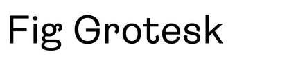
Holding the system together is a more neutral, a grotesque typeface with a playful personality: Fig Grotesk by TienMin Liao. Its role is to create contrast with the main lettering and give the communication a structure that is clear, contemporary and legible.
The final result attempts to hold graphic design and cinema together within a single gesture. The images function like stills from a title sequence, while the typography builds an identity shaped by rhythm, play, staging and visual memory. There is also a very specific nostalgia embedded in the project for the cinema of the 1960s and 1970s: the saturated colours, so unlike those we are used to today, and the performative dynamism of Louis de Funès, the emblematic face of postwar French comedy, whose physical, popular and irresistible comic energy made him a European cultural phenomenon. Rather than simply representing the festival, the project attempts to set it in motion: the titles roll, the auditorium darkens, and Bergamo Film Meeting is about to begin.
Source: luigistanga.com Photo: Luigi Stanga. License: All Rights Reserved.
Source: luigistanga.com Photo: Luigi Stanga. License: All Rights Reserved.
Source: luigistanga.com Photo: Luigi Stanga. License: All Rights Reserved.
Source: luigistanga.com Photo: Luigi Stanga. License: All Rights Reserved.
Source: luigistanga.com Photo: Luigi Stanga. License: All Rights Reserved.
Source: luigistanga.com Photo: Luigi Stanga. License: All Rights Reserved.
Source: luigistanga.com Photo: Luigi Stanga. License: All Rights Reserved.
Source: luigistanga.com Photo: Luigi Stanga. License: All Rights Reserved.
Source: luigistanga.com Photo: Luigi Stanga. License: All Rights Reserved.
Source: luigistanga.com Photo: Luigi Stanga. License: All Rights Reserved.
Source: luigistanga.com Photo: Luigi Stanga. License: All Rights Reserved.
This post was originally published at Fonts In Use