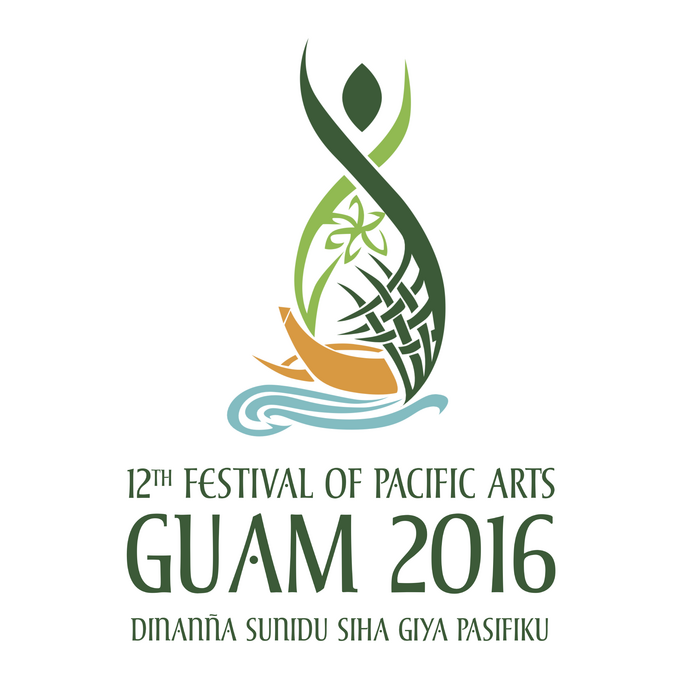
12th Festival of Pacific Arts – Guam 2016 logo
Source: festpac.visitguam.com License: All Rights Reserved.
Established in 1972, the Festival of Pacific Arts, or FestPAC, is a traveling festival held every four years in a different Pacific Island nation. It’s “the world’s largest celebration of indigenous Pacific Islanders, drawing artists, cultural practitioners, scholars and officials from member nations of the Pacific Community (SPC).” In 2016, Guam hosted the 12th edition.
The theme for Guam 2016 was “Hafa Iyo-ta, Hafa Guinahata, Hafa ta Patte, Dinanna’ Sunidu Siha Giya Pasifiku” / “What We Own, What We Have, What We Share, United Voices of the Pacific”.
The festival website describes the four pictorial elements of the logo:
The Latte Stone / I Tasa yan I Aligi: Latte is the term for a pillar (aligi) capped by a hemispherical stone capital (tasa) with the flat side facing up. Used as building/home supports by the ancient Chamorro people, they are found throughout most of the Mariana Islands. Today, the Latte Stone is an icon of our Chamorro people, our strength and our resilience.
Sling Stone / åcho’ atupat: The signature weapon of the ancient Chamorro warrior were fashioned from either limestone, basalt, or fire-hardened clay and were hung from slings of made of pandanus or coconut fiber. Today, these oval-shaped stones is part of the design of the official Guam flag and is incorporated into architectural designs. Like the latte the slingstone is a cultural icon that exhibit Chamorro pride and cultural identity.
The Coconut Tree / Tronkon Niyok: The tree of life, symbolizes the resources of our land.
Blue Ocean & Outrigger Canoe / Tasi yan Galaide’: Symbolizes our ocean resources as well as connecting us with our pacific brothers and sisters through our seafaring knowledge and skills.
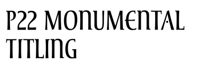
The typographic part is in English and in Chamorro, the native language of the indigenous people of the Mariana Islands. P22 Monumental Titling is the chosen font. Designed by Michael Clark and released with IHOF in 2005, it’s described by the foundry as a “well crafted Humanist display face […] based on Transitional Roman forms [that] exudes an air of authority along with a subtle playfulness.” Monumental Titling doesn’t have any lowercase glyphs, but offers a range of alternate capital forms – see the two different forms for A F and S in the logo – as well as some ligatures.
Source: festpac.visitguam.com License: All Rights Reserved.
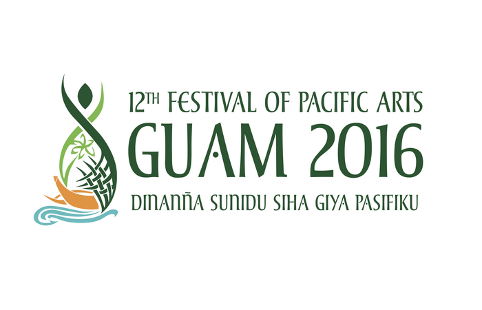
Landscape version of the logo
Source: festpac.visitguam.com License: All Rights Reserved.
A more informal and English-only variant of the logo
This post was originally published at Fonts In Use