“Cooler than Cool” advertisement by Coca-Cola
Published September 4, 2023
By FontsInUse
Contributed by Bryson Stohr
Source: www.ebay.com jakeofthenorth90. License: All Rights Reserved.


This post was originally published at Fonts In Use
Source: www.ebay.com jakeofthenorth90. License: All Rights Reserved.
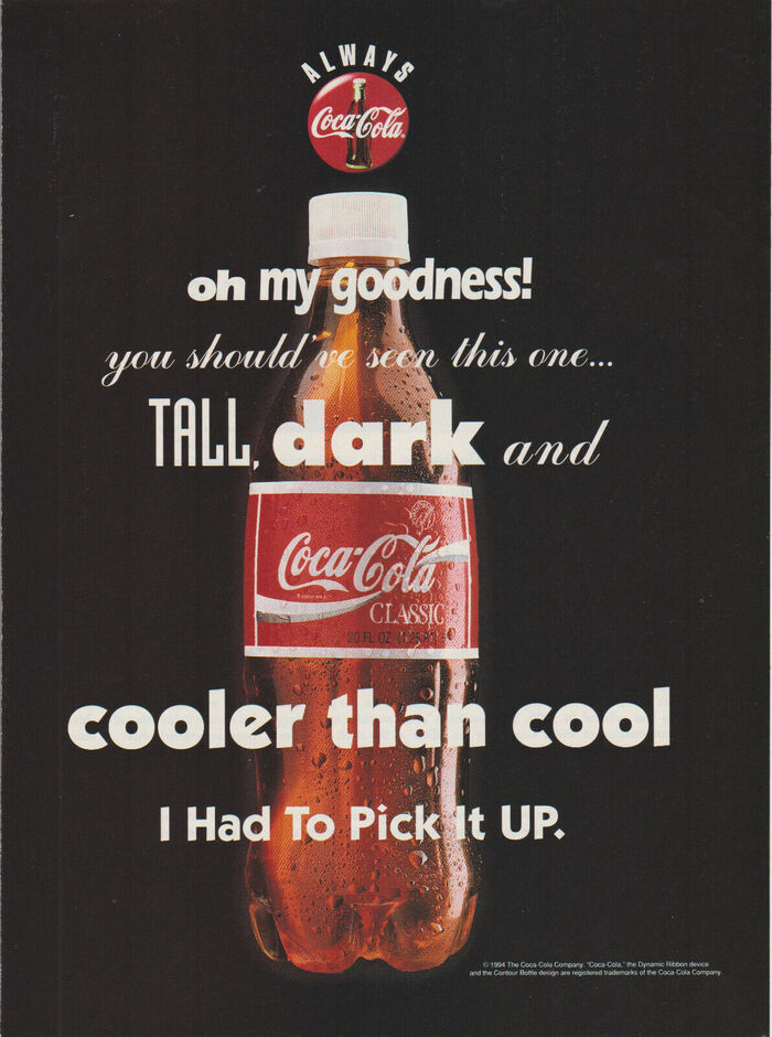
A mid 1990s print advertisement for Coca-Cola, known at the time as Coca-Cola Classic:
oh my goodness!
you should’ve seen this one…
TALL, dark and
cooler than cool
I Had To Pick It UP.
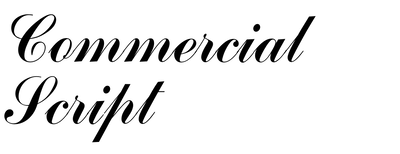
The typography uses no less than five (or seven, if one takes weights into consideration) fonts: Eras (in 2 weights) for “Oh my goodness!”, Commercial Script for “you should've seen this one…” and – with tracking – for “and”, Industria for “Tall”, Futura Extra Bold for “dark”, and ITC Kabel for the last two lines; “cooler than cool” uses the Ultra style, whilst “I had to pick it up” uses the Bold style. In addition, “Always” in the slogan “Always Coca-Cola” at the top uses Compacta, and the small print at the bottom is set in Helvetica.
This post was originally published at Fonts In Use
Read full story.
WRITTEN BY
FontsInUse
An independent archive of typography.
More from FontsInUse