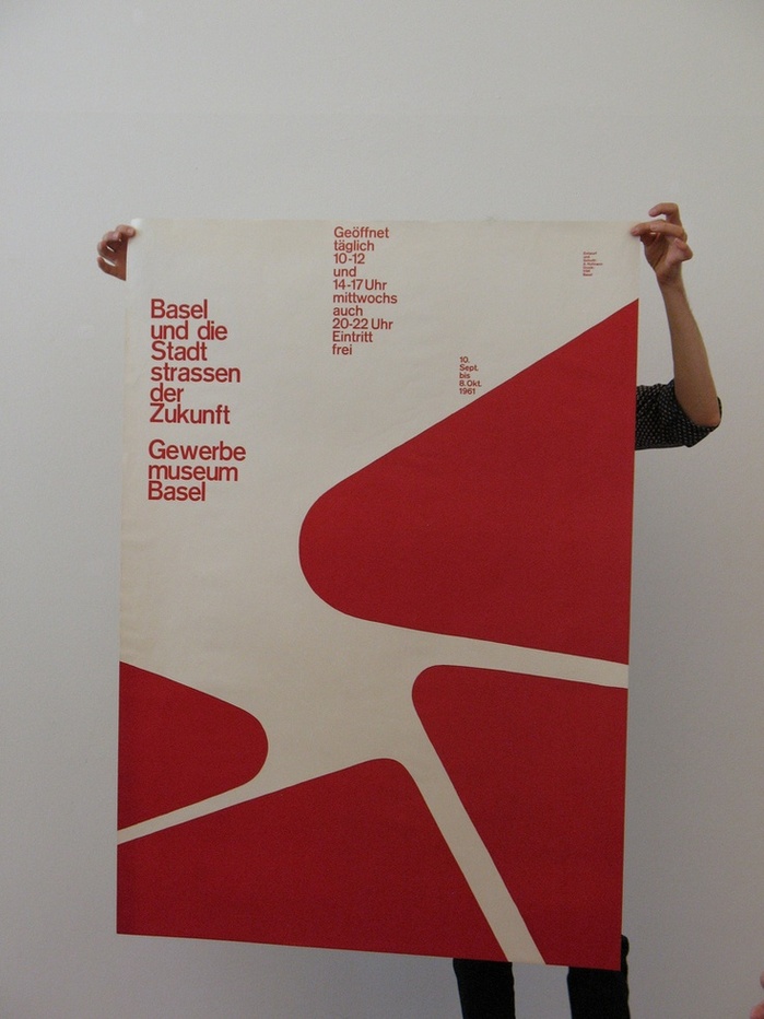
“Basel und die Stadtstrassen der Zukunft” poster
Source: www.flickr.com Lil' Higgs. License: All Rights Reserved.
Armin Hofmann designed this 127×90 cm poster for a 1961 exhibition at Gewerbemuseum Basel entitled Basel und die Stadtstrassen der Zukunft (“Basel and the urban roads of the future”).
This poster beautifully demonstrates Hofmann’s ability to create effective and powerful images with the simplest elements. Here, Hofmann restricts himself to one typeface and four triangular shapes in one shade of red, yet produces a poster that is at once functional, relevant, and visually striking. The alignment and sizing of the type leads the reader’s eye in a logical order and at a pleasant pace. The negative space around the shapes is dynamic, almost creating an illusion of movement. Despite its abstract nature, the negative space is evocative of the poster’s subject matter (urban roads). Through its contrasting point sizes, alignment, and its relationship to the four shapes, the typography creates a sense of perspective or depth – without ever resorting to overlapping elements. Rather than simply being smaller, text at smaller point sizes appears to be further away.
The powerful effect of the typography is demonstrated further by comparing the poster to the accompanying exhibition booklet that Hofmann also designed, see the website of the Museum für Gestaltung Zürich. The shapes and their placement in the frame are the same. The booklet’s title is positioned in a similar place as the poster’s headline. The composition thus remains satisfyingly dynamic (now with the flow of the negative space predominant). However, due to the small size of the cover (20.8×14.8 cm), there is no supplementary text and only one point size is used. Without contrasting typographic sizes, the poster’s incredible sense of depth is lost.

Source: pinterest.com License: All Rights Reserved.
This post was originally published at Fonts In Use