You Can’t Do That by George Seldes
Source: archive.org Internet Archive. License: All Rights Reserved.


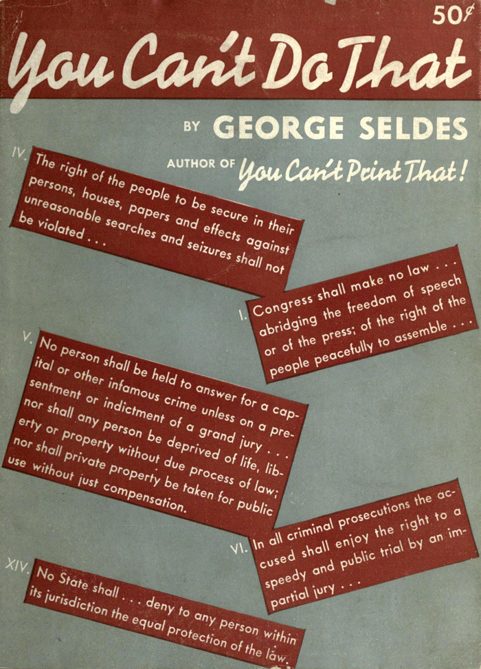
Nine years after his first book, You Can’t Print That!, George Seldes (1890–1995) used a very similar title: You Can’t Do That is “a survey of the forces attempting, in the name of patriotism, to make a desert of the Bill of Rights”. It was published by Modern Age Books in 1938 and includes a selected bibliography on civil liberties in the United States, compiled by Clarice A. Rosenthal, M. Meeker, M. Ottenberg, and others for the American Civil Liberties Union.
For the title, book designer Robert Josephy chose Signal – a typeface he already used two years earlier, for Edmund Wilson’s Travels in Two Democracies. The author’s name is in Tempo Heavy with its long-legged R. The articles appear to be set in Futura. The full-circled C in “Congress” and the straight comma and semicolon don’t match Futura, but I’m not aware of a closer match. Maybe Josephy touched up the setting manually.
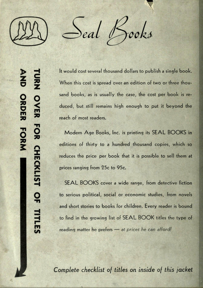
The back of the jacket advertises the Seal Books imprint. It features Bauer’s Quick, known in the United States as Trafton Script. Copy is set in Sans Serif, Monotype’s copy of Kabel, which is distinguished by the lower bar in A and the top-heavy S, among other things. The bottom line is Tempo Medium Italic with its distinctive flat exit strokes.
Source: archive.org Internet Archive. License: All Rights Reserved.
This post was originally published at Fonts In Use