Yellow Fellow

Yellow Fellow. License: All Rights Reserved.
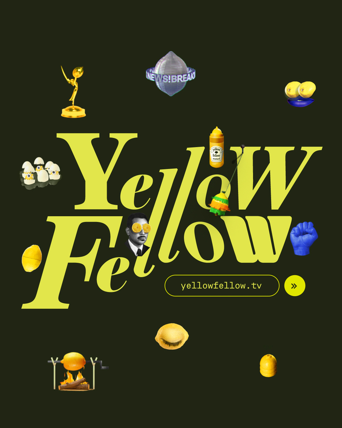
The logo is composed of a collection of different typefaces that blend together in harmony.


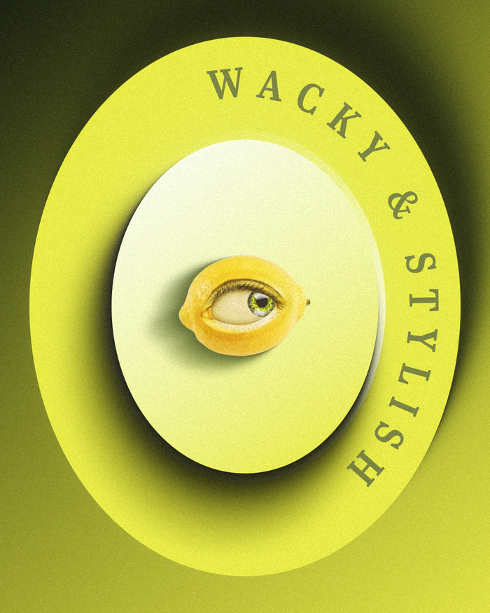
We just launched our new branding and website for our studio, Yellow Fellow. We worked on it for the past year with a team of talented designers and coders. The website's homepage is a playful interactive environment full of thumbnail animations inspired by the studio's symbol – the lemon eye.
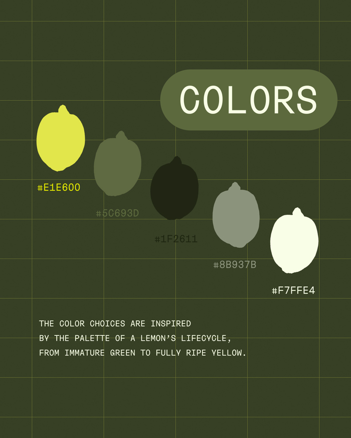
We've also created the studio's brand style guide which is also based on the lemon eye symbol. The main typeface is TheBasics, a sans-serif font with a geometric and classic character, featuring varying letter widths that create playful touch and a unique rhythm. It’s used in proportional and monospaced styles. To complement the main font, the serif Abril Titling Condensed is used for longer texts. The website uses Abril Text.
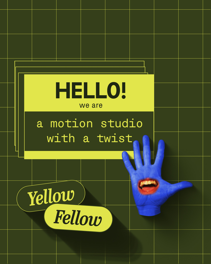
The studio specializes in crafting graphics packages for films and series, building design systems for brands, creating stunning explainers and mind-blowing music videos.
We're passionate about making creative moving content which is wacky and stylish. We use a lot of mixed-media approaches in our style as we believe that taking different elements/ideas and combining them creates new and fresh visuals.

Yellow Fellow. License: All Rights Reserved.
Screengrab from a series of short looping animations

Source: yellowfellow.tv Yellow Fellow. License: All Rights Reserved.
Logo as shown on the website

Source: yellowfellow.tv Yellow Fellow. License: All Rights Reserved.
Menu with selected projects on the website

Yellow Fellow. License: All Rights Reserved.
Screengrab from a series of short looping animations

Yellow Fellow. License: All Rights Reserved.
Screengrab from a series of short looping animations
This post was originally published at Fonts In Use