World Atlas. The Cartographic Encyclopedia of Planet Earth

Source: www.millenniumhouse.com.au Millennium House. License: All Rights Reserved.
The cover of this atlas by Millennium House prominently displays Adobe Serif MM. Jack Yan, publisher, author and typeface designer, comments on Mastodon:
I can’t believe it. Here’s this stunning atlas, nearly A3 size […] and in its whole production chain, no one noticed that the title typeface failed to embed into the PDF.
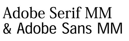
In lay terms, “World Atlas” is in the wrong font. But not just the wrong font, but a substitute that Acrobat puts in when the actual font data are missing. Part of this is down to experience and knowing what a typeface should look like. You might notice that the widths of the characters are unnatural based on what you are used to reading, or the varying widths of the strokes.
Don’t worry if you can’t spot it, but the issue here is that a professional should. Any designer worth their salt would recognize the placeholders. There’s a serif one and a sans serif one. The letters are stretched or squashed to match the widths of the original, a big giveaway. Really hard to say how they missed this, as final pre-press PDFs are usually very accurate these days. I’ve seen Woolworths and BP slip up this way on signage, but a publishing house should do better.
This post was originally published at Fonts In Use