WHEN Fertility
Source: universalfavourite.com.au License: All Rights Reserved.

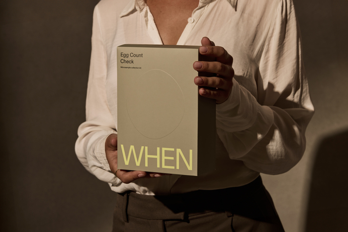
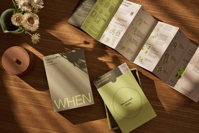
In an Australian first, WHEN provides at-home egg count testing and access to the country’s leading fertility experts—prompting a conversation about how and when people can access their own fertility information. The medtech company came to Universal Favourite to conceive a brand that could balance credibility and compassion in equal measure. Universal Favourite needed to build a brand that was empathetic, sharing the real stories behind the brand, yet also built trust through medical expertise. Striking this balance was critical.
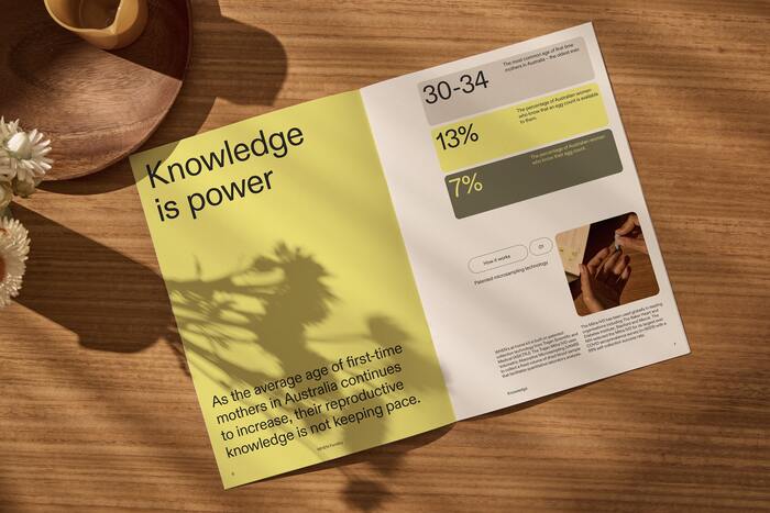
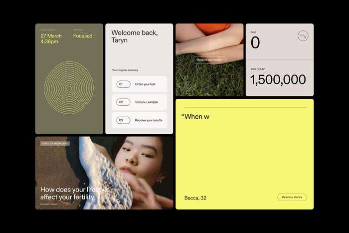
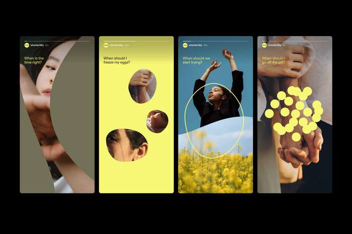
The result is a visual and verbal system that blends emotion with science, expression with information. Designed to break the stigma of the biological clock, showcase fertility stories, expert advice, and provide validation to the endless questions we ask ourselves, the brand moves seamlessly from packaging to print, and in online and retail environments.
WHEN's typeface is ABC Diatype. It's used for everything—from wordmark to body copy. Chosen for its modernity and scientific edge, it brings calm and clarity to everything. Paired with a colour palette of lemon and neutrals, the identity feels light and warm against an industry so often cold and clinical.

Source: universalfavourite.com.au License: All Rights Reserved.

Source: universalfavourite.com.au License: All Rights Reserved.

Source: universalfavourite.com.au License: All Rights Reserved.
Source: universalfavourite.com.au License: All Rights Reserved.
Source: universalfavourite.com.au License: All Rights Reserved.
Source: universalfavourite.com.au License: All Rights Reserved.
Source: universalfavourite.com.au License: All Rights Reserved.
This post was originally published at Fonts In Use