Wellfound Foods
Source: polygraphcreative.com Polygraph. License: All Rights Reserved.


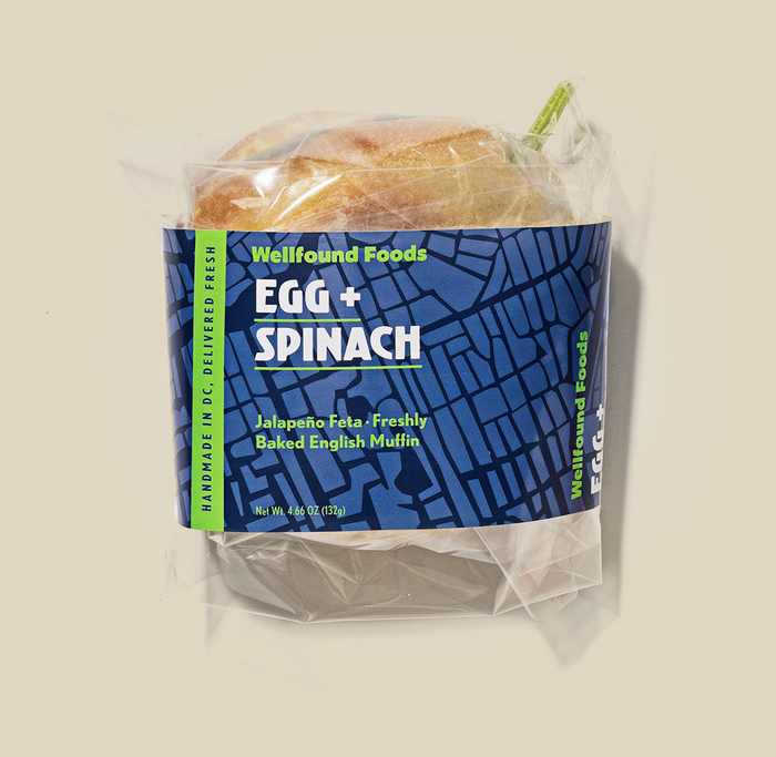
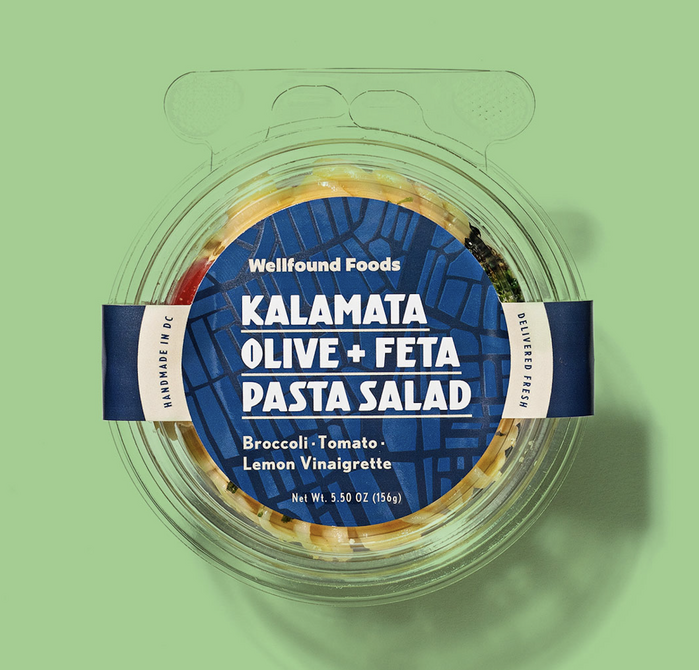
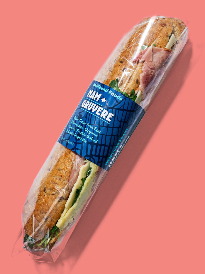
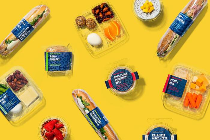
Kurversbrug from ReType and Tobias Frere-Jones’s FB Nobel (a revival of Nobel, released in 1929 by Typefoundry Amsterdam) are the brand typefaces of Wellfound Foods. From design studio Polygraph:
After studying in Amsterdam, Wellfound founder Sarah “Frim” Frimpong decided to bring the culture of fresh on-the-go sandwiches back to her home in the States. Frim wanted the Wellfound fare to stand out in cafe food cases and clearly show their high-quality ingredients. We designed a bold, colorful brand and system of labels for Wellfound’s varied containers and food styles, featuring a block map of Amsterdam’s iconic Oude Centrum. The core element of the new brand is the beautiful display type Kurversbrug, designed by Ramiro Espinoza. The bold, modern sans is a revival of the letters that appear on the historic bridges of Amsterdam.
Source: polygraphcreative.com Polygraph. License: All Rights Reserved.
Source: polygraphcreative.com Polygraph. License: All Rights Reserved.
Source: polygraphcreative.com Polygraph. License: All Rights Reserved.
This post was originally published at Fonts In Use