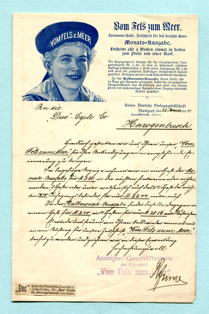
Vom Fels zum Meer letterhead (1894)
Source: www.flickr.com Uploaded to Flickr by altpapiersammler and tagged with “münchnerfraktur” and “tudorblack”. License: All Rights Reserved.


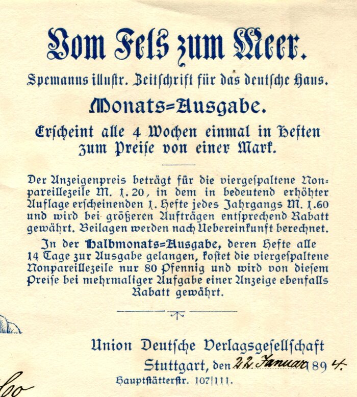
Vom Fels zum Meer (“From rock to sea”) is an “illustrated journal for the German house” edited by Wilhelm Spemann (1844–1910) and published from 1881 to 1917. Between 1890 and 1897, Spemann’s publishing house was merged into Union Deutsche Verlagsgesellschaft, a company he had founded together with Adolf Kröner (1836–1911).
The shown letter was sent in January 1894 to one of the family journal’s advertisers, the “Duc” Cycle Co. in Herzogenbusch, that is ’s-Hertogenbosch in the Netherlands. “Duc” was a brand by B.A. Jansen who imported bicycles manufactured by the Quinton Cycle Co. in Coventry, England. Pasted in the bottom left corner is a sample of the ad that was to be included in Vom Fels zum Meer.
The text block at the top right features five different blackletter typefaces. The title is set in Renaissance-Fraktur, with the subtitle added in a version of Original-Gotisch. “Monats-Ausgabe” uses a German adaptation of Tudor Black, possibly Psalter-Gotisch by Krebs. Last but not least, we get to see Flinsch’s Halbfette Schwabacher and Albert Anklam’s Neue Schwabacher.
Source: www.flickr.com Uploaded to Flickr by altpapiersammler. License: All Rights Reserved.
Detail
This post was originally published at Fonts In Use