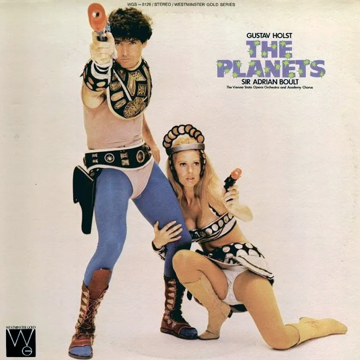
Vienna State Philharmonic Orchestra – The Planets by Gustav Holst album art
Source: www.flickr.com Uploaded to Flickr by sacqueboutier (edited). License: All Rights Reserved.


Record collector sacqueboutier comments:
An all time classic. Humorous in that Holst’s Planets had nothing to do with space flight or Buck Rogers. This satirical take on the subject draws on the early TV and movie serials with the cheap cheesy props and story lines.
The recording in question was originally issued with a more suitable cover. But, it does catch your eye, doesn’t it?
In a gallery of “terrible album covers [that] will make you laugh and then violently cringe”, Classic FM adds:
Much like an eclipse, it’s best not to stare directly at it.
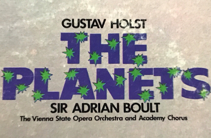
Design by Igor Kipnis (credited as Keith Longino) and See Hear & How!, with art direction by Christopher Whorf and photography by Fred Poore. The title typography makes use of purple Flash Caps, with the explosions colored in green.
Source: www.ebay.com Music Shop Collectables (edited). License: All Rights Reserved.
Detail

Source: www.facebook.com Zachary Hruby. License: All Rights Reserved.
This post was originally published at Fonts In Use