Ventoline no. 6
Source: clubventoline.fr Ventoline. License: All Rights Reserved.
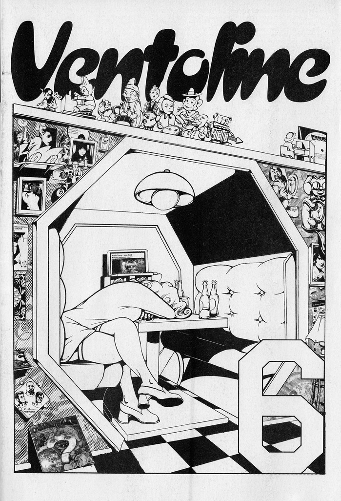
Cover with slanted Croissant for the title


From the Ventoline website (translated from the French):
Ventoline is a fanzine born of both a daily enthusiasm for everything to do with music, and a genuine weariness at the near-absence of women's words on this vast subject. Commenting, criticizing, prescribing, sharing stories, tastes, dislikes – in short, musical culture… […]
Ventoline is an entirely self-produced and self-distributed editorial project that receives no public or private financial support, and has been running for three years thanks to the sale of its issues and a few hectoliters of elbow grease. Everyone contributes on a voluntary basis, according to their desires, means and time. The frequency of each issue is therefore erratic, but this absence of imperatives also proves to be a relief: Ventoline comes out when you can, when you want.
In issue no. 6, the contributors talk “about record collecting. Algerians, unloved instruments, Mexican narco-culture, euphoria and mourning of concerts, a heterotopic club of dykes, Moldavian tradition, and even motherhood – who knows!”
Ventoline. License: All Rights Reserved.
The text typeface in this feature is GR10. The blackletter used for the headline is Neue Theuerdank Fraktur.

Source: clubventoline.fr Ventoline. License: All Rights Reserved.
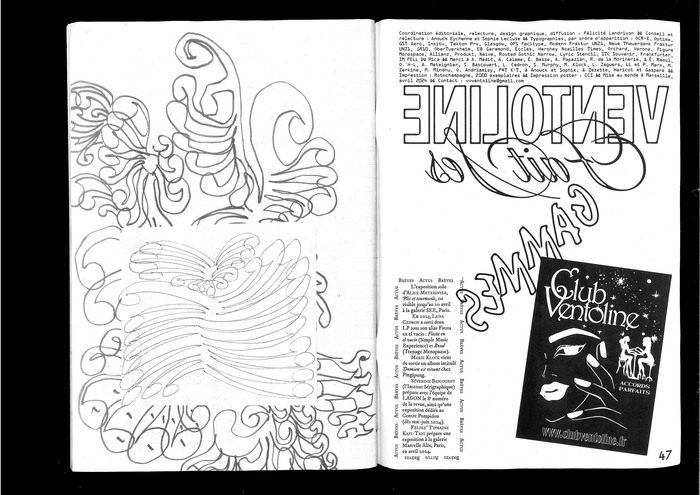
Contents (“sommaire”) ft. Spider Panic and Optima with faux small caps. The numbers are from GST Aero; the text at the top is set in OCR-X.
Ventoline. License: All Rights Reserved.
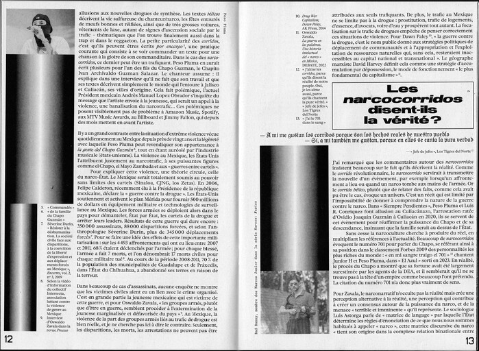
Insitu in two columns for text, with Tekton for the headline and emphasis
Source: clubventoline.fr Ventoline. License: All Rights Reserved.
Body copy is set in Glasgow. The quote uses Modern Blackletter and the bold extended grot is OPS Facitype.
Ventoline. License: All Rights Reserved.
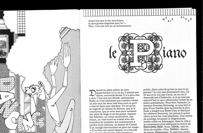
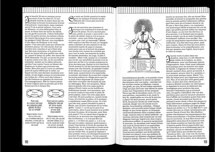
More text in GR10, paired with drop caps from Neue Theuerdank Fraktur and some Ober-Türkheim.
Source: www.instagram.com Ventoline. License: All Rights Reserved.
Verona on an angled baseline, with body text in Figure Monospace. The sans used for the lines on a steep angle appears to be Allianz.

Source: clubventoline.fr Ventoline. License: All Rights Reserved.
The poster (50×34 cm) included in Ventoline no. 6 is a transcript of a TV interview with Edith Massey, a.k.a. the Egg Lady, actress and friend of John Waters, and performer of two punk rock hits including “Punks, Get Off the Grass”. The display typeface is Lyric Stencil NF, slanted, paired with more Figure Monospace.
Ventoline. License: All Rights Reserved.
On the left: Produkt and Glasgow Italic with headlines in obliqued Optima. On the right: Naive with triple contour and replies in Routed Gothic.
Source: clubventoline.fr Ventoline. License: All Rights Reserved.
More of the interview in Produkt and Routed Gothic
Source: clubventoline.fr Ventoline. License: All Rights Reserved.
Frankfurter Medium (left) and ITC Souvenir Italic (right), with big type in IM Fell DW Pica Italic and Lyric Stencil NF
Source: clubventoline.fr Ventoline. License: All Rights Reserved.
The box on the bottom left of the right page is set in EB Garamond. The colophon in OCR-X additionally mentions Eccles and Hershey Times, but these fonts don’t seem to be shown in the images included here. Flash (“Gammes”) and Harrington (“Club Ventoline”) appear to be reproductions of previous designs and aren’t listed under the fonts used for the design of the zine.
This post was originally published at Fonts In Use