Uniworld Logistics visual identity revamp
Source: www.bharatharappali.com Bharath Arappali. License: All Rights Reserved.

Uniworld Logistics is one of Asia’s largest independent providers of freight and supply chain solutions. For the company, communicating the legacy of two decades was as important as their foray into the future. The brand exercise and its visual extension capture the essence of the legacy meeting the future seamlessly.
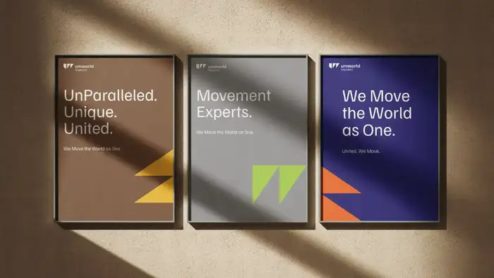
The new visual imagery is inspired by the core story of “United, We Move” with a bold color palette inspired by the modes of transportation. The design system consists of vertical and horizontal traingles , derived from the W of the logo mark, signifying movement and solutions in every aspects of logistics.
Familjen Grotesk by Swedish design bureau Familjen and available from Google Fonts was chosen for the overall verbal communication for its modern yet institutionalised interpretation.
Source: www.bharatharappali.com Bharath Arappali. License: All Rights Reserved.

Source: www.bharatharappali.com Bharath Arappali. License: All Rights Reserved.

Source: www.bharatharappali.com Bharath Arappali. License: All Rights Reserved.

Source: www.bharatharappali.com Bharath Arappali. License: All Rights Reserved.

Source: www.bharatharappali.com Bharath Arappali. License: All Rights Reserved.

Source: www.bharatharappali.com Bharath Arappali. License: All Rights Reserved.

Source: www.bharatharappali.com Bharath Arappali. License: All Rights Reserved.
This post was originally published at Fonts In Use