Uncommon Goods
Source: www.kalenaschoen.com Kalena Schoen. License: All Rights Reserved.


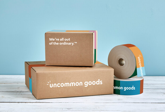
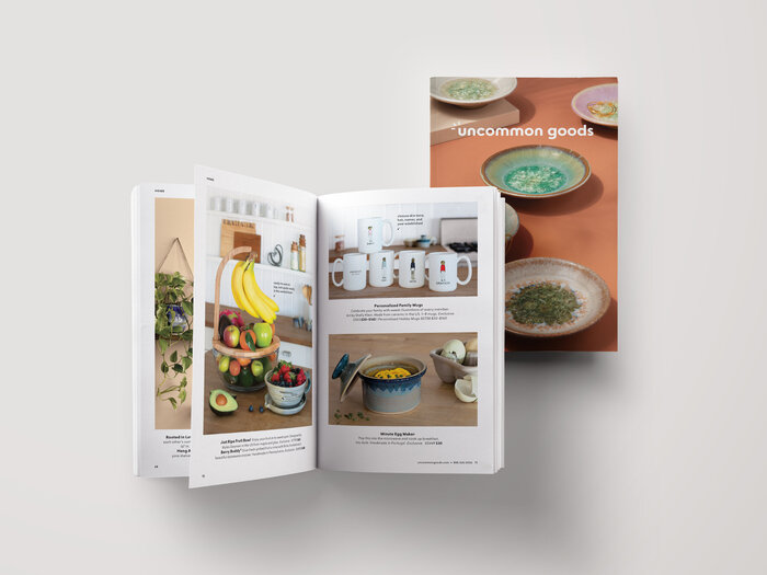
Uncommon Goods is a Brooklyn-based retailer with an emphasis on extraordinary gifts and ethical business practices. In 2020, creative agency Madwell (led by design director Rachel Matts) collaborated with their in-house team on a complete redesign of the brand’s design system. Escalator is used for the logo and extensive typesetting, while Tiempos is used as a secondary typeface in display settings.
Madwell senior designer Tanya Pedra describes the project in her case study:
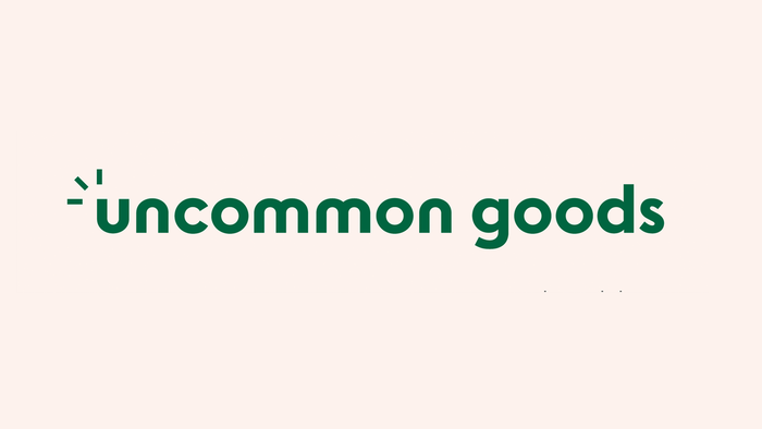
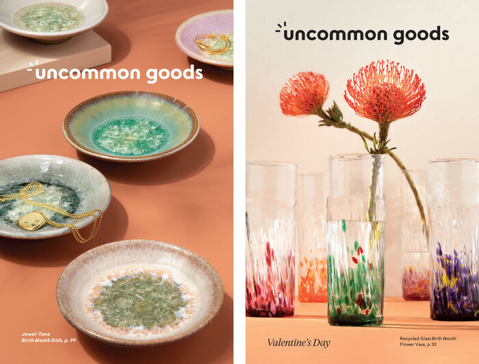
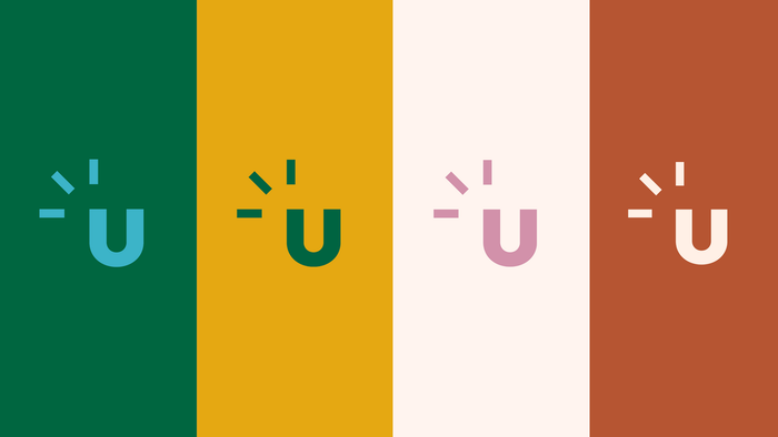
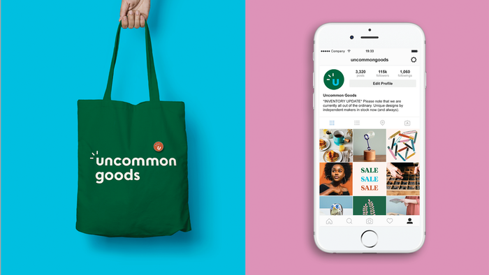
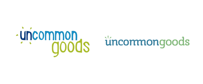
The logo consists of a rounded typeface—Its curves are simple and clean and playful, communicating that the brand is fun, inviting, and not overly serious. The “sparks” around the u represent the spark of creativity; it’s the gleam of something special catching your eye. The color palette is bright, fresh, and earthy. Photography creates a visual experience that communicates quality and a distinct brand aesthetic.
Source: www.kalenaschoen.com Kalena Schoen. License: All Rights Reserved.
Source: tanyapedra.com Tanya Pedra. License: All Rights Reserved.
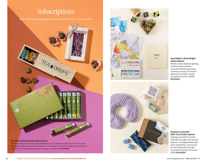
Source: view.publitas.com Uncommon Goods. License: All Rights Reserved.

Source: view.publitas.com Uncommon Goods. License: All Rights Reserved.
Source: view.publitas.com Uncommon Goods. License: All Rights Reserved.
Source: tanyapedra.com Tanya Pedra. License: All Rights Reserved.
Source: www.uncommongoods.com Uncommon Goods. License: All Rights Reserved.
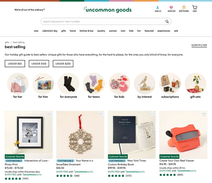
Uncommon Goods website
Source: tanyapedra.com Tanya Pedra. License: All Rights Reserved.

Source: www.uncommongoods.com Uncommon Goods. License: All Rights Reserved.
Uncommon Goods website
Source: www.kalenaschoen.com Kalena Schoen. License: All Rights Reserved.
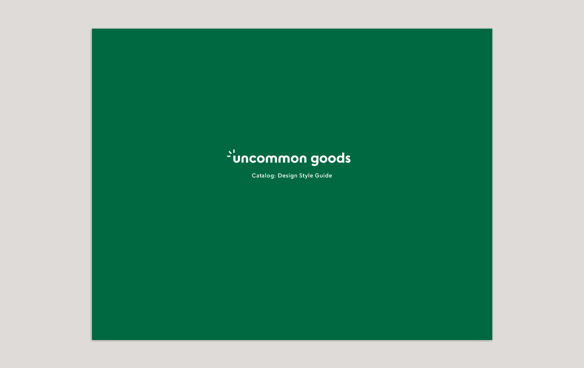
Design style guide
Uncommon Goods. License: All Rights Reserved.
Two previous logos
This post was originally published at Fonts In Use