Tula Skincare

Source: tula.com License: All Rights Reserved.


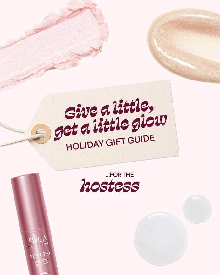
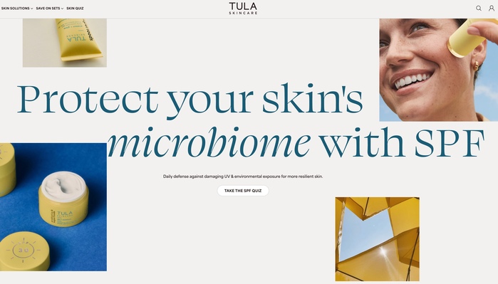
Tula is a probiotic-powered skincare brand built around the idea that healthy skin starts from within. Founded in 2014, Tula has grown into one of the more visible direct-to-consumer beauty brands in the US, with a strong presence in retail and a devoted community online. Tula uses OH no Type Co.’s Swear as their headline typeface across their website, campaign imagery, packaging, and social media.
Swear’s range of styles lends the brand’s communications a confident flexibility: the upright roman weights bring clarity to product naming and section headers, while the italic styles introduce warmth and editorial flair. The Cilati – Swear’s distinctive reversed-contrast italic – makes appearances where the brand wants to add a more expressive, unexpected note, its unconventional stroke structure sitting in contrast to the clean, wellness-forward aesthetic of the rest of the identity.
Swear is paired throughout with Area by Blaze Type, a geometric grotesque that handles the brand’s body copy, navigation, and supporting text. The combination keeps the hierarchy legible and grounded while allowing Swear to do the expressive heavy lifting at display sizes.

Source: tula.com License: All Rights Reserved.
Source: www.instagram.com License: All Rights Reserved.

Source: tula.com License: All Rights Reserved.
Source: tula.com License: All Rights Reserved.
This post was originally published at Fonts In Use