Top Manta (2025 rebrand)

Top Manta. License: All Rights Reserved.


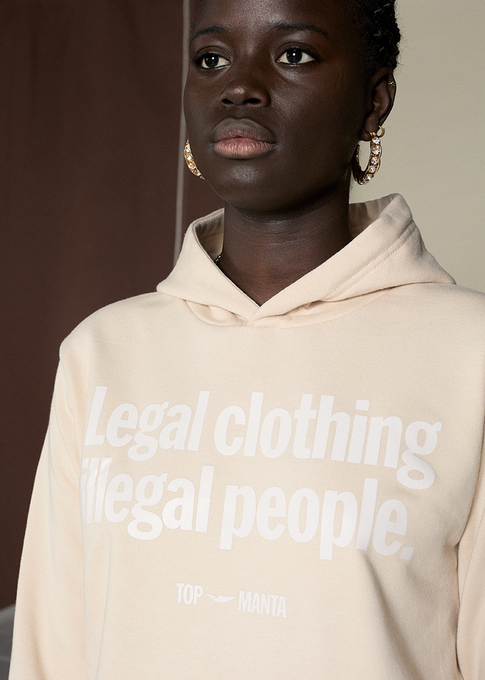
In 2025, Barcelona-based activist streetwear brand Top Manta unveiled a bold new identity, designed by Aleix Font. The rebrand aims to strengthen the brand’s visual language while reinforcing its deep-rooted commitment to social justice and migrant rights.
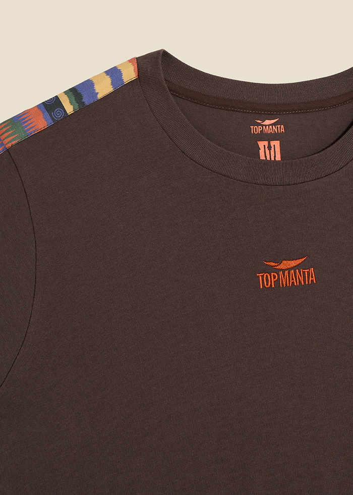
At the heart of the new identity is Manter Black, a bespoke typeface crafted by GS-Type. Designed specifically for the Top Manta rebrand, this display typeface plays a key role in shaping the brand’s visual identity and communication system.
Manter Black is more than just a typeface – it’s an expression of intercultural activism, resistance, and urban energy. Its design draws inspiration from African wax prints, incorporating jagged structures, geometric patterns, and rounded counterforms to create a bold, rhythmic, and expressive aesthetic. This visual language reflects the ethnic and social essence of Top Manta, reinforcing its mission through typography.
Beyond its aesthetic impact, Manter Black is a highly versatile graphic tool, designed for use across various mediums. It enhances the brand’s storytelling, amplifies its messages, and serves as a powerful symbol of dignity, equality, and creative empowerment.
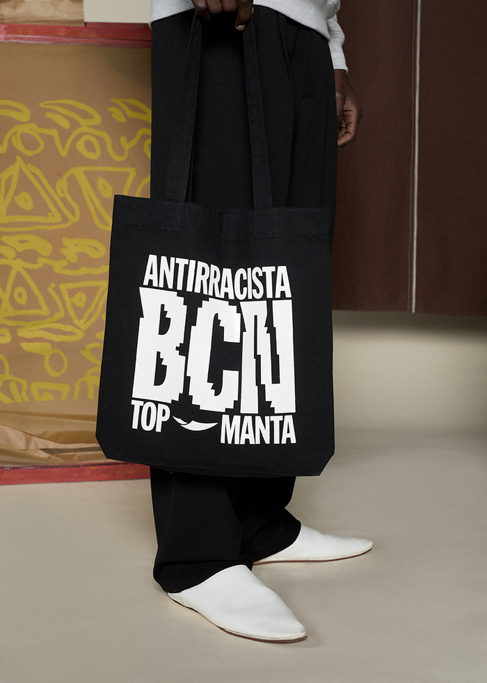
Manter Black has been designed to work seamlessly alongside HEX Projects’ Franklin Gothic XCondensed XBold, which is used across communication materials and in key brand applications where a stronger tone is needed. Both typefaces share a common structure, weight, and metrics, ensuring a cohesive and balanced visual system.
HEX Franklin is a modern reinterpretation of the iconic Franklin Gothic, a grotesque sans-serif typeface from the early 20th century. While retaining the character of its historical reference, HEX Franklin presents a more refined and contemporary aesthetic, making it ideal for reflecting Top Manta’s intercultural ethos.
In the new identity system, the XCondensed XBold variant of HEX Franklin was chosen to complement Manter Black, optimizing visual impact in tight spaces and reinforcing the brand’s powerful and unapologetic voice.
For body text and longer-form communication, the system incorporates Neue Haas Grotesk, a versatile sans-serif that provides clarity, neutrality, and readability. This typeface ensures a seamless reading experience, balancing the bold expressiveness of Manter Black and HEX Franklin with a functional yet sophisticated typographic foundation.

Top Manta. License: All Rights Reserved.
Top Manta. License: All Rights Reserved.
Top Manta. License: All Rights Reserved.
Top Manta. License: All Rights Reserved.

Top Manta. License: All Rights Reserved.

Top Manta. License: All Rights Reserved.

Top Manta. License: All Rights Reserved.

Top Manta. License: All Rights Reserved.
This post was originally published at Fonts In Use