Tooth & Nail
Source: tartnyc.com TART NYC. License: All Rights Reserved.


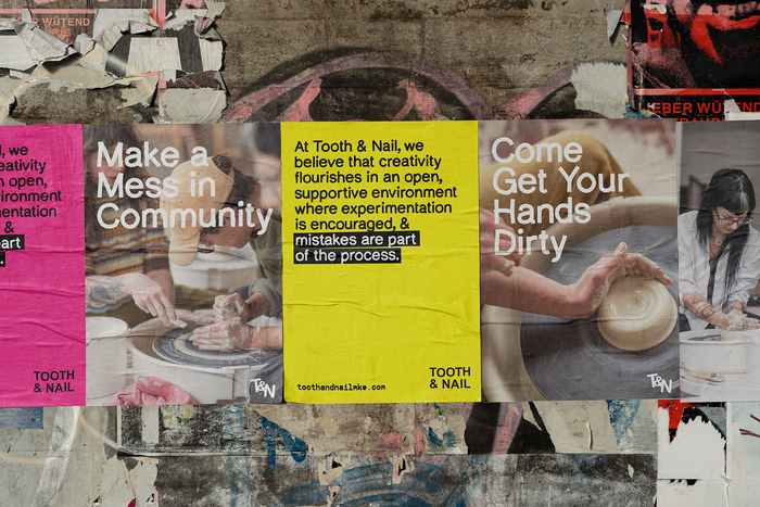
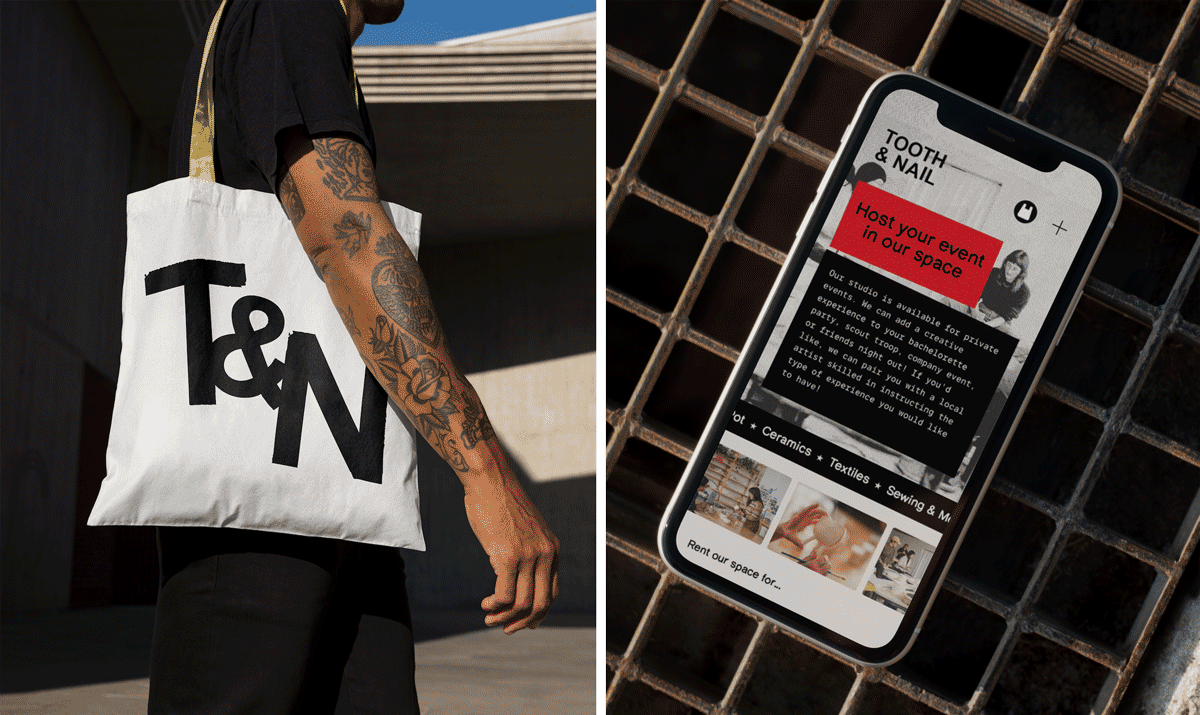
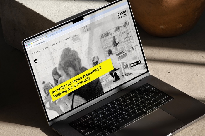
Tooth & Nail is a queer, artist-run ceramics studio and gallery based in Milwaukee. Designed by TART NYC, the visual identity reflects the studio’s grassroots, collaborative ethos, drawing inspiration from zine culture, punk ephemera, and analog collage.
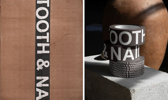
Typography is central to the system’s voice. The primary logotype usesArial Bold, with each letter individually set and distressed to create an intentionally handmade feel. Choosing a default system font like Arial nods to accessibility, DIY tools, and “anti-design” traditions.
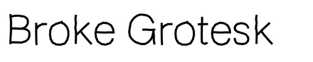
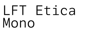
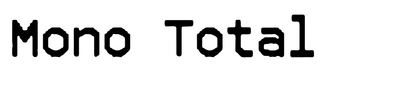
The supporting type palette adds expressive contrast. Broke Grotesk contributes compressed, angular energy in headlines. Mono Total introduces mechanical irregularity through its monospace rhythm, while LFT Etica Mono offers a clean, humanist counterpoint for body text and smaller applications. Lo Fi Copy brings a photocopied texture reminiscent of activist flyers and homemade zines.
Designed to work across signage, printed materials, and the website, the typography stretches between rawness and order. Decorative halftones, hand-drawn elements, and scanner artifacts layer over structured layouts, reinforcing a collective, community-first spirit.
Photographer: Kat Schleicher

Source: tartnyc.com License: All Rights Reserved.
Source: tartnyc.com License: All Rights Reserved.
Source: tartnyc.com License: All Rights Reserved.
Source: tartnyc.com License: All Rights Reserved.
Source: tartnyc.com License: All Rights Reserved.
This post was originally published at Fonts In Use