Tom Baxter portfolio website
Published July 25, 2024
By FontsInUse
Contributed by Lucas Descroix
Source: www.tom-baxter.com Tom Baxter. License: All Rights Reserved.


Source: www.tom-baxter.com Tom Baxter. License: All Rights Reserved.
Source: www.tom-baxter.com Tom Baxter. License: All Rights Reserved.

Source: www.tom-baxter.com Tom Baxter. License: All Rights Reserved.
Source: www.tom-baxter.com Tom Baxter. License: All Rights Reserved.
Source: www.tom-baxter.com Tom Baxter. License: All Rights Reserved.
This post was originally published at Fonts In Use
Source: www.tom-baxter.com Tom Baxter. License: All Rights Reserved.
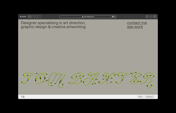
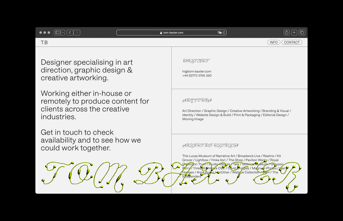
For his portfolio website, British graphic designer and art director Tom Baxter paired Hal Four Grotesk with Plain Form's Ready Active, both in their Light weight.
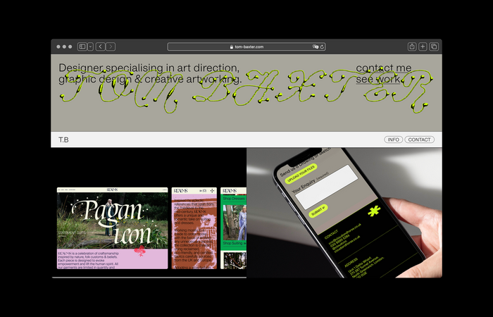
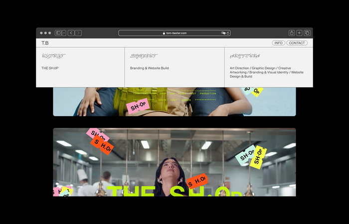
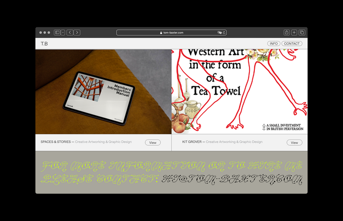
The latter is used to set titles and footer content, as well as the name of the designer on the home and info pages, filling the full width of the screen, sporting an acid-y lime green color and additional relief effect in black. This little bit of maximalism offers a nice contrast to the otherwise clean and grid-based layout of the portfolio. I quite like the overlay that happens when scrolling down on the home page.
Source: www.tom-baxter.com Tom Baxter. License: All Rights Reserved.
Source: www.tom-baxter.com Tom Baxter. License: All Rights Reserved.
Source: www.tom-baxter.com Tom Baxter. License: All Rights Reserved.
Source: www.tom-baxter.com Tom Baxter. License: All Rights Reserved.
Source: www.tom-baxter.com Tom Baxter. License: All Rights Reserved.
This post was originally published at Fonts In Use
Read full story.
WRITTEN BY
FontsInUse
An independent archive of typography.
More from FontsInUse