Toké empanadas visual identity
Published November 6, 2023
By FontsInUse
Contributed by Jérémy Raucq
Source: instagram.com Toké. License: All Rights Reserved.


Source: www.facebook.com License: All Rights Reserved.
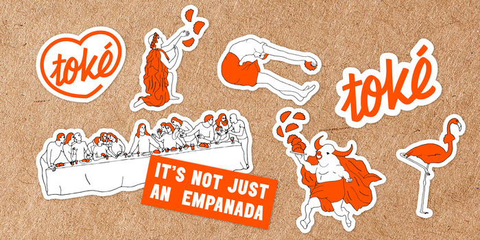
Photo: Jérémy Raucq. License: All Rights Reserved.
Source: bokchoy.studio Photo: Jérémy Raucq. Maison.Mockup. License: All Rights Reserved.
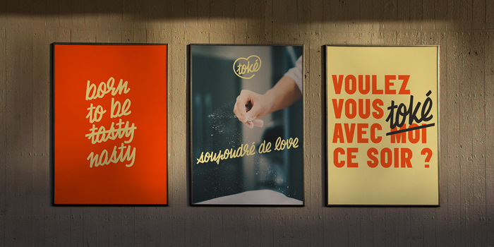
Photo: Jérémy Raucq. License: All Rights Reserved.

Photo: Jérémy Raucq. Bendito. License: All Rights Reserved.
Source: www.instagram.com Toké. License: All Rights Reserved.

Source: instagram.com Toké. License: All Rights Reserved.
Source: www.toke.eu License: All Rights Reserved.
This post was originally published at Fonts In Use
Source: instagram.com Toké. License: All Rights Reserved.
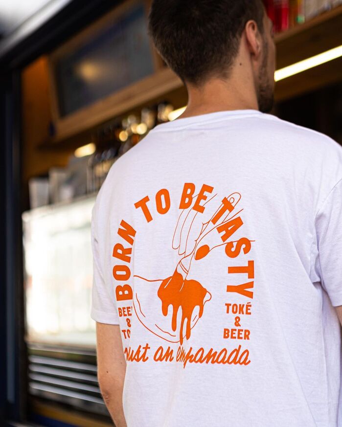
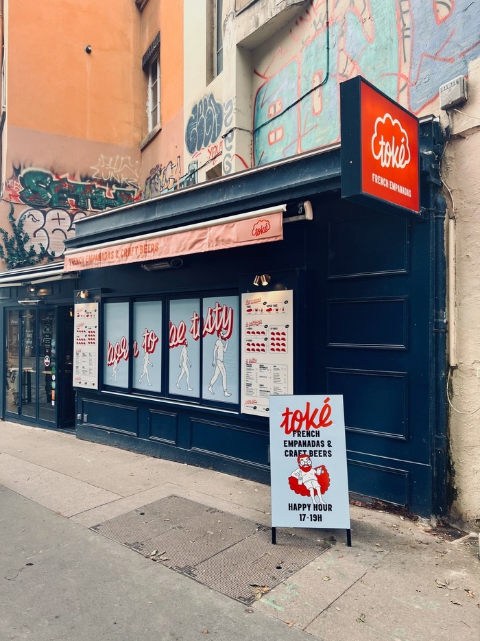
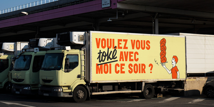
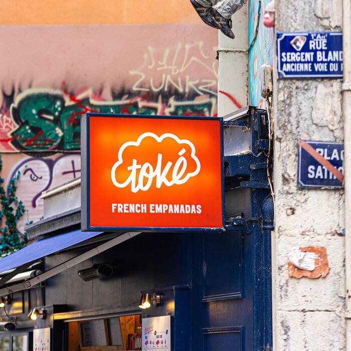
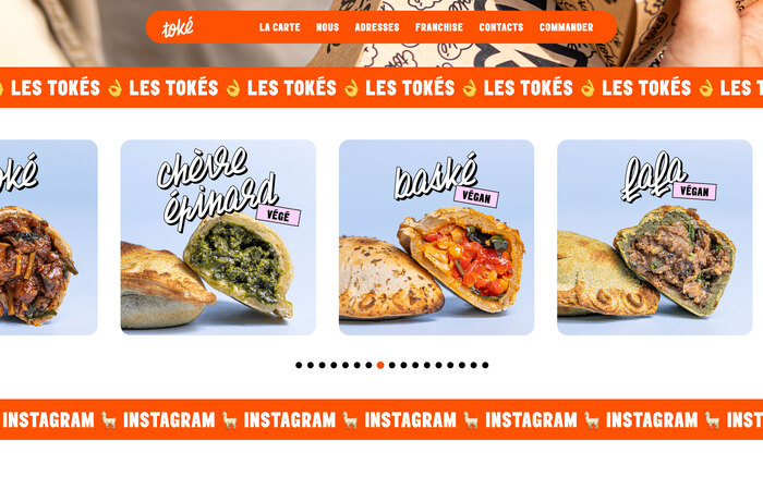
Toké is a fast food restaurant based in Lyon, France, offering tasteful French empanadas. Their light hearted visual identity uses three typefaces plus a series of illustrations. The logo is based on Chaumont Script, which is also used for headlines in combination with Elephant. On the website, body copy is set in Degular.
Branding by Bokchoy
Visual identity with Por Qué No
Illustrations by Gabriela Laurent
Photography by Pookie Cookie Studio
Web design with Por Qué No
Web development by Bokchoy
Source: www.facebook.com License: All Rights Reserved.
Photo: Jérémy Raucq. License: All Rights Reserved.
Source: bokchoy.studio Photo: Jérémy Raucq. Maison.Mockup. License: All Rights Reserved.
Photo: Jérémy Raucq. License: All Rights Reserved.
Photo: Jérémy Raucq. Bendito. License: All Rights Reserved.
Source: www.instagram.com Toké. License: All Rights Reserved.
Source: instagram.com Toké. License: All Rights Reserved.
Source: www.toke.eu License: All Rights Reserved.
This post was originally published at Fonts In Use
Read full story.
WRITTEN BY
FontsInUse
An independent archive of typography.
More from FontsInUse