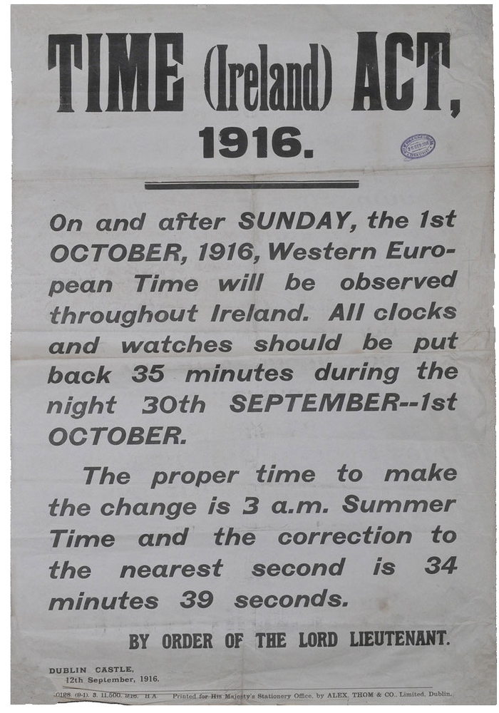
Time (Ireland) Act 1916 government notice
Published June 23, 2024
By FontsInUse
Contributed by Param Anand Singh
Source: en.wikipedia.org Lord Lieutenant of Ireland for the Government of the United Kingdom of Great Britain and Ireland. License: Public Domain.


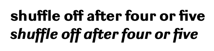
Photo: Param Anand Singh. License: All Rights Reserved.
This post was originally published at Fonts In Use
Source: en.wikipedia.org Lord Lieutenant of Ireland for the Government of the United Kingdom of Great Britain and Ireland. License: Public Domain.
A decent example of Miller & Richard's Grotesque No. 4 Italic, which, for all its quirks, looks perfectly at home on a no-nonsense government notice. I particularly like the flinching f, echoed in Fred Smeijers’ vintage-inspired Ludwig, which uses it—quite pragmatically—in ligatures.
The other typefaces are mysteries to me, and I would appreciate any help in identifying them—especially the interloping 3s in “30th SEPTEMBER” and “3 a.m.” and the O in “On and after,” which differs a bit from the others.
Photo: Param Anand Singh. License: All Rights Reserved.
Ludwig Black and Black Italic by Fred Smeijers. The f flinches à la Grotesque No. 4 Italic to make way for l, f, t, and i, but stands (or leans) straight next to o. (The second f in “off” flinches in solidarity with the first, I suppose.)
This post was originally published at Fonts In Use
Read full story.
WRITTEN BY
FontsInUse
An independent archive of typography.
More from FontsInUse