The Hitchhikers Guide to the Galaxy (1979 book and double LP)

Source: www.reddit.com Hipgnosis/Ian Wright. License: All Rights Reserved.
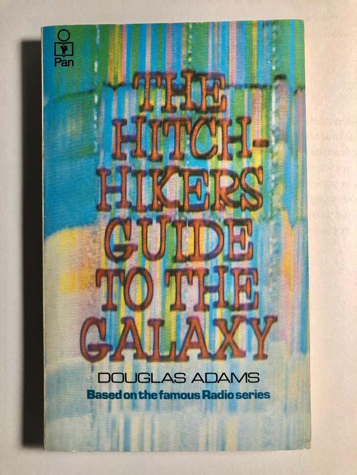
Pan Books edition. The type on the bottom appears to be the wide lightweight of Eurostile and the same typeface but in a normal width of bold weight.


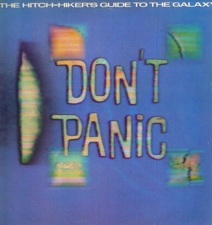
Two covers for the 1979 edition of British author and screenwriter Douglas Adams’ comedy science fiction franchise: an eponymous novel, published by Pan Books in the UK, and the double LP featuring the four episodes, released by Original Records in the UK and Canada.
The art group Hipgnosis and illustrator Ian Wright were credited for designing the cover for the original British release, which included three Filmotype fonts shown in this example. Also, it was one of these examples of video art used for the design.
First, there was Fleet. VGC then copied the face as C-13 in or before 1972, and this font was digitized by Castcraft in 1990 as OPTIFleet. Omaha (named after a city in Nebraska in the United States, also by VGC as M-15) comes with the big capital letters in the center and Orlando (copied as G-25) for the back cover.

Source: www.amazon.ca Hipgnosis/Ian Wright. License: All Rights Reserved.
Front cover of the LP. The title set in Omaha has alternate glyphs for D, N, and P. [More info on Discogs]

Source: www.amazon.ca Hipgnosis/Ian Wright. License: All Rights Reserved.
Back cover. The text on the left side was set in Univers.
This post was originally published at Fonts In Use