Stormvloed consultancy
Source: stephanieluescher.com © Kesselskrammer 2023. License: All Rights Reserved.

Description of the project from Stephanie Lüscher's website:
Stormvloed (Stormflood) is an organizational consultancy that focuses on major social themes such as energy transition, housing shortage, and infrastructure maintenance backlog. (...)
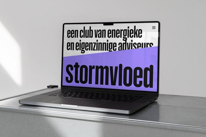
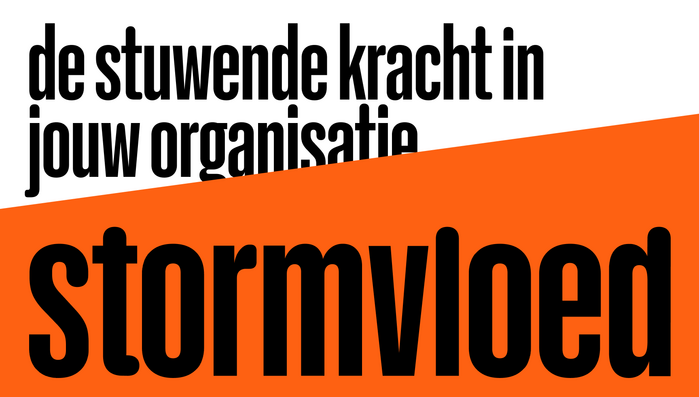
The concept of Stormvloed's visual identity is inspired by the upward trajectory of a storm flood, symbolizing the consultancy's commitment to raising the bar in the market. This recognizable and simple visual element represents how Stormvloed takes charge, driving quality and fostering the growth of talents. The visual identity embodies both energy and simplicity, creating a powerful and appealing combination.
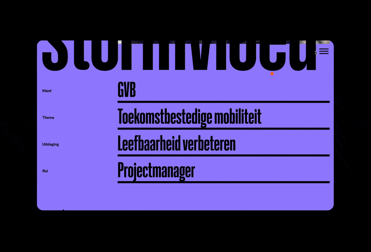
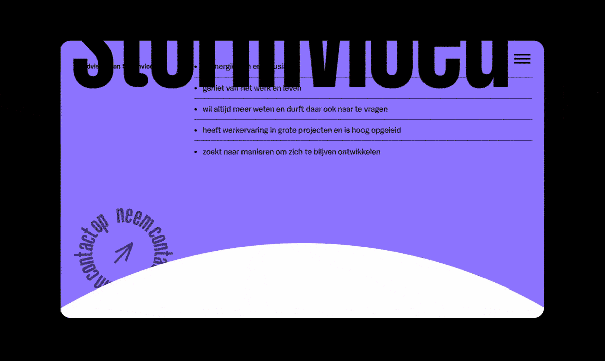
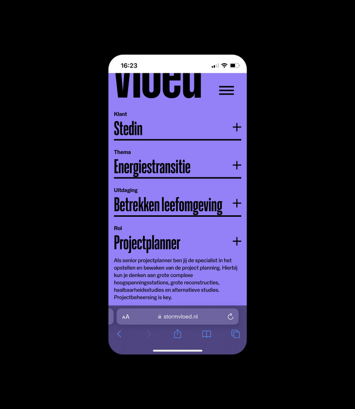
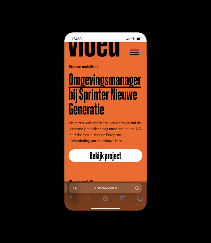
Stormvloed uses NaN Holo in 2 widths all over the place. The compressed bold style makes the huge size titles compact, such as the name of the project taking 100% of the width of the screen. All the texts are set up in NaN Holo Narrow, either Regular or Bold, a choice that reflects the voluntary simplicity underlying the project.
Client: Stormvloed
Agency: KesselsKramer Digital
Art Director/Designer: Stephanie Lüscher, Roland Cos
Creative Director: Merijn Straathof
Source: stephanieluescher.com © Kesselskrammer 2023. License: All Rights Reserved.
Source: stephanieluescher.com © Kesselskrammer 2023. License: All Rights Reserved.
Source: stephanieluescher.com © Kesselskrammer 2023. License: All Rights Reserved.
Source: stephanieluescher.com © Kesselskrammer 2023. License: All Rights Reserved.
Source: stephanieluescher.com © Kesselskrammer 2023. License: All Rights Reserved.
Source: stephanieluescher.com © Kesselskrammer 2023. License: All Rights Reserved.

Source: stephanieluescher.com © Kesselskrammer 2023. License: All Rights Reserved.
This post was originally published at Fonts In Use