Simon & Schuster redesign (fictional)

Source: micahhoang.info Photo: Micah Hoang. License: All Rights Reserved.


As a student assignment at the ArtCenter College of Design, instructor Charles Lin presented the following context:
Simon & Schuster, a publishing institution with a century-long legacy, undergoes a strategic rebranding following the US government’s intervention to thwart Penguin Random House's acquisition bid. This shift heralds a new era for the company, positioning it as a champion for underrepresented voices and diverse narratives.
Simon & Schuster now serves as a beacon for small-scale and marginalized authors, reshaping the literary landscape by elevating unconventional forms of expression. This rebranding initiative encapsulates the company’s commitment to fostering dialogue and inclusivity, envisioning a literary culture that transcends boundaries and embraces controversy as a catalyst for meaningful discourse.
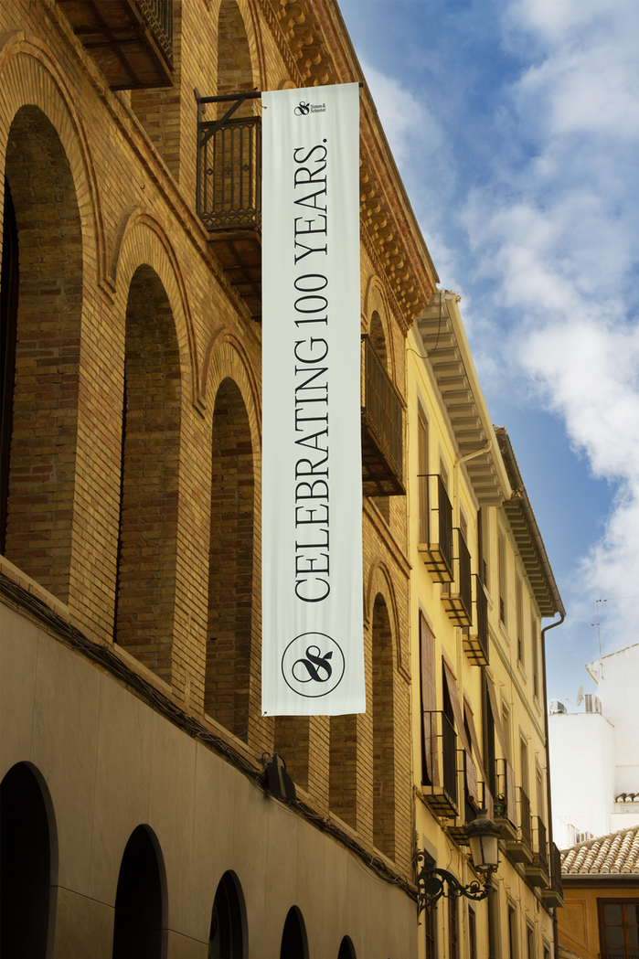
The logo design utilizes the S from the typeface Voyage – which also reads as an ampersand. The ampersand symbolizes the brand’s commitment to unity, collaboration, and the joining of voices. Just as the ampersand brings together separate entities into a cohesive whole, the rebrand strives to amplify voices that have been marginalized, and illuminate stories that have been overlooked.
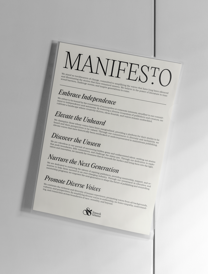
Editorial New, crafted by Pangram Pangram, elevates the brand with a sophisticated and contemporary aesthetic. Its lighter weights exude elegance, refinement, and subtlety, making them ideal for sub-headers. The heavier weights make bold statements, boasting lush curves and exaggerated forms for enhanced expressiveness. Additionally, the luscious and curvy italics serve as a pattern system, adding dynamic flair to the brand communication.
The brand voice echoes the harmony of the emotional and rational, the timeless and contemporary. IBM Plex Serif combines components from classic typefaces like Bodoni and Janson into a contemporary serif, bridging the gaps between Simon & Schuster’s long-standing heritage and relevance in the modern era.
Source: micahhoang.info Photo: Micah Hoang. License: All Rights Reserved.

Source: micahhoang.info License: All Rights Reserved.
Source: micahhoang.info License: All Rights Reserved.

Source: micahhoang.info License: All Rights Reserved.
Source: micahhoang.info License: All Rights Reserved.
This post was originally published at Fonts In Use