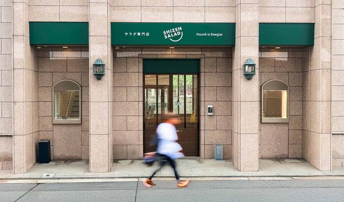
Shizen Salad
Source: mayukosoga.com Photo: Mayuko Soga. License: All Rights Reserved.


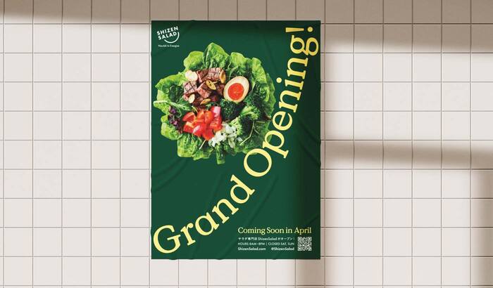
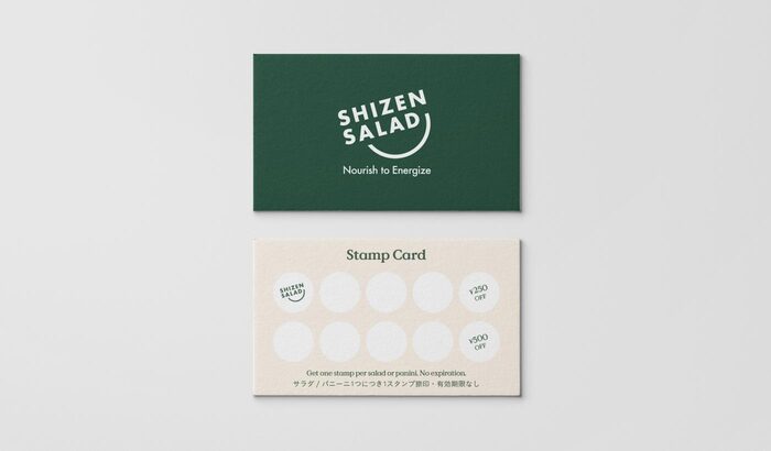
Shizen Salad is a modern custom salad brand based in Osaka, Japan. The goal was to provide a vibrant, healthy alternative that balances everyday affordability with premium quality, serving as a fresh new hub for local professionals and residents.
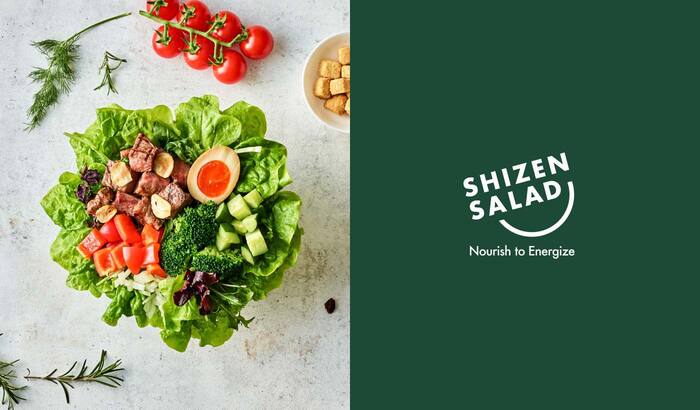
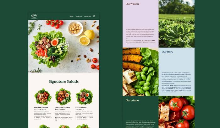
Our challenge was to build a highly approachable identity that instantly communicates freshness, while maintaining an elevated, trustworthy feel. To balance this friendly and dynamic symbol, I needed a typeface that could provide a sophisticated, grounding anchor. I selected Value Serif by Colophon as the primary typeface. While the brand’s core concept is everyday-friendly, Value Serif brings a crucial sense of modern refinement and high-quality craftsmanship.
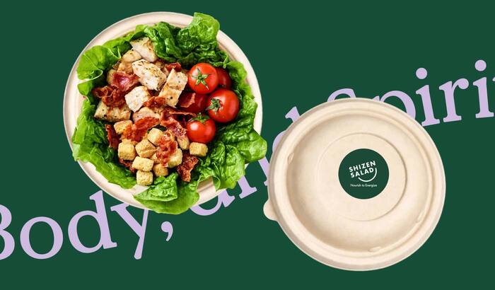
Its elegant proportions and contemporary, sharp wedge serifs create a beautiful contrast with the organic curves of the symbol. This typographic choice allowed the brand to scale seamlessly from physical eco-friendly packaging to digital UI/UX, ensuring the visual language remains both inviting and decidedly premium across all touchpoints.
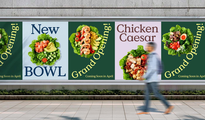
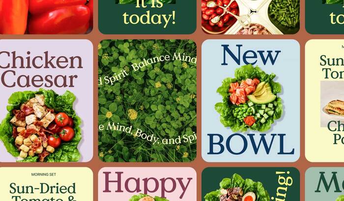
The logo and slogan use Futura. On the website, headings in Value Serif are combined with text set in Koburina Gothic and Inter.
Source: mayukosoga.com License: All Rights Reserved.
Source: mayukosoga.com License: All Rights Reserved.
Source: mayukosoga.com License: All Rights Reserved.
Source: mayukosoga.com License: All Rights Reserved.
Source: mayukosoga.com License: All Rights Reserved.
Source: mayukosoga.com License: All Rights Reserved.
Source: mayukosoga.com License: All Rights Reserved.
This post was originally published at Fonts In Use