SfG Aargau signage
Source: www.feinform.ch Jean-Claude Jossen. License: All Rights Reserved.


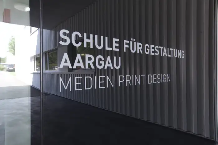
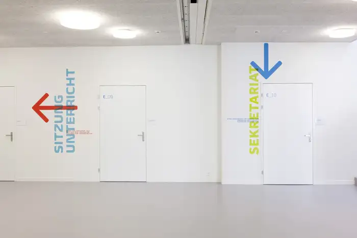
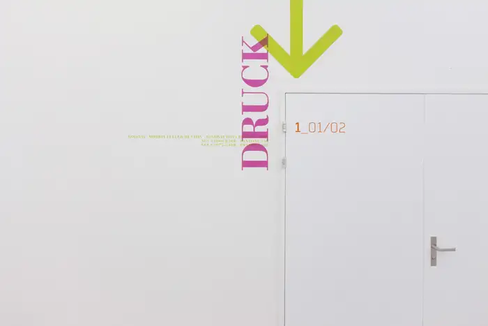
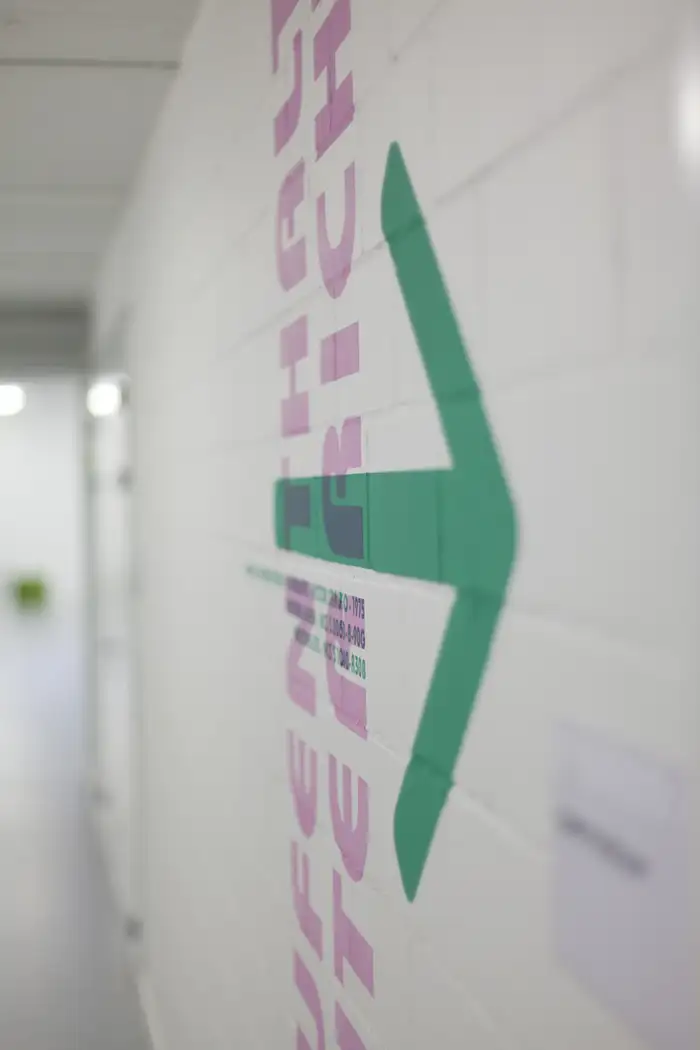
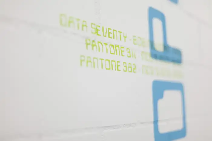
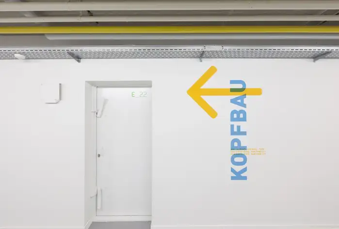
The signs on the campus of the Schule für Gestaltung Aargau (SfGA, Aargau School of Design), Switzerland, uses a wide range of different typefaces.
The signage concept was developed by Andrea Gmünder of Feinform Grafik, Zurich. It was installed in 2012, when the school’s building on Weihermattstrasse 94 was converted and extended by the architects of Baumann Projektmanagement, Basel.
From a 2012 press release (translated):
For the school, which also teaches typography, it was important to focus on this topic. Andrea Gmünder has succeeded in giving the building a strong identity of its own through a playful overlapping of colors and typography.
See more images on the websites of Feinform Grafik and photographer Jean-Claude Jossen.
Source: www.feinform.ch Jean-Claude Jossen. License: All Rights Reserved.
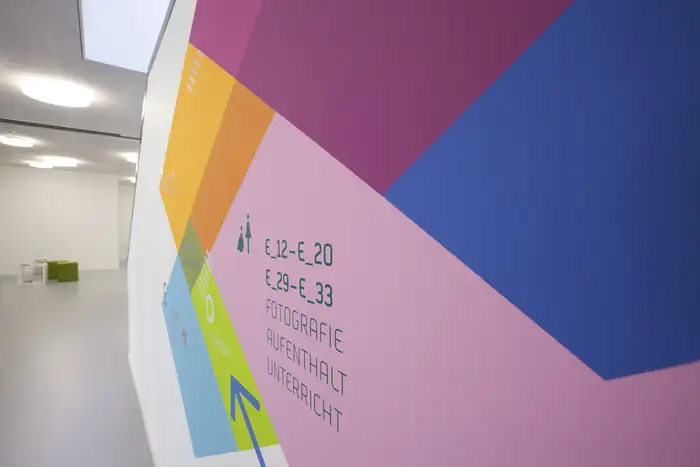
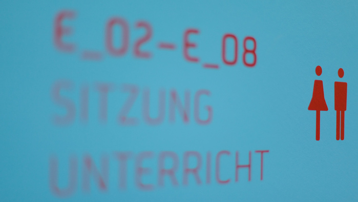
The typeface used for room numbers and labels is Neustadt by Jörn Oelsner.
Source: jcjavm.com Jean-Claude Jossen. License: All Rights Reserved.
Detail with Neustadt caps in two weights

Photo: Manuel Schmalstieg. License: CC BY.
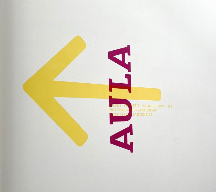
Photo: Manuel Schmalstieg. License: All Rights Reserved.
Source: www.feinform.ch Jean-Claude Jossen. License: All Rights Reserved.
Biome by Carl Crossgrove and Effra by Jonas Schudel / Dalton Maag

Source: www.feinform.ch Jean-Claude Jossen. License: All Rights Reserved.
Clarendon by Hermann Eidenbenz
Source: www.feinform.ch Jean-Claude Jossen. License: All Rights Reserved.
Bodoni by Morris Fuller Benton after Giambattista Bodoni
Source: www.feinform.ch Jean-Claude Jossen. License: All Rights Reserved.
ITC Bauhaus by Ed Benguiat and Victor Caruso
Source: www.feinform.ch Jean-Claude Jossen. License: All Rights Reserved.
Source: www.feinform.ch Jean-Claude Jossen. License: All Rights Reserved.
FF DIN by Albert-Jan Pool – which is also used for the main sign at the entrance
This post was originally published at Fonts In Use