Sammontana Gruvi
Published July 19, 2023
By FontsInUse
Contributed by TypeType
Source: auge-design.com Auge Design. License: All Rights Reserved.

Auge Design. License: All Rights Reserved.
Auge Design. License: All Rights Reserved.
Auge Design. License: All Rights Reserved.
Auge Design. License: All Rights Reserved.

Auge Design. License: All Rights Reserved.
Auge Design. License: All Rights Reserved.
This post was originally published at Fonts In Use
Source: auge-design.com Auge Design. License: All Rights Reserved.
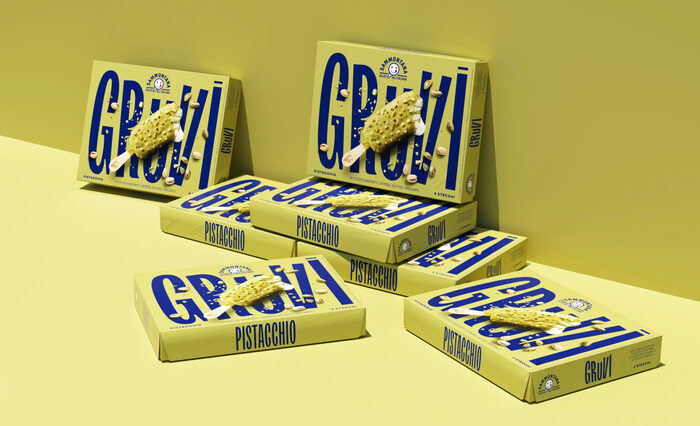
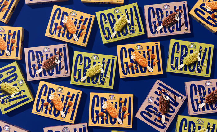
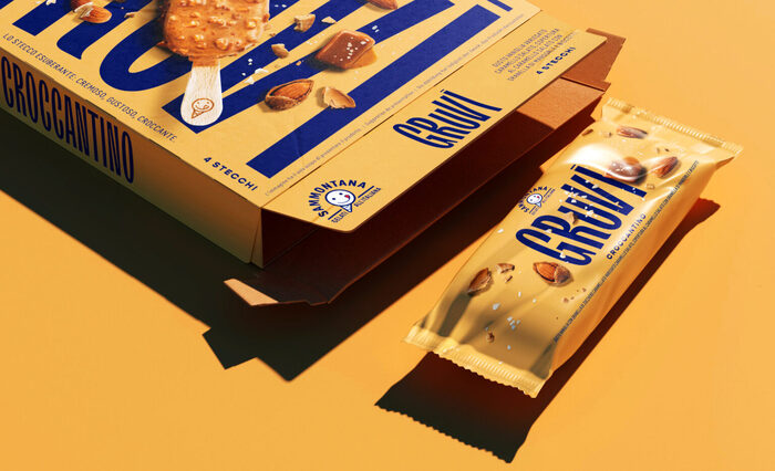
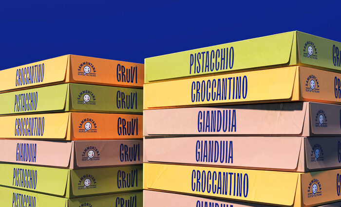
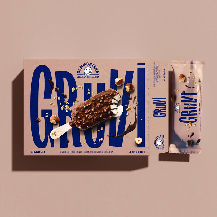
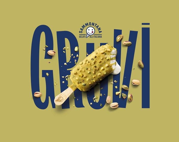
TT Trailers is used in packaging design for the Gruvi ice cream bar by Sammontana.
Auge Design –
chose the product name thinking the different tastes of the ice cream as a groovy beat. The logo design, the typography, the shooting art direction, they all express the idea of movement and the exuberance of the ice cream and its contrasts. Smooth colors on the background and a “soft touch” finishing for the pack oppose a bold blue (brand color) typography, a catchy type and a high-contrast photography. The result is a striking pack that embodies the essence of the ice cream and that feels as inviting as its content!
Auge Design. License: All Rights Reserved.
Auge Design. License: All Rights Reserved.
Auge Design. License: All Rights Reserved.
Auge Design. License: All Rights Reserved.
Auge Design. License: All Rights Reserved.
Auge Design. License: All Rights Reserved.
This post was originally published at Fonts In Use
Read full story.
WRITTEN BY
FontsInUse
An independent archive of typography.
More from FontsInUse