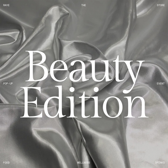
raye the store 08, Beauty Edition
Source: www.studio-boereck.com License: All Rights Reserved.
raye the store is showcasing hundreds of products of the most innovative and exciting food, drinks and wellness brands. It brings together a meticulously curated collection of selective brands in one store with innovation, nutrition, and design at its core.
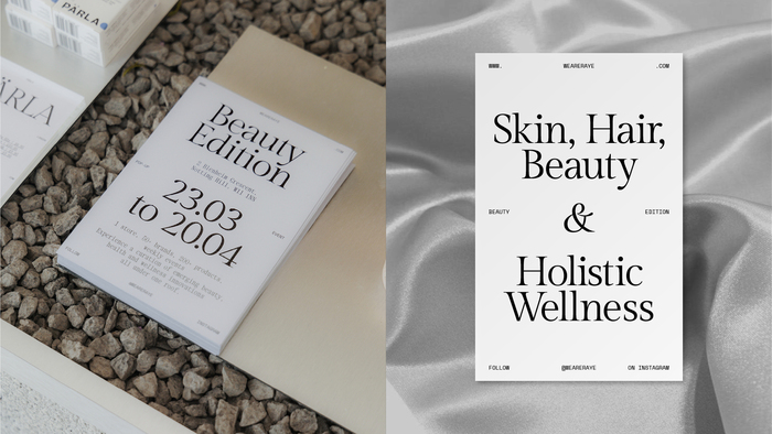
Based on a minimalistic grid system, the typographic identity is flexible to adapt a fresh look from edition to edition. So far, eight pop-up events have been taking place in the birth city of raye — London, UK. Each one has been branded with a signature color and typeface, which together with the iconic grid system formed the basis for the unique look.
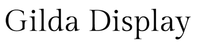
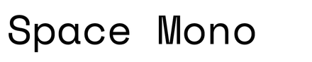
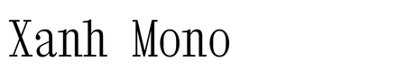
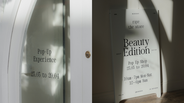
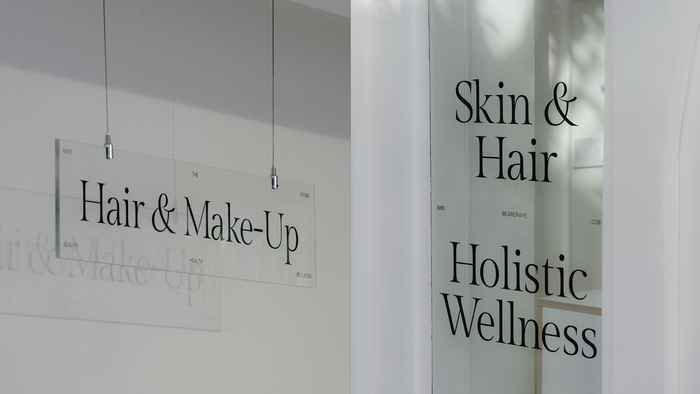
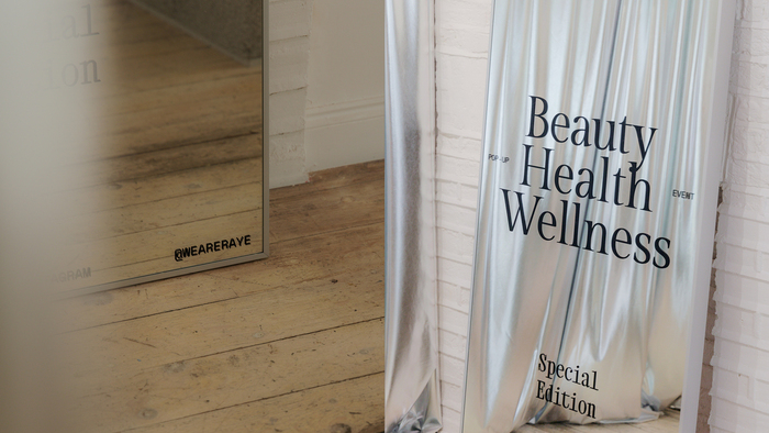
Edition number 08 is a special edition focusing on brands and products in beauty and health care. To emphasize this unique edition, instead of choosing a particular color a specific material was used: silky silver surfaces were combined with the clean, elegant Gilda Display and the project’s brand typefaces Space Mono and Xanh Mono.
See also previously posted editions of raye the store.
Source: www.studio-boereck.com License: All Rights Reserved.
Source: www.studio-boereck.com License: All Rights Reserved.
Source: www.studio-boereck.com License: All Rights Reserved.
Source: www.studio-boereck.com License: All Rights Reserved.
This post was originally published at Fonts In Use