Ramensky
Source: ostecx.com Ostecx. License: All Rights Reserved.


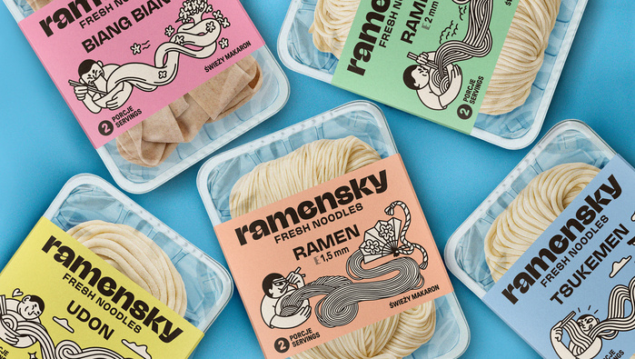
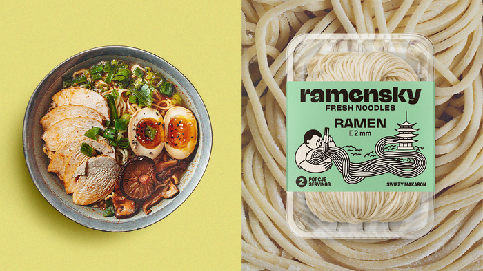
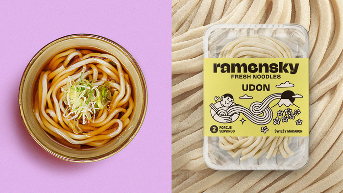
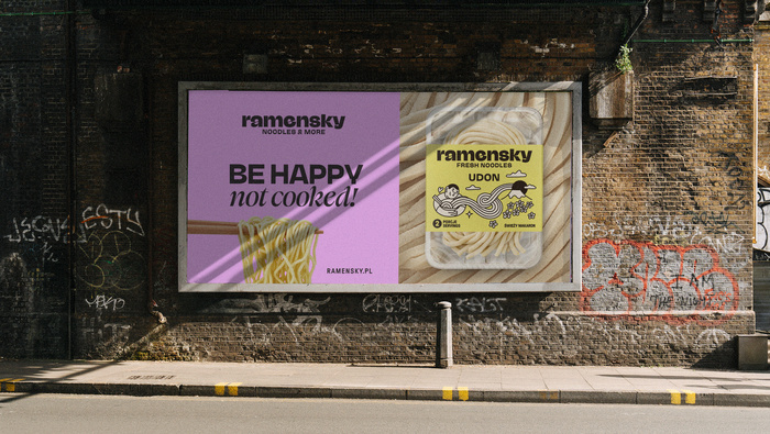
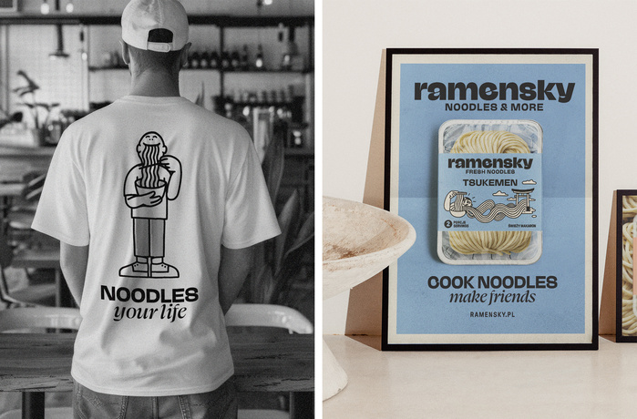
Ramensky is a Polish manufacturer of fresh noodles for Asian restaurants and fans of Far Eastern cuisine. The company decided to expand its retail offerings, so we had the opportunity to refresh its visual identity and design the packaging for Ramen, Udon, Biang Biang, and Tsukemen noodles. All elements of the new image were created in collaboration with illustrator Kinga Offert.
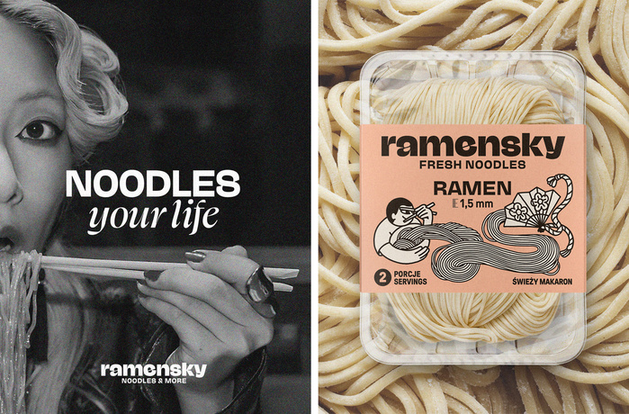
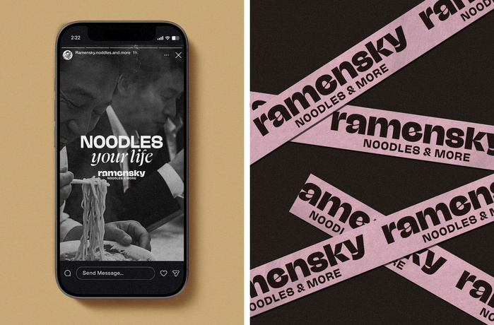
To meet the challenge, we needed the right fonts. We used NaN Jaune for the brand's logo and as the main font on the packaging, giving it a unique character. We also used the Swear font in our advertising materials, adding a dynamic and playful touch to our ads and branded merchandise. This resulted in a rich and engaging brand universe, inspired by Japanese culture.
Source: ostecx.com Ostecx. License: All Rights Reserved.
Source: ostecx.com Ostecx. License: All Rights Reserved.
Source: ostecx.com Ostecx. License: All Rights Reserved.
Source: ostecx.com Ostecx. License: All Rights Reserved.
Source: ostecx.com Ostecx. License: All Rights Reserved.
Source: ostecx.com Ostecx. License: All Rights Reserved.
This post was originally published at Fonts In Use