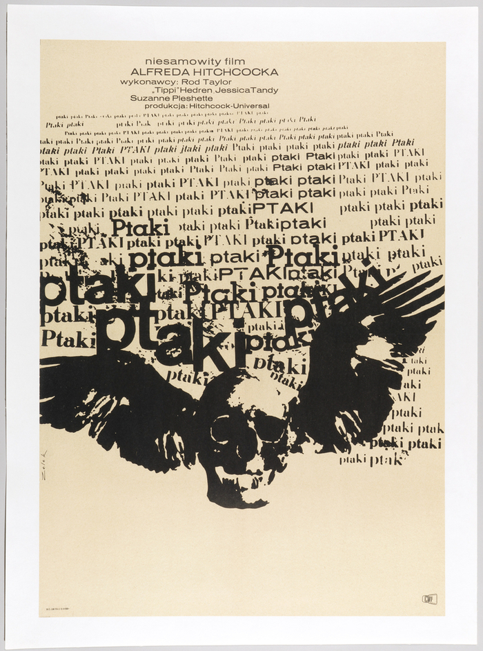
Ptaki (The Birds) Polish movie poster
Source: collection.cooperhewitt.org Cooper Hewitt, Smithsonian Design Museum. License: All Rights Reserved.
Poster, Ptaki [The Birds], 1963–65; offset lithograph on wove paper, mounted on canvas; 83.6×58.9 cm (32 15/16 × 23 3/16 in.); Gift of Sara and Marc Benda; 2010-21-7


On Fonts In Use, Bronisław Zelek (1935–2018) is mostly represented through his typefaces Zelek and New Zelek. Zelek was not a full-time type designer, though: he primarily worked as graphic artist, poster designer, and painter. We have documented two of his poster designs before, for Głód (1967) and Jazz Jamboree 68 (1968).
Shown here is one of Zelek’s most striking posters, designed only a few years after he graduated from Henryk Tomaszewski’s class at the Warsaw Academy of Fine Arts in 1961. It’s a movie poster made for the Polish release of Hitchcock’s The Birds (1963).
Instead of depicting birds directly, Zelek opted for a winged skull to symbolize the mortal threat. The dead’s head leads a flock of words which repeat the title – ptaki is Polish for birds – countless times. Still small and orderly at the top, the words grow larger, unrulier and more aggressive toward the bottom, in an extraordinary typographic translation of the swelling sound of screeching birds with beating wings.
Zelek used various capitalizations to increase the diversity of “species”. Among the fonts in use are Akzidenz-Grotesk and a number of metal typefaces by the Polish foundry Jan Idźkowski i S-ka, all of which are more or less directly derived from designs that originated in Germany: the slab serif is Nil, which is based on Stempel’s Memphis. The roman with the round-bellied a is Ratio-Latein, also by Stempel, which was cast by Idźkowski under the name Modena. The italic looks like Berthold’s Augustea, known in Poland as Szkolna Sejmowa.
Last but not least, there’s Baccarat półgruby, sometimes also called Baccarat półtłusty, which is also used for the credits at the top. This wide sans is a version of a design that originated at Wagner & Schmidt, and went under various names, including Edel-Grotesk halbfett (at Ludwig Wagner) or Aurora-Grotesk VII breit halbfett (at C.E. Weber). Idźkowski’s Baccarat family is an amalgamation of various wide styles from Edel-Grotesk / Aurora-Grotesk VI–VII, Annonce / Aurora-Grotesk V, and Industria Gravur. In January 2023, Mateusz Machalski released Sztos, designed with support from Małgorzata Bartosik and Karol Mularczyk. This family “is a remix of one of the most famous grotesques used in Poland – Baccarat”.
Małgorzata is currently working on a book about Bronisław Zelek, titled In the enchanted land of letters. As a matter of course, it also contains the famous Ptaki poster, as well as a later cycle of paintings that continues this work. For typesetting the book, she’s using New Zelek and also Sztos – full circle! If you want to get your hands on a copy of this monograph, there is a crowdfunding campaign. But you need to hurry, it will end very soon (March 31).
Source: theredlist.com License: All Rights Reserved.
This post was originally published at Fonts In Use