Protean Funds Scandinavia identity and website
Frostner Studio. License: All Rights Reserved.


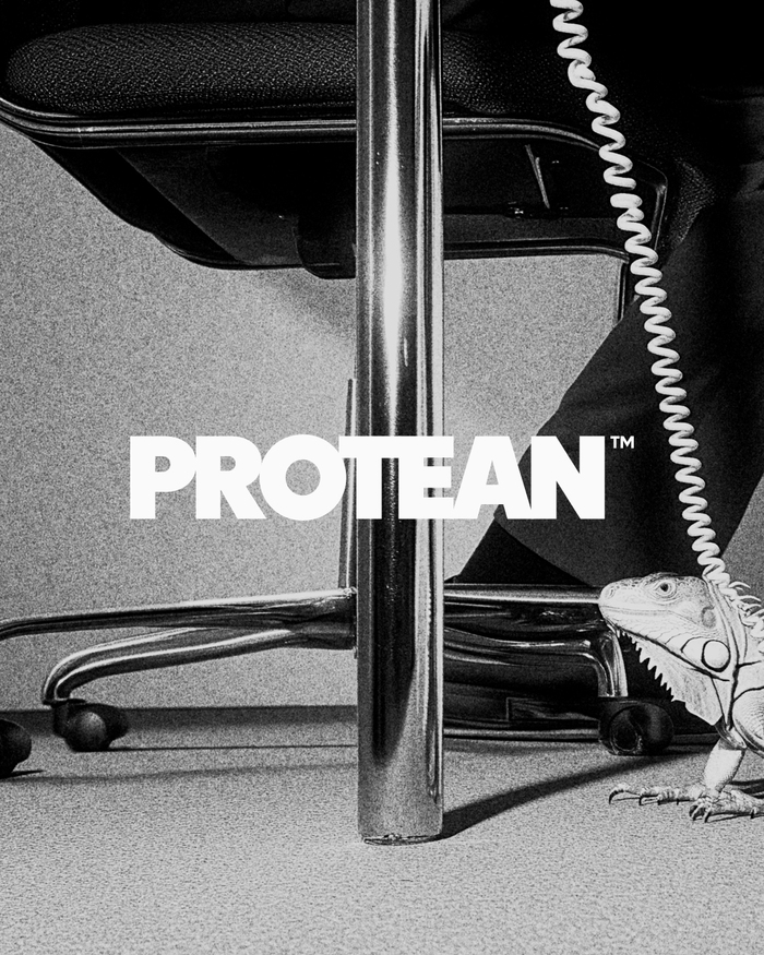
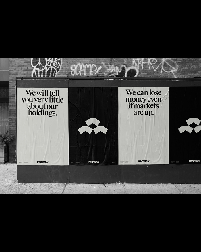
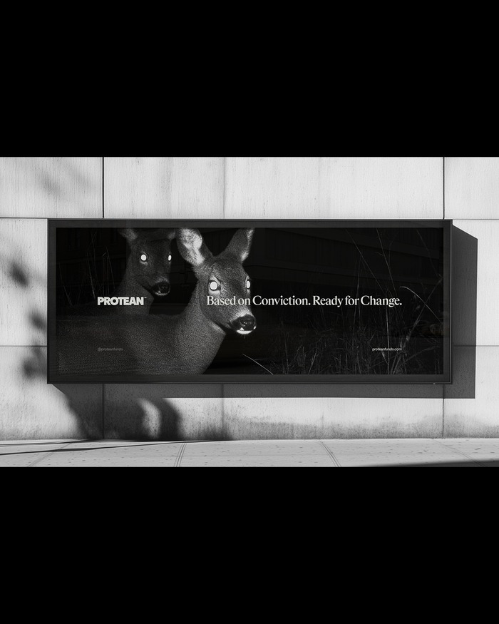
Protean’s brand concept “Based on Conviction. Ready for Change” describes a very specific attitude in finance, disciplined decisions, and an explicit willingness to revise them when reality shifts. The identity was built to hold that tension without falling into the usual finance clichés, polished certainty on top of implied complexity underneath.
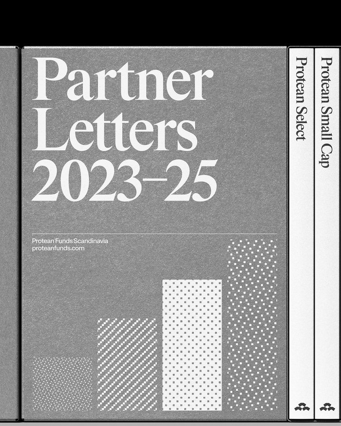
The typographic system is built around a deliberate tension between permanence and adaptability. TWK Burns anchors the identity with a sense of weight, discipline, and institutional memory, it feels carved rather than drawn, aligning with Protean’s emphasis on conviction and responsibility. Rhymes introduces a more expressive, high-contrast voice in headlines, allowing for nuance, emphasis, and moments of controlled instability. Ritual (with Ritual Mono) functions as the connective tissue, a contemporary sans that keeps the system operational, readable, and grounded in the present. Together, the typefaces mirror Protean’s philosophy: decisions rooted in strong belief, but always open to revision as conditions change.
Frostner Studio. License: All Rights Reserved.
Frostner Studio. License: All Rights Reserved.
Frostner Studio. License: All Rights Reserved.

Source: www.proteanfunds.com Frostner Studio. License: All Rights Reserved.

Source: www.proteanfunds.com Frostner Studio. License: All Rights Reserved.

Source: www.proteanfunds.com Frostner Studio. License: All Rights Reserved.
This post was originally published at Fonts In Use