Porto City Identity (2014)
Source: eduardoaires.com Studio Eduardo Aires. License: All Rights Reserved.

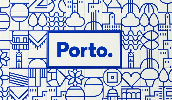
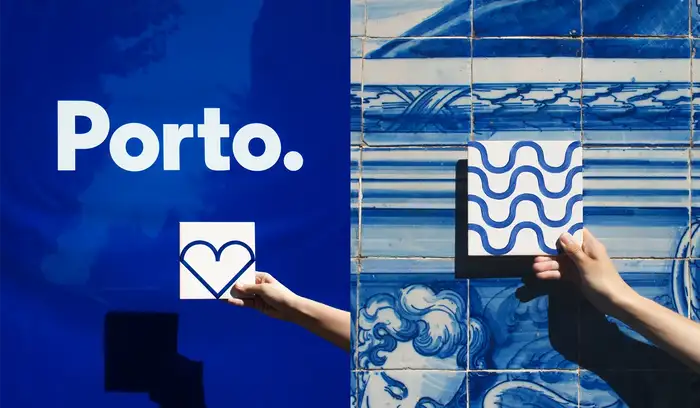
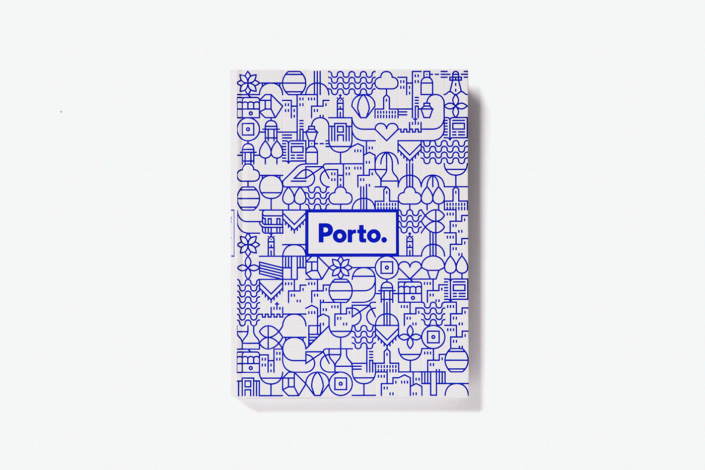
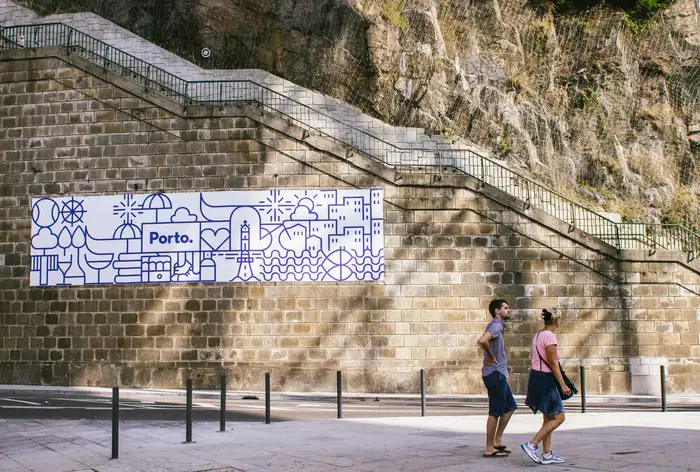
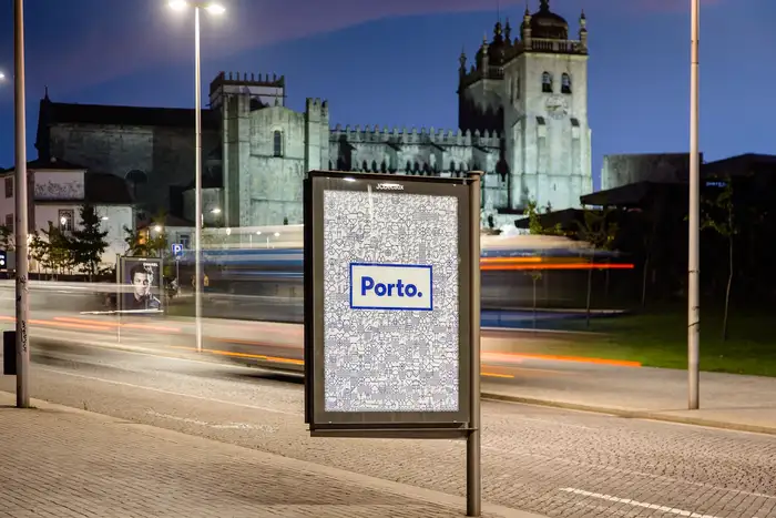
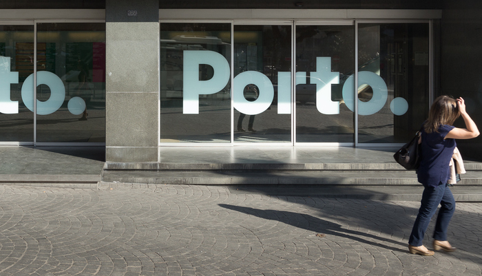
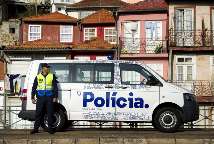
In 2014, Studio Eduardo Aires (then White Studio) had the opportunity to design and implement a visual identity for the city of Porto, Portugal. The main logo, set in A2 Regular ExtraBold with a full stop, makes a statement, reflecting the authenticity, straightforwardness and attitude linked to the northern city and its people.
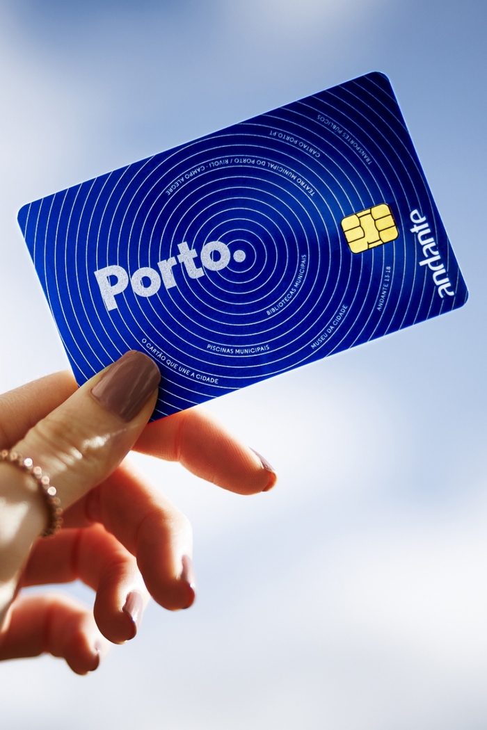
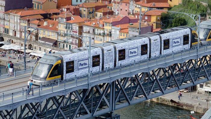
The blue represents the pure, unmistakable connection to the sea, the northern cold and the Portuguese azulejos. This strong personality is also shown in the iconography and subsequent illustrations used, inspired by the blue tiles that cover many historic buildings.
The visual identity includes a dynamic, grid-based system that adapts to different applications. It was implemented in public transportation, uniforms, porticoes of events, outdoors and even tattooed.
Source: www.behance.net Studio Eduardo Aires. License: All Rights Reserved.

Source: www.cm-porto.pt Studio Eduardo Aires. License: All Rights Reserved.
Source: www.behance.net Studio Eduardo Aires. License: All Rights Reserved.
Source: www.behance.net Studio Eduardo Aires. License: All Rights Reserved.

Source: www.behance.net Studio Eduardo Aires. License: All Rights Reserved.
Source: www.behance.net Studio Eduardo Aires. License: All Rights Reserved.
Source: eduardoaires.com Studio Eduardo Aires. License: All Rights Reserved.
Source: mir-s3-cdn-cf.behance.net Studio Eduardo Aires. License: All Rights Reserved.
Source: www.behance.net Studio Eduardo Aires. License: All Rights Reserved.
Source: eduardoaires.com Studio Eduardo Aires. License: All Rights Reserved.

Source: eduardoaires.com Studio Eduardo Aires. License: All Rights Reserved.
This post was originally published at Fonts In Use