Popcorn for the People
Published June 4, 2025
By FontsInUse
Contributed by Benoît Bodhuin
Source: meat.studio Meat. License: All Rights Reserved.


Source: meat.studio Meat. License: All Rights Reserved.
Source: meat.studio Meat. License: All Rights Reserved.
Source: meat.studio Meat. License: All Rights Reserved.

Source: meat.studio Meat. License: All Rights Reserved.

Source: www.popcornforthepeople.com License: All Rights Reserved.
This post was originally published at Fonts In Use
Source: meat.studio Meat. License: All Rights Reserved.
Popcorn for the People offers –
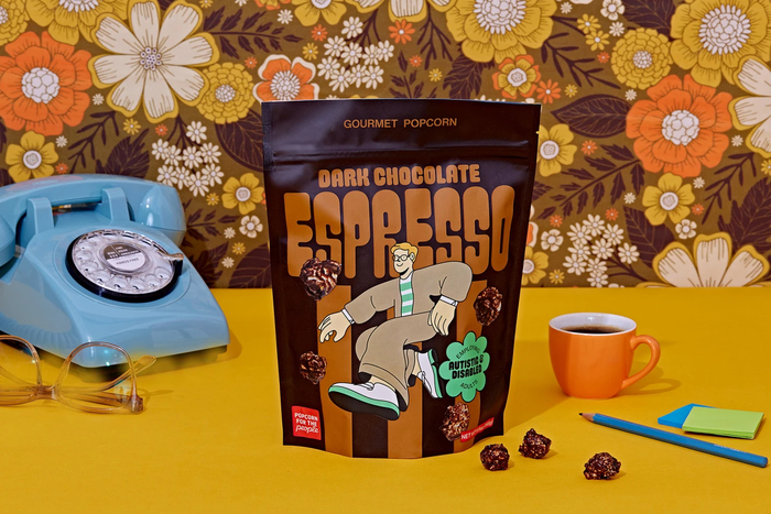
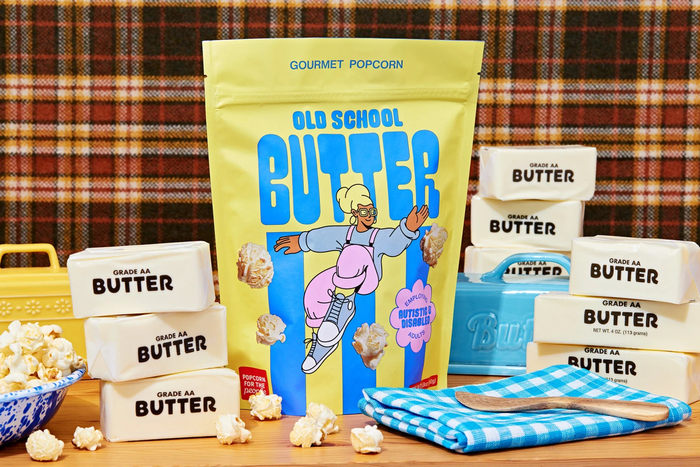
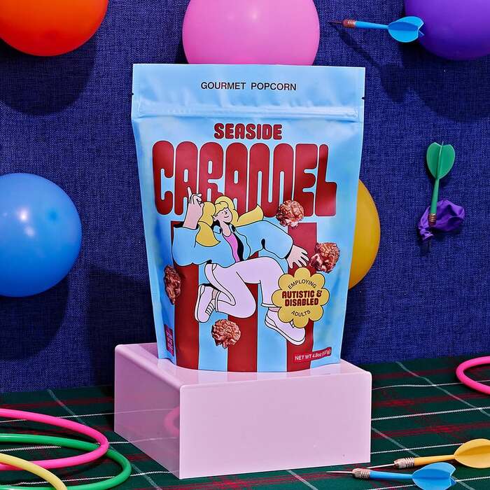
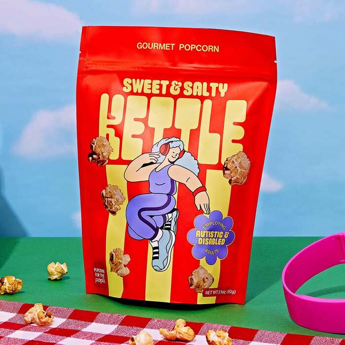
Popcorn crafted with care with a mission that moves us. This project celebrates neurodiversity and characters on the most colorful of spectrums.
Design by Meat, who write:
Our collaboration has tried to convey and explore, through a small gesture, what the path towards Designing for a Neurodiverse Future might be in the B2C market.
The main typefaces are Pimpit by Benoît Bodhuin and Mayonnaise by Pauline Fourest, accompanied by Neue Helvetica or similar. The logo combines Kiro (Ryoichi Tsunekawa) and Susa (Hubert Jocham).
Source: meat.studio Meat. License: All Rights Reserved.
Source: meat.studio Meat. License: All Rights Reserved.
Source: meat.studio Meat. License: All Rights Reserved.
Source: meat.studio Meat. License: All Rights Reserved.
Source: www.popcornforthepeople.com License: All Rights Reserved.
This post was originally published at Fonts In Use
Read full story.
WRITTEN BY
FontsInUse
An independent archive of typography.
More from FontsInUse