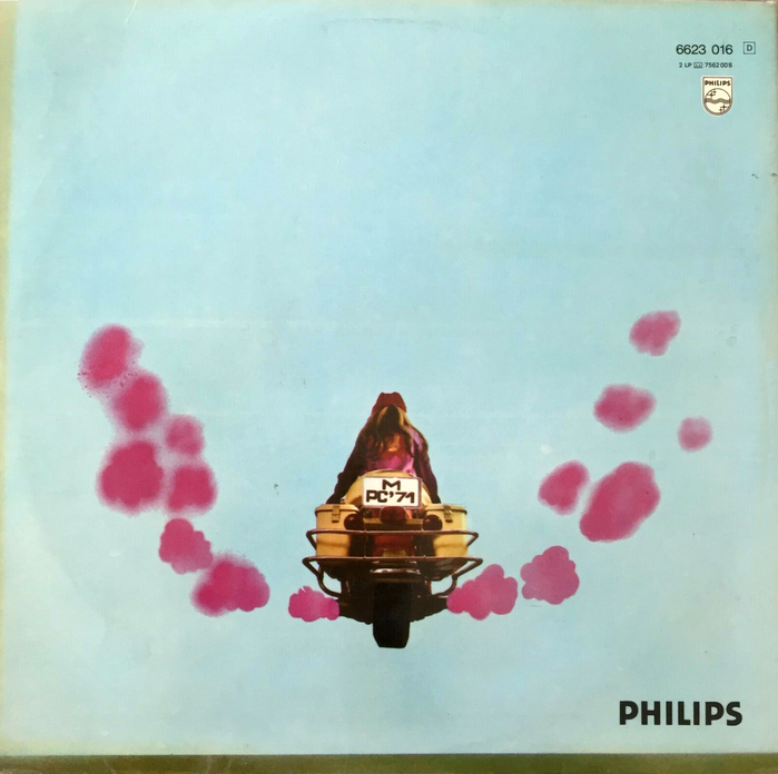
Peter Covent – The Happy Sound of Peter Covent album art

Source: www.flickr.com Leopardtronics. License: All Rights Reserved.

Witt is a bold rounded sans that emerged in the early 1970s. Just like Porker, it’s featured on Fonts In Use for the first time today.
Witt is shown in a 1973 catalog by Typeshop in eight numbered styles; No. 1 is solid, 2 is outlined, 3 is open with a thick-thin outline, 4 is solid with a thick-thin outline, 5 has a thin outline, 6 additionally sports an open SW shade, 7 is solid with an open SW shade, and 8 is outlined with a solid SW shade. The catalog doesn’t include design credits, but the typeface family very likely was designed by Hamburg-based designer Klaus Witt. This assumption is based on the typeface name and the fact that Witt used the fonts in several of his covers designs.
Peter Covent was one of several aliases used by German jazz and entertainment musician Carlos Diernhammer (1931–2000). This album of his was released by Philips Records in 1971.
Source: www.ebay.de disco-rara. License: All Rights Reserved.
This post was originally published at Fonts In Use