Percy Faith and His Orchestra – Younger Than Springtime album art


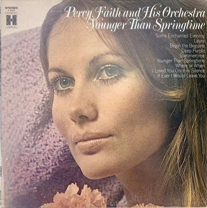
In the 1960s, CBS/Columbia Records released dozens of albums by easy listening band leader, Percy Faith. Many of the covers featured a trendy new typeface, often (if not always) supplied by New York’s top headline phototype shop, Photo-Lettering, given that many of the styles were available exclusively from PLINC – for their first few years, at least.
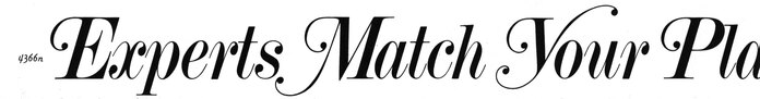
This circa 1970 release of Younger Than Springtime was issued by CBS’s budget labels, Harmony Records and Columbia Special Products. The typeface is the brand new Torino Italic Swash, Photo-Lettering’s ornamental version of the early-19th-century didone, which didn’t appear in a major PLINC catalog until 1971. See the P from “Percy” and the Y from “Younger” matched in this sample from Alphabet Thesaurus Vol. 3 (1971):
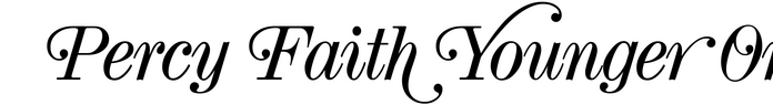
Within a few years, another phototype firm – likely Castcraft – caught on to the idea that Torino italic, with its sparkling contrast and ball terminals, was well suited for embellishments. Their bulkier, stubbier version isn’t as elegant as Photo-Lettering’s, but it has lowercase swashes that the original doesn’t have, and still packs a pretty punch. Here’s a sample in Torino Display JF, Jason Walcott’s digitization of the typeface:
This post was originally published at Fonts In Use