Peralta Supermercados
Published March 17, 2023
By FontsInUse
Contributed by Rodrigo Saiani

Source: www.behance.net License: All Rights Reserved.


Source: www.behance.net License: All Rights Reserved.
Source: www.behance.net License: All Rights Reserved.

Source: www.behance.net License: All Rights Reserved.

Source: www.behance.net License: All Rights Reserved.

Source: www.behance.net License: All Rights Reserved.
Source: www.behance.net License: All Rights Reserved.
Source: www.behance.net License: All Rights Reserved.
Source: www.behance.net License: All Rights Reserved.

Source: www.behance.net Photo: Rodrigo Saiani. License: All Rights Reserved.
This post was originally published at Fonts In Use
Source: www.behance.net License: All Rights Reserved.
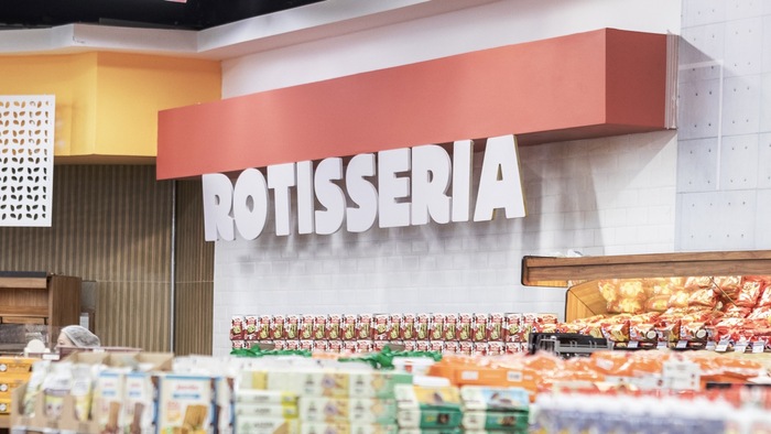
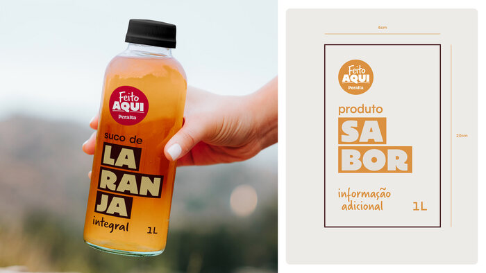
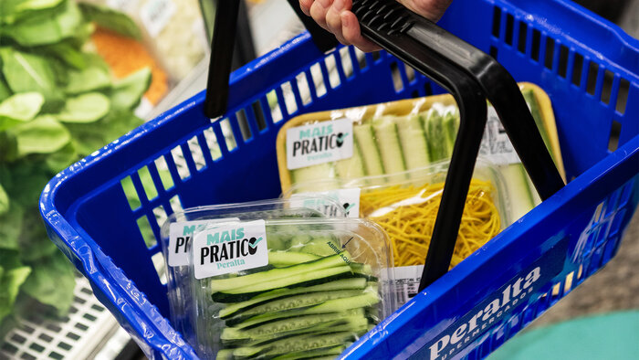
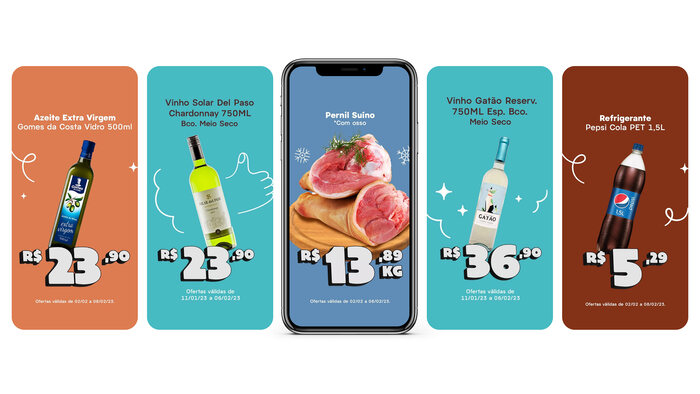
We made an eclectic type palette for Peralta Supermercados, a chain of supermarkets in Brazil.
The simplicity of Pacaembu for text, paired with giant Acme Gothic and Graúna for punch and prices. Verveine serves as a soft, hand drawn counterpart to complete the set.
Scale and punch go hand in hand with supermarket visual communication. This one sets an active yet not as in-your-face retail tone.
See the full case study including detailed credits on Behance.
Source: www.behance.net License: All Rights Reserved.
Source: www.behance.net License: All Rights Reserved.
Source: www.behance.net License: All Rights Reserved.
Source: www.behance.net License: All Rights Reserved.
Source: www.behance.net License: All Rights Reserved.
Source: www.behance.net License: All Rights Reserved.
Source: www.behance.net License: All Rights Reserved.
Source: www.behance.net License: All Rights Reserved.
Source: www.behance.net Photo: Rodrigo Saiani. License: All Rights Reserved.
This post was originally published at Fonts In Use
Read full story.
WRITTEN BY
FontsInUse
An independent archive of typography.
More from FontsInUse