Peanuts books from Determined Productions
License: All Rights Reserved.
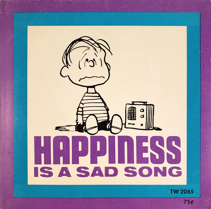
“Happiness is a sad song” ft. Othello and Venus Extended. See more pages in a 1967 edition by Scholastic.



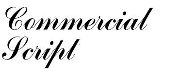





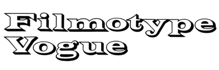

Connie Boucher founded Determined Productions to publish these Peanuts books in the early 1960s, and they've been reprinted and even redesigned while staying within this aesthetic. The design is great, the type is great, the text is great, the illustrations are great.
They also made other materials in this aesthetic, like banners, and sweatshirts that can now run in the $1,000s.

License: All Rights Reserved.
“Happiness is knowing you’ve made it through one more day.” ft. Volta Bold and an ornamented Tuscan initial from an unidentified source

Source: archive.org License: All Rights Reserved.
All-caps Cooper Black for “I need all the friends I can get”. See more images in a 1985 printing by Ivory Tower Publishing.
Source: archive.org License: All Rights Reserved.
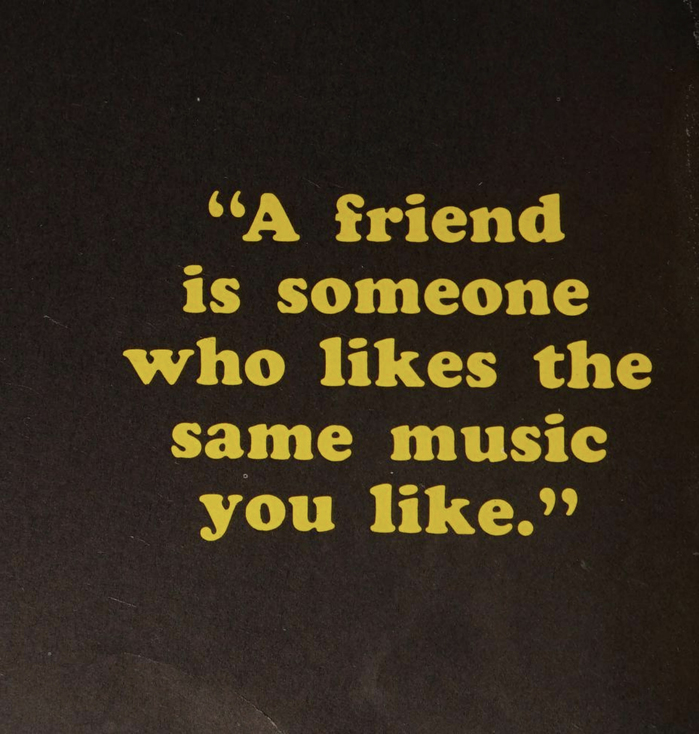
More Cooper Black, this time in mixed case, for “A friend is someone who likes the same music you like.”
Source: www.abebooks.com License: All Rights Reserved.
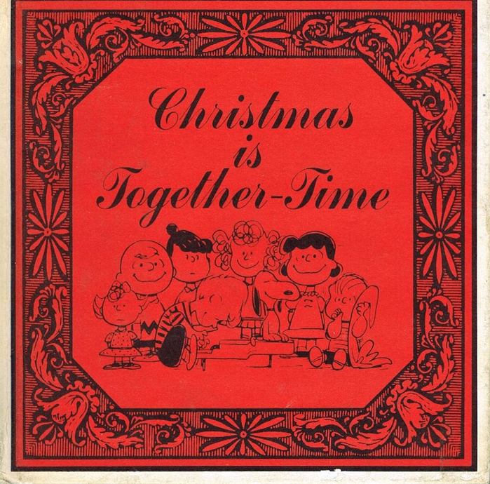
“Christmas is Together-Time” ft. Commercial Script. See more pages in a 1966 edition by Hamlyn.

Source: archive.org License: All Rights Reserved.
“Christmas is hearing about those partridges and pear trees until you’re ready to tear your hair” – this quote is set in Ultra Bodoni Italic with an initial from Macdonald.
Source: archive.org License: All Rights Reserved.
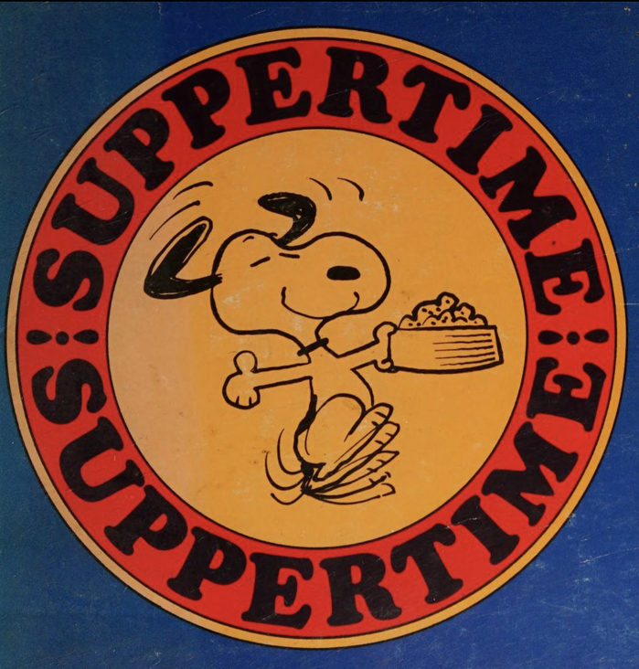
“Suppertime” ft. more all-caps Cooper Black, this time set on a circle
Source: archive.org License: All Rights Reserved.
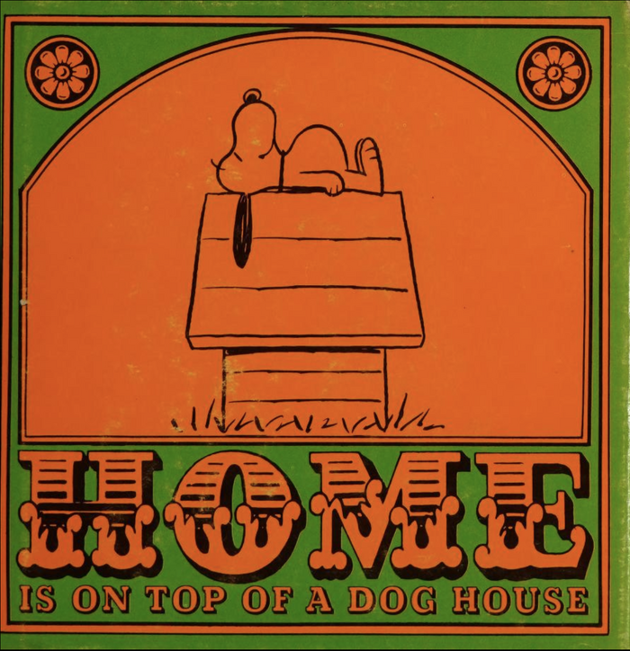
“Home is on top of a dog house” combines Cavanagh Chandelier with Beton licht.
Source: archive.org License: All Rights Reserved.
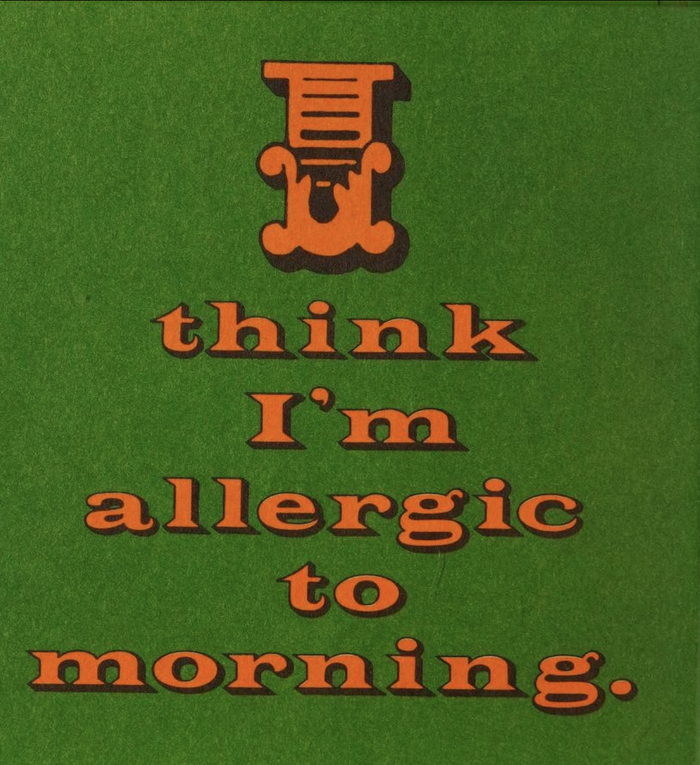
“I think I’m allergic to morning.” Here, Chandelier is paired up with another shaded typeface: it’s Filmotype Vogue.
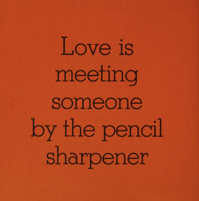
Source: archive.org License: All Rights Reserved.
“Love is meeting someone by the pencil sharpener” in Stymie Light. See more pages from Love Is Walking Hand in Hand (1965).
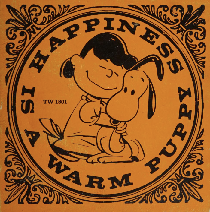
Source: archive.org License: All Rights Reserved.
More Volta Bold for “Happiness is a warm puppy”. See more images in this 1973 printing by Scholastic.
This post was originally published at Fonts In Use