Pac-Man arcade game US flyer
Source: www.flyerfever.com Midway MFG. Co. under license from Namco Ltd. License: All Rights Reserved.
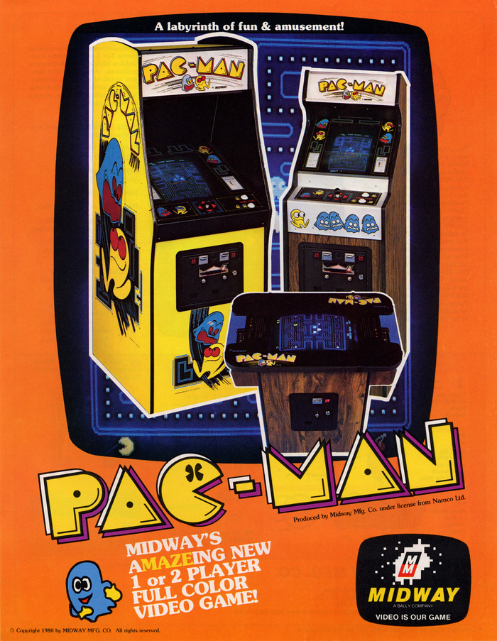
US Pac-Man flyer ca. 1980 (front)

From Wikipedia:
Pac-Man, originally called Puck Man in Japan, is a 1980 maze video game developed and released by Namco for arcades. In North America, the game was released by Midway Manufacturing as part of its licensing agreement with Namco America. The player controls Pac-Man, who must eat all the dots inside an enclosed maze while avoiding four colored ghosts. Eating large flashing dots called "Power Pellets" causes the ghosts to temporarily turn blue, allowing Pac-Man to eat them for bonus points.
This is a 1980 poster created by Midway to advertise the game in North America. Display and body text is set entirely in various weights of ITC Souvenir, with Helvetica used for legal copy (including Midway’s logo).
The logo for Pac-Man was designed by Tadashi Yamashita, a member of Namco’s design department. It is an original logotype, although it resembles the geometric Art Deco fonts that received a revival in popularity in the 1970s, particularly Baby Teeth.
The geometric design of the logo reflects the iconic wedge shape of Pac-Man’s in-game representation; this was emphasized by Midway, editing the design on the flyer (though not the cabinet) to add Pac-Man’s eyes to the letter C.
Yamashita also created the character artwork for Pac-Man; he is said to have “paid heed to the American influence in pop culture at the time”, envisioning scenes in which Pac-Man “runs along a West Coast landscape while the Ghosts make mischief”. His illustrations often borrowed influence from the logotype on imported album covers.
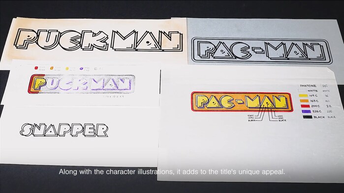
Originally, the game was known as Puck Man in Japan. In North America, the game's name was changed to avoid crude vandalism. The founder of Namco, Masaya Nakamura, eventually recommended the name Pac-Man, as he believed this would better reflect the Japanese spelling, pakkuman. Before this title was settled upon, Snapper was also considered.
All three logos use the same general design and logotype. However, they show peculiarities when compared to similar fonts, notably the letter K in the Puck Man logo and the letter E in the Snapper logo.
Each logo is set in three offset layers, the top layer in signature Pac-Man yellow and the bottom layers in white (up and to the left) and purple (down and to the right), typically atop an orange-and-red frame. The letters have contoured lines suggesting shading in the bottom right.
To this day, whenever new text in the Pac-Man logotype is required, unique characters are created; it does not have one standardized design.
Source: www.flyerfever.com Midway MFG. Co. under license from Namco Ltd. License: All Rights Reserved.
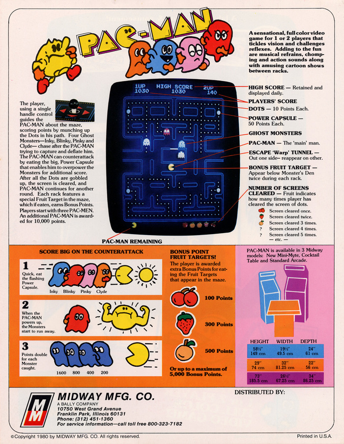
US Pac-Man flyer ca. 1980 (back)
Source: www.youtube.com Bandai Namco Studios Art Team. License: All Rights Reserved.
The original design sketches for the Pac-Man logo, by Tadashi Yamashita of Namco. The title was changed from the original Japanese Puck Man, although Snapper was briefly considered instead.
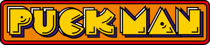
Source: logos.fandom.com Namco Ltd. License: All Rights Reserved.
The finalized design of the Puck Man logo, as the game was known in Japan. Note the distinct shape of the letter K.
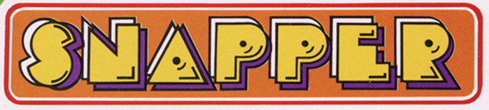
Source: www.flyerfever.com Namco Ltd. License: All Rights Reserved.
An early English flyer, released before the US debut of Pac-Man, shows the finalized design of the Snapper logo (cropped for detail). Note the distinct shape of the letter E.
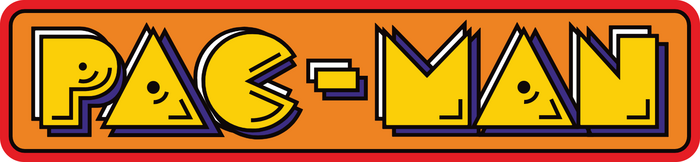
Source: logos.fandom.com Namco Ltd. License: All Rights Reserved.
The finalized design of the Pac-Man logo
This post was originally published at Fonts In Use