Osteria del Gallo Ardito
Source: www.carlottabacchini.com Photo: Carlotta Bacchini. License: All Rights Reserved.


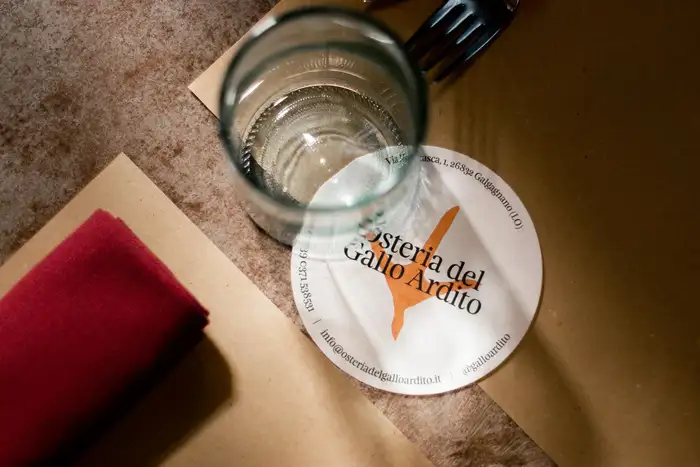
The identity for Osteria del Gallo Ardito strikes a balance between heritage and modernity, much like its culinary philosophy. While grounded in traditional Lombard roots, the osteria in Galgagnano reinterprets classic flavors with a contemporary touch, an approach reflected in its identity and typographic system.
Feijoa, used in the logo and key identity elements, brings a sense of warmth and craftsmanship with its organic serif forms. Its subtle elegance nods to the osteria’s historical origins. In contrast, Suisse Int’l offers a clean, modern counterbalance, ensuring clarity and readability across supporting materials.
This interplay between serif and sans-serif highlights the osteria’s blend of refinement and tradition, reinforcing the narrative of a dining experience that bridges past and present.

Source: www.carlottabacchini.com License: All Rights Reserved.
Osteria del Gallo Ardito translates to “Bold Rooster Inn”. This is echoed by the logo visual, a chicken footprint.

Source: www.carlottabacchini.com License: All Rights Reserved.

Source: www.carlottabacchini.com License: All Rights Reserved.

Source: www.carlottabacchini.com License: All Rights Reserved.

Source: www.carlottabacchini.com License: All Rights Reserved.
This post was originally published at Fonts In Use