Os Hassums TV series logo and title cards

Source: barbara-abbes.com License: All Rights Reserved.


Despite the chaos, the must-see spots, the food poisoning, and the lost-in-translation moments, the memories of family vacations are preserved in the poorly framed photos and the laughs shared over the pickles encountered along the way.
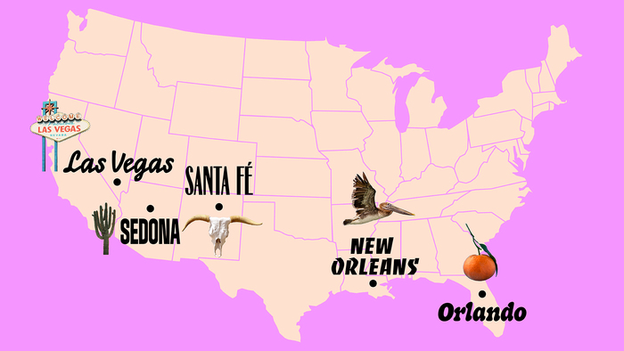
In Os Hassums, comedian Leandro Hassum embarks on a motorhome journey with his family through the United States and explores the pains and delight of traveling with loved ones.
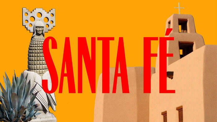
The show’s identity takes a contemporary spin on the retro and kitsch visuals associated with travel postcards, motorhomes, and motel graphics adding saturated colors and expressive type to their air of faded glory. Each trip stop gets its own type treatment and title card responding to the place's vibe.
The show logo mixes Eubie Script and an extruded version of BN Dime Display. Supporting copy and credits use Fraunces.
Design by Bárbara Abbês, with motion design by Renan Vasconcelos.

Source: barbara-abbes.com License: All Rights Reserved.
Source: barbara-abbes.com License: All Rights Reserved.

Source: barbara-abbes.com License: All Rights Reserved.

Source: barbara-abbes.com License: All Rights Reserved.
Source: barbara-abbes.com License: All Rights Reserved.

Source: barbara-abbes.com License: All Rights Reserved.

Source: barbara-abbes.com License: All Rights Reserved.

Source: barbara-abbes.com License: All Rights Reserved.

Source: barbara-abbes.com License: All Rights Reserved.
This post was originally published at Fonts In Use