Orquesta Típica de la Ciudad de México concert posters 2026


Sebastian Vigueras. License: All Rights Reserved.
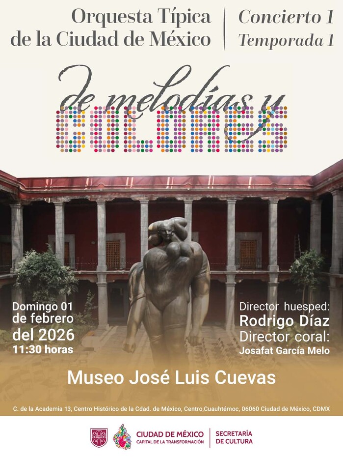
De Melodías y Colores, 1 February 2026
This post presents a series of concert posters designed for the Orquesta Típica de la Ciudad de México (OTCM) in 2026.
The poster shown above officially inaugurates the 2026 Season 1, presenting a renewed visual structure. The composition centers on La Giganta, the monumental sculpture by José Luis Cuevas, which serves as a powerful iconic element. The design employs a high-contrast photographic style in which the background image engages in a dialogue with a typographic composition of two fonts.
The typographic system is a sophisticated fusion of four distinct voices. The main title, De Melodías y Colores (“Of Melodies and Colors”), creates a rhythmic dialogue between Chicago – a robust, dotted typeface – and Origins, a fluid, handwritten typeface that mimics the expressiveness of a calligrapher’s stroke. This combination reflects the dual nature of the concert: the technical precision of the music and the vitality of the visual arts. Questa – here in the form of Questa Grande – is introduced as the new institutional serif typeface, lending a modern and elegant voice to the orchestra’s name. Finally, Cabin remains the official typeface of the Mexico City government for secondary information, ensuring that details about the guest conductor and soloists remain legible against the monumental background. This design establishes the template for the first season in 2026, prioritizing striking iconography and expressive typographic combinations.
Sebastian Vigueras. License: All Rights Reserved.
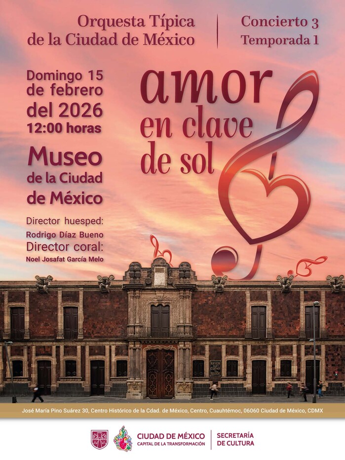
Amor en clave de sol, 15 February 2026
The visual narrative for the third poster centers on a dramatic sunset over the facade of the Museo de la Ciudad de México, where the sky's warm gradients are mirrored by the lyrical and romantic theme of the concert, Amor en clave de sol.
The typographic composition introduces a new, sophisticated hierarchy. The main title is set in Mon Nicolette, an expressive typeface by Mexican designer Cristóbal Henestrosa. Its fluid, calligraphic strokes and elegant swashes – integrated here with musical clef and heart motifs – capture the emotional essence of the repertoire.
Sebastian Vigueras. License: All Rights Reserved.
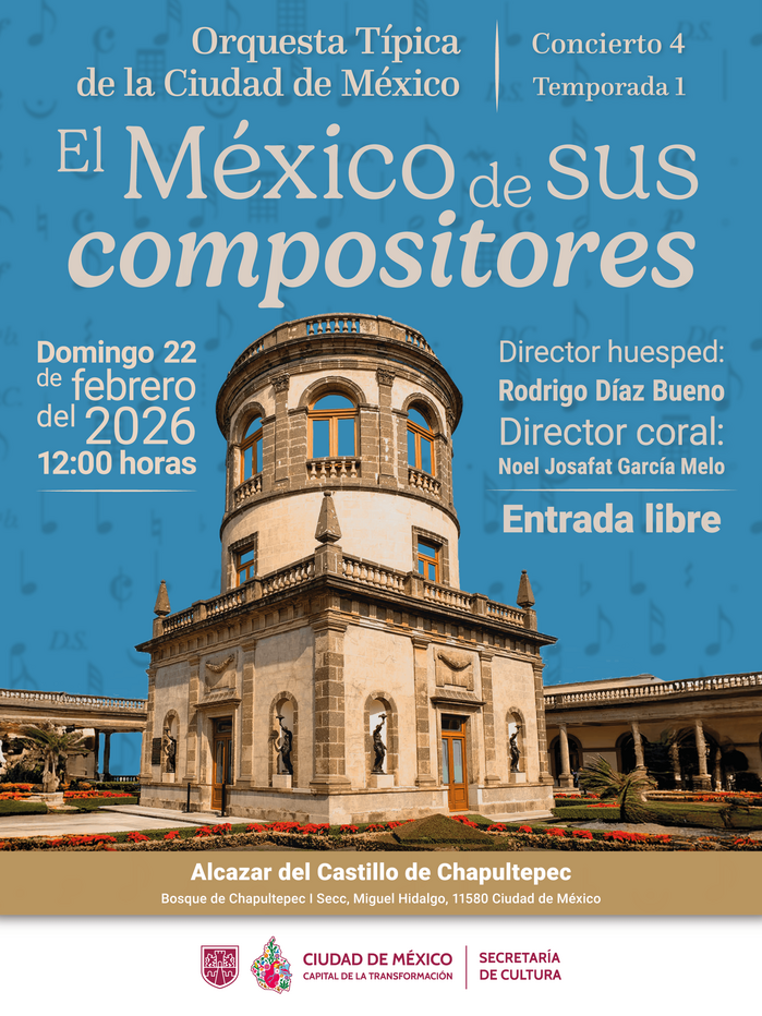
El México de sus compositores, 22 February 2026. This poster was designed together with Vania Rabago.
The fourth poster for the concert at the Alcázar of Chapultepec Castle utilizes a dramatic architectural photograph that emphasizes the perspective of the venue’s iconic checkered floor and classical arches. The deep vanishing point serves as a natural visual anchor, guiding the viewer’s eye through the historic corridor and toward the musical information.
The typographic palette is led by Gelica for the concert title. This choice brings a warm, retro-contemporary charm to the design, with its soft serifs and organic terminals providing a lyrical counterpoint to the rigid geometry of the architecture. The friendly and expressive nature of Gelica perfectly captures the passionate spirit of the repertoire.
Sebastian Vigueras. License: All Rights Reserved.
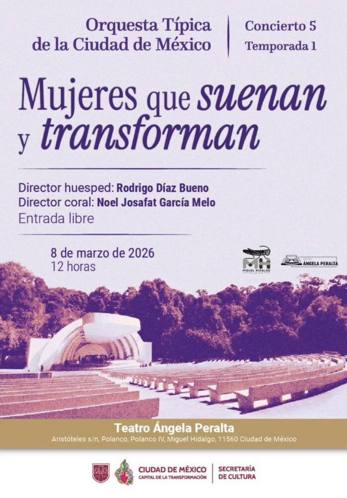
Mujeres que suenan y transforman, 8 March 2026
The fifth poster for the concert at the Ángela Peralta Open-Air Theater utilizes a striking high-angle photograph that captures the venue’s unique integration with the surrounding greenery of Parque Lincoln. The radial symmetry of the theater’s seating serves as a natural visual anchor, drawing the eye toward the stage and the performers.
The typographic palette is led by Instrument Serif for the concert title. This choice brings a classic, scholarly elegance to the design, echoing the operatic and historical legacy of the theater’s namesake. The serif structure of Instrument Serif provides a high level of sophistication that balances the organic textures of the surrounding trees.
Sebastian Vigueras. License: All Rights Reserved.
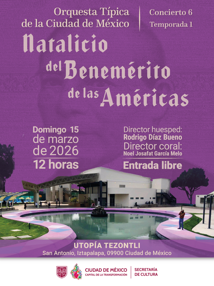
Natalicio del Benemérito de las Américas, 15 March 2026
This poster for the sixth concert of the 2026 season highlights the presence of the Orquesta Típica de la Ciudad de México (OTCM) in contemporary social spaces. The visual centerpiece is a panoramic photograph of Utopía Tezontli, a modern community center in Iztapalapa. The architectural geometry, with its white structural ribs and circular patterns, creates a rhythmic backdrop that symbolizes the utopian and transformative nature of the place.
The typographic strategy introduces Caligra, a contemporary Gothic typeface used for the main title. This choice creates a tension between the orchestra's historical roots and the modern, urban environment of the venue, while also evoking the complex framework of the building’s roof.
Sebastian Vigueras. License: All Rights Reserved.
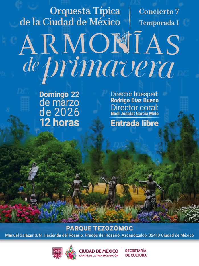
Armoniás de primavera, 22 March 2026
The visual composition of the seventh poster is centered on an expansive landscape photograph of Parque Tezozómoc, featuring its iconic artificial lake and the pre-Hispanic-inspired topography. The open, bright blue sky and the reflection of the clouds in the water serve as a natural visual anchor, providing a serene and airy backdrop that reflects the “spring harmonies” theme.
The typographic hierarchy is led by a sophisticated pairing for the title: Amster, with its contemporary and sharp personality, and ATF Garamond, which provides a timeless, academic elegance. This combination creates a refined, editorial feel that contrasts with the organic, open-air nature of the park. The layout effectively utilizes the landscape’s “white space” to allow the intricate typographic layers to breathe, maintaining a balance between historical tradition and the modern urban environment.
This post was originally published at Fonts In Use