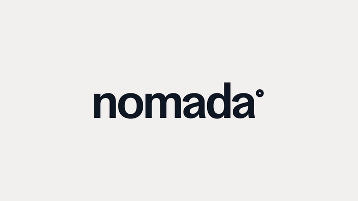
Nomada brand identity
Source: solublestudio.com License: All Rights Reserved.


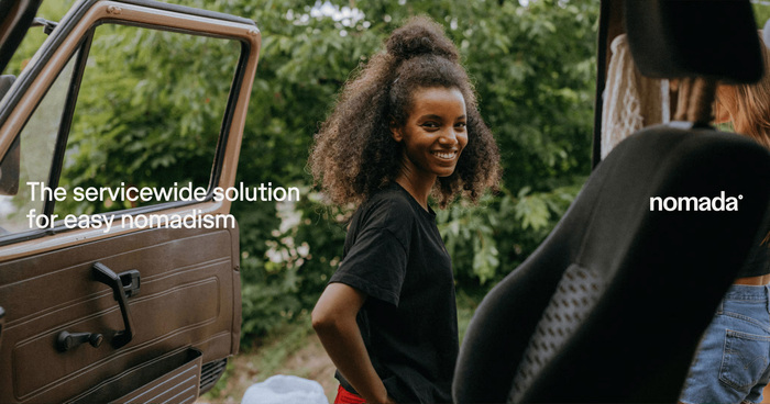
Soluble Studio has created the identity for Nomada, a specialized brand to serve digital nomads.
Soluble Studio describe their concept like this:
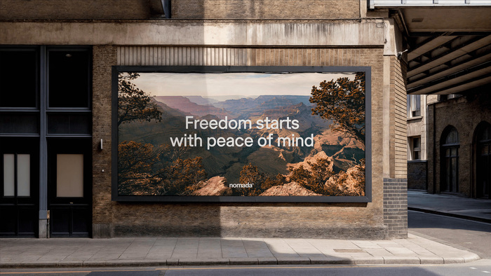
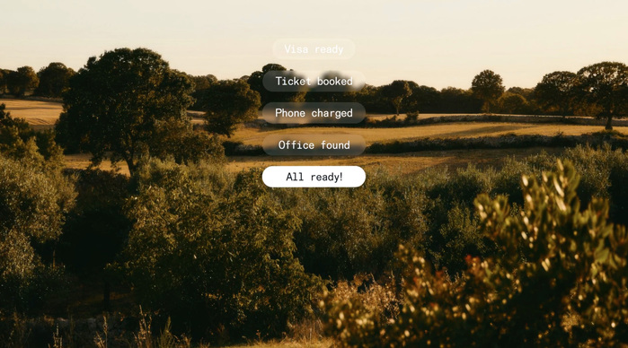
Nomada’s identity revolves around a central concept: peace of mind. Everything, from the visual aesthetic to the way we communicate, is designed to convey a sense of calm and trust.
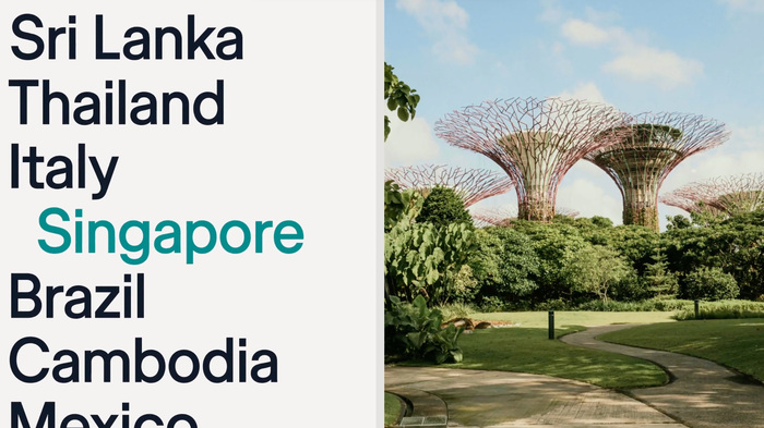
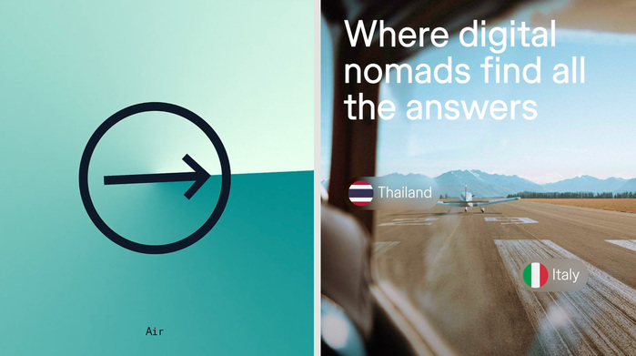
Inspired by elements like coordinates—reflected in both the logo and the icon—we’ve created a visual identity that symbolizes movement, discovery, and home.
Warmth and authenticity define the designs, capturing the free-spirited, exploratory essence of nomads. All of this is presented with a strong digital focus, as Nomada’s website will be the primary point of contact with its audience.
Typefaces used are Store Norske Ja and Store Norske Nord Mono, by Skriftkompani.
Source: solublestudio.com License: All Rights Reserved.
Source: solublestudio.com License: All Rights Reserved.
Source: solublestudio.com License: All Rights Reserved.

Source: solublestudio.com License: All Rights Reserved.
Source: solublestudio.com License: All Rights Reserved.

Source: solublestudio.com License: All Rights Reserved.
Source: solublestudio.com License: All Rights Reserved.

Source: solublestudio.com License: All Rights Reserved.
This post was originally published at Fonts In Use