Nod skincare
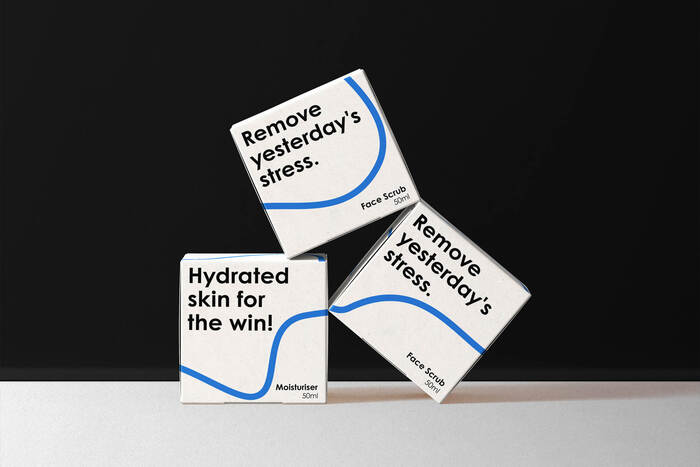
Photo: Noramble. License: All Rights Reserved.
Nod came to us (originally called Mave Care) needing communication help. However, when we dug a little deeper, it was clear that they needed assistance with strategy from the ground up.
Once we had a strong brand core and the difficult conversations, we could make the intangible–tangible. We started with a new name and brainstormed many perspectives. We knew we wanted to create a sense of community with the brand, so we landed on the name "NOD". You know, the thing that men do when they sort of know each other and walk past each other in the supermarket.
Once the name was nailed down, we moved on to the visual identity and messaging of the brand. Knowing it was for a male audience, we wanted to keep it simplistic and remove the industry jargon from everything the brand did.
We used a black-and-white color scheme with blue as an accent colour and a sans-serif typeface to help create some impact on the packaging.
The brand launched in December 2021 and earned media coverage in their local news outlets, creating a massive buzz for their launch. We continue to work with Nod to ensure consistency and growth in everything they do.
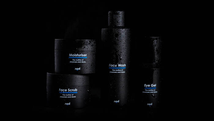
Photo: Noramble. License: All Rights Reserved.
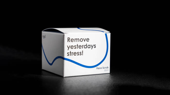
Photo: Noramble. License: All Rights Reserved.
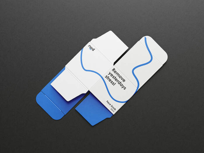
Photo: Noramble. License: All Rights Reserved.
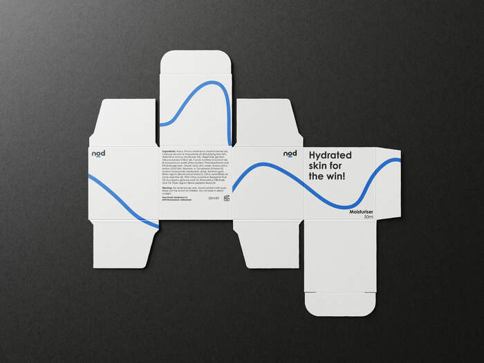
Photo: Noramble. License: All Rights Reserved.
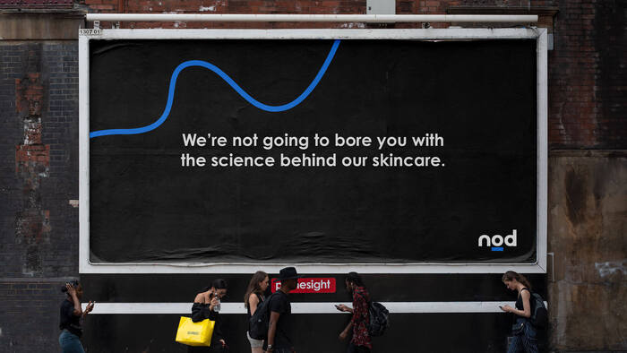
Photo: Noramble. License: All Rights Reserved.
This post was originally published at Fonts In Use