Nintendo GameCube

License: All Rights Reserved.


Released in 2001, Nintendo GameCube (codenamed Dolphin during development) is a video game console, developed and marketed by Nintendo.
Unfortunately, the font used for “Nintendo” at the top is unidentified. With its round E, Handel Gothic is similar, but wider (and the Compressed style too narrow). Here’s hoping that someone else will do a better job than me and find it.
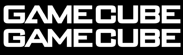
“GameCube” is based on Bank Gothic, thickened and modified, featuring a unique A along with a modified M and small changes towards the bowl area of B, see the comparison below.
License: All Rights Reserved.
Some stretching and thickening of the letterforms was needed to match the exact proportions.
Source: upload.wikimedia.org Evan-Amos. License: All Rights Reserved.
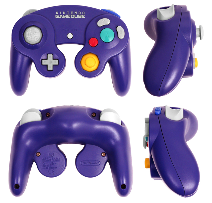
The controller is designed by Shigeru Miyamoto, it uses an embossed Futura Condensed for Start/Pause texts and possibly also the buttons.
License: All Rights Reserved.
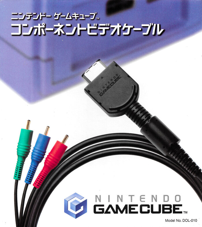
The official packaging for cables uses Japanese letters that follow quite closely the style of Bank Gothic. Since Bank Gothic doesn’t offer support for Japanese characters, it’s thinkable that Nintendo designed its own. Or maybe it’s just a different typeface with similar characteristics.
This post was originally published at Fonts In Use