New York City Opera (2009–2013)

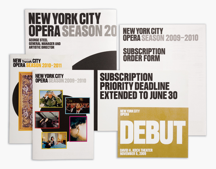
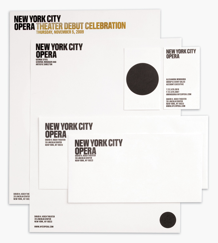
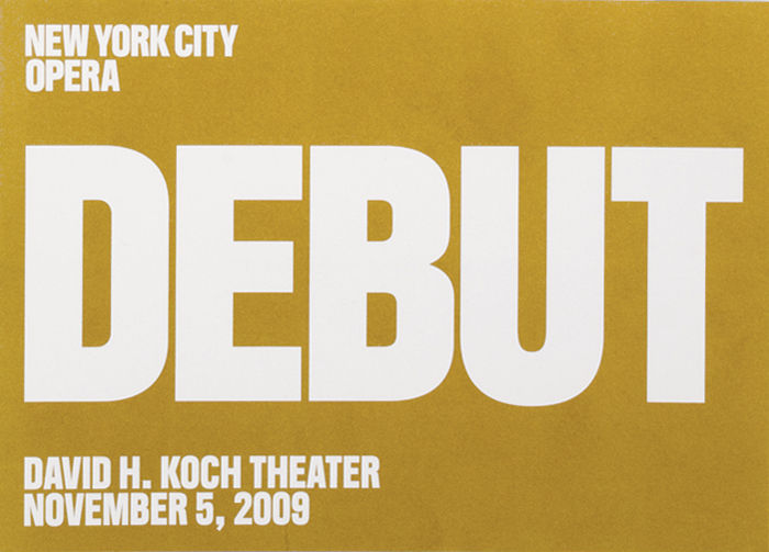
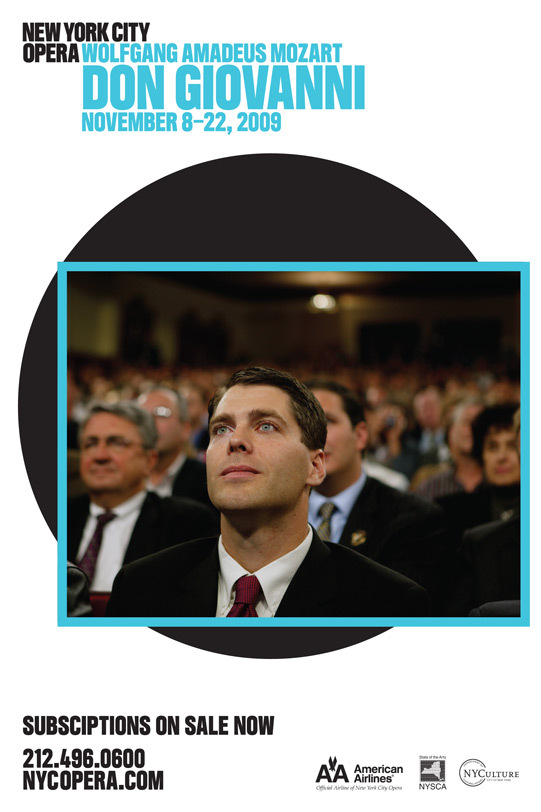
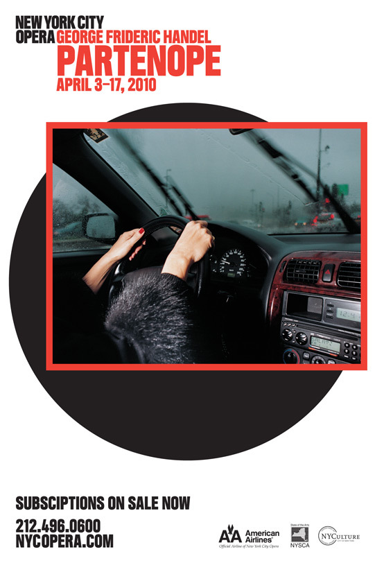
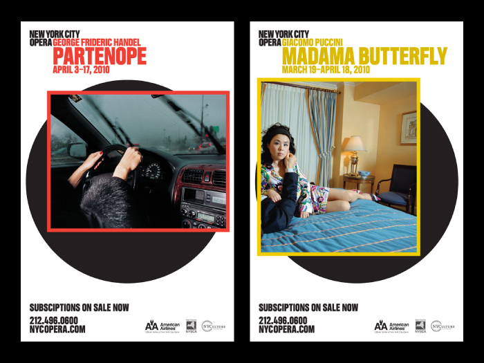
When 2x4inc redesigned the brand identity for the New York City Opera in 2008, they commissioned a custom all-caps typeface named Mortier. The retail version is available from Labor & Wait, now named Obbligato, and amended with a lowercase.
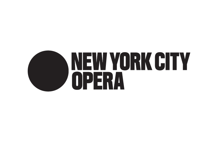
The people's opera: The founding principle of the New York City Opera. A touchstone for a brand strategy that links opera to contemporary culture; a design system that relaunched New York City Opera as a bold platform for creative expression. The provocative logo – a strong statement that sets NYC Opera off from its more staid neighbors – reinforces its mission in the face of adversity. By using contemporary artistic practices to examine enduring political and cultural issues, collaborations with artists such as Nikki S. Lee and Ryan McGinley provide new interpretations of historic themes at events designed to attract new audiences.
This post was originally published at Fonts In Use