Museum of London Docklands 20th anniversary campaign
Source: www.instagram.com Studio Bergini Ltd. License: All Rights Reserved.


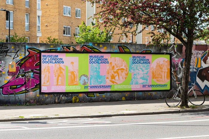
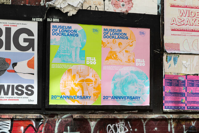
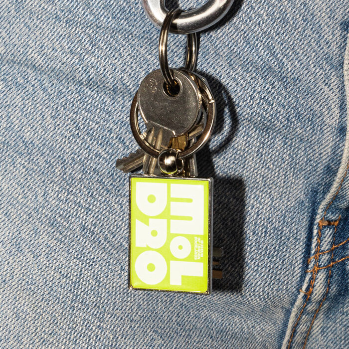
Over the summer of 2023, the Museum of London Docklands celebrated their 20th anniversary with a series of events on their East London site and around the local area. Studio Bergini were brought on board to design the visual identity and advertising campaign for the events, as well as a commemorative mark.
The colourful campaign for the celebratory events highlighted the vibrant, multicultural community and social history of the Docklands. The images used were all taken by local photographer Harry Grant in the 50's–60's, showing local people in various festive situations.
As a main typeface for the campaign and logo mark, our choice fell on Megazoid from DJR to help communicate how the Docklands’ landscape feels, visually and architecturally, with its evolving, post-industrial landscape and unique juxtapositions of centuries old infrastructure, machinery, and warehouses sitting next to glass towers and monorail trains. Dinamo’s ABC Marfa was a great match for cementing this tone without going too obvious with the victorian industrial grotesque lettering references.
Source: www.instagram.com Studio Bergini Ltd. License: All Rights Reserved.

Source: www.instagram.com Studio Bergini Ltd. License: All Rights Reserved.
Source: www.instagram.com Studio Bergini Ltd. License: All Rights Reserved.

Source: www.instagram.com Studio Bergini Ltd. License: All Rights Reserved.

Source: www.instagram.com Studio Bergini Ltd. License: All Rights Reserved.
This post was originally published at Fonts In Use