Museu Terra
Source: www.clasebcn.com Clase bcn. License: All Rights Reserved.


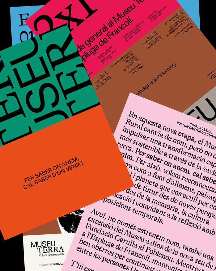
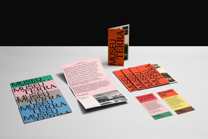
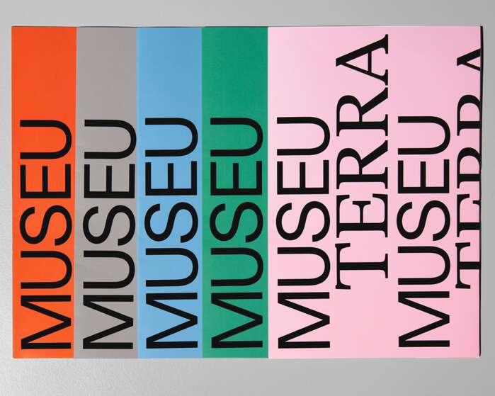
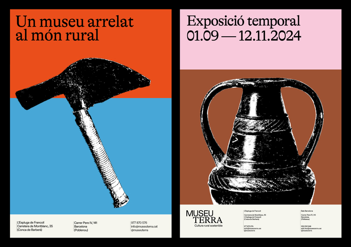
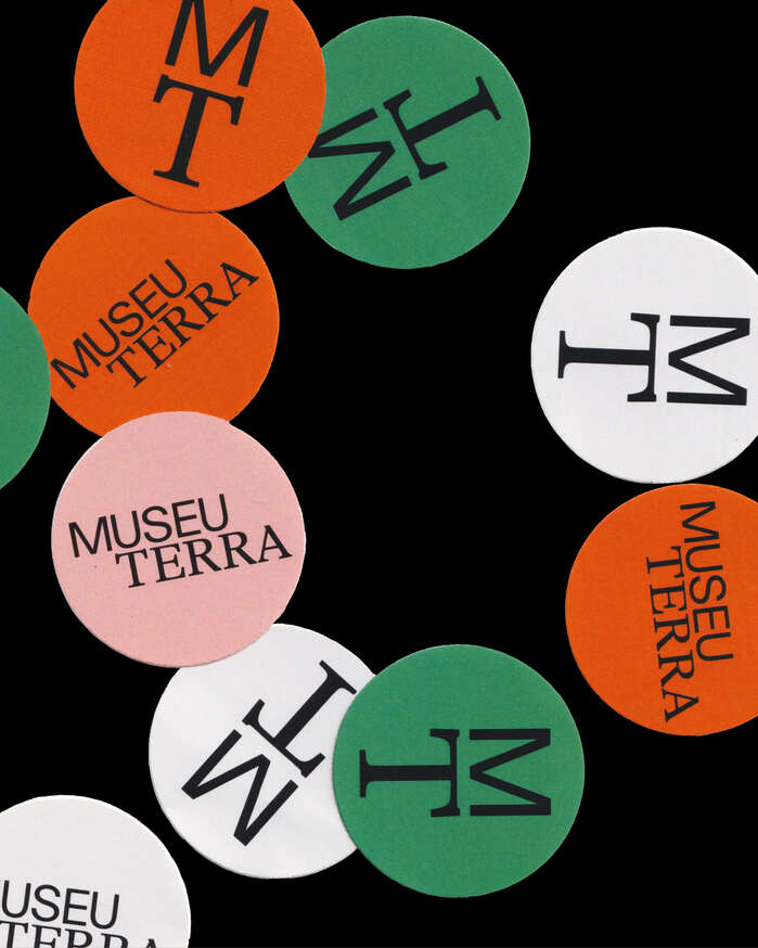
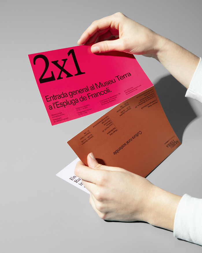
The Museu Terra’s branding and communication design reflect its role as a cultural center focused on sustainability and rural culture, learning from the past to shape the future. Inspired by geological strata, the graphic system symbolizes both the earth’s layers and historical depth. The use of sans-serif ABC Diatype and serif GT Alpina typefaces reinforces this connection across time.
Since its opening in 1988, the museum has evolved into a space that preserves and shares knowledge, fostering reflection on sustainable change from a rural viewpoint. It operates two cultural venues: one rural, one urban.
The name and visual identity are rooted in the metaphor of strata—representing time, land, and legacy—creating a distinct design language that extends beyond the logo.
Source: www.clasebcn.com Manel Cano. License: All Rights Reserved.
Source: www.clasebcn.com Manel Cano. License: All Rights Reserved.
Source: www.clasebcn.com Clase bcn. License: All Rights Reserved.
Source: www.clasebcn.com Clase bcn. License: All Rights Reserved.
Source: www.clasebcn.com Manel Cano. License: All Rights Reserved.
This post was originally published at Fonts In Use