Mulbi branding and packaging
Published September 30, 2024
By FontsInUse
Contributed by VJ-Type
Source: www.tbpmx.com the branding people. License: All Rights Reserved.

Source: www.tbpmx.com the branding people. License: All Rights Reserved.
Source: www.tbpmx.com the branding people. License: All Rights Reserved.
Source: www.tbpmx.com the branding people. License: All Rights Reserved.
Source: www.tbpmx.com the branding people. License: All Rights Reserved.
Source: www.tbpmx.com the branding people. License: All Rights Reserved.
This post was originally published at Fonts In Use
Source: www.tbpmx.com the branding people. License: All Rights Reserved.
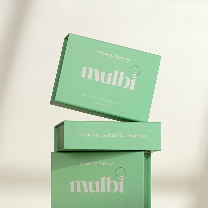
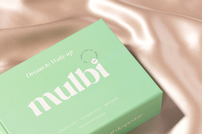
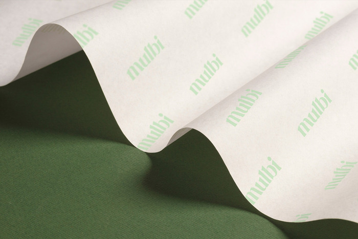
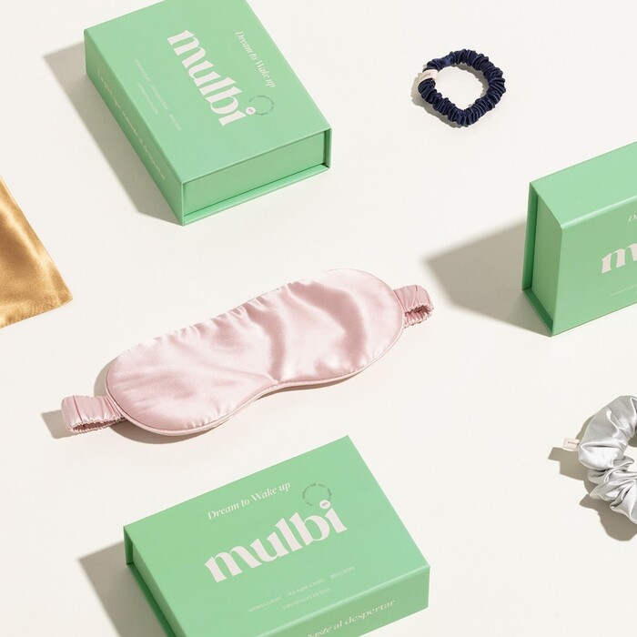
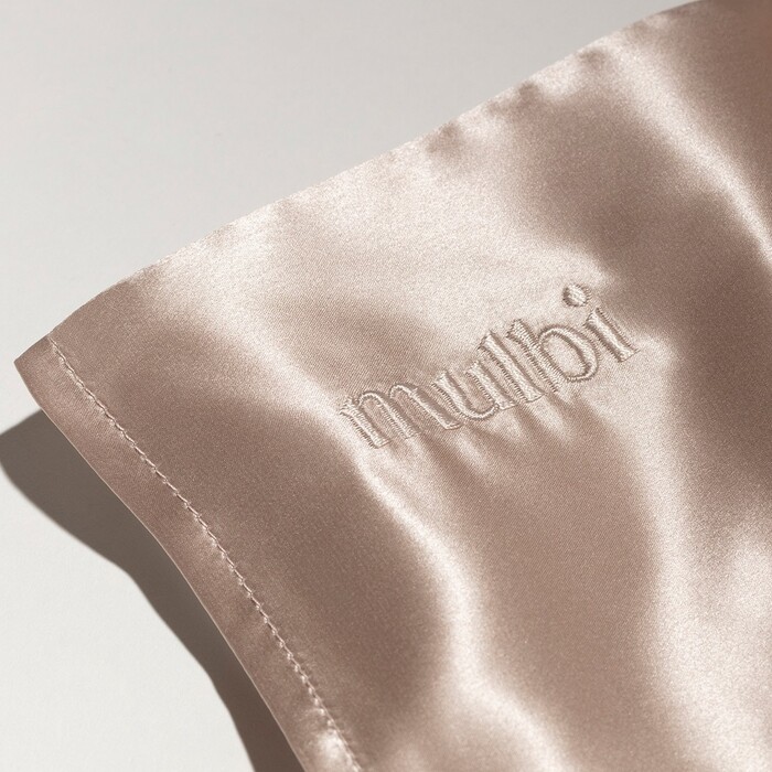
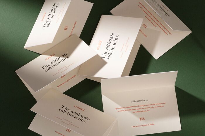
Mulbi is a silk product company that focuses on high-quality skincare materials that aim to better people’s lives through rest and rejuvenation. Therefore, Mulbi’s branding revolves around elegant, dream-like textures and timeless graphic assets that coexist in perfect harmony.
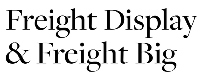
To express this, the branding people created an editorial that plays with relaxed, neutral colors, grainy textures, and compositions that evoke a feeling as though one is slipping in silk. This is complemented with a bold, yet friendly, logo set in Dahlia that contrasts perfectly with the soft and neutral backgrounds. Dahlia is supported by Freight Big in roman and italic styles. Overall, the graphic system is created to transmit Mulbi’s idea of dreaming to wake up.
Source: www.tbpmx.com the branding people. License: All Rights Reserved.
Source: www.tbpmx.com the branding people. License: All Rights Reserved.
Source: www.tbpmx.com the branding people. License: All Rights Reserved.
Source: www.tbpmx.com the branding people. License: All Rights Reserved.
Source: www.tbpmx.com the branding people. License: All Rights Reserved.
This post was originally published at Fonts In Use
Read full story.
WRITTEN BY
FontsInUse
An independent archive of typography.
More from FontsInUse