MR Jobim branding boutique

MR Jobim. License: All Rights Reserved.


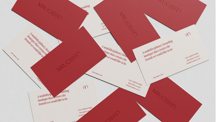
Based in São Paulo, creating for the world: MR Jobim is a branding boutique that combines strategy, creativity and a sensitive perspective to connect brands to the future through tailor-made solutions. To compose our typography, we matched two contrasting fonts: TT Commons and Span.
In search of a neutral and versatile option that wouldn’t draw more attention to itself than the content we present to our clients, we chose TT Commons: a font that, depending on the way it’s worked, can ensure the strength and presence we need in our deliveries.
To create a height contrast, TT Commons is paired with Span. A font with elevated x-height and classy serif which has several weights. In addition to being versatile, Span flirts with fashion information – an aspect that permeates our DNA.
The logo uses Redonda.

MR Jobim. License: All Rights Reserved.

MR Jobim. License: All Rights Reserved.

MR Jobim. License: All Rights Reserved.

MR Jobim. License: All Rights Reserved.
This post was originally published at Fonts In Use