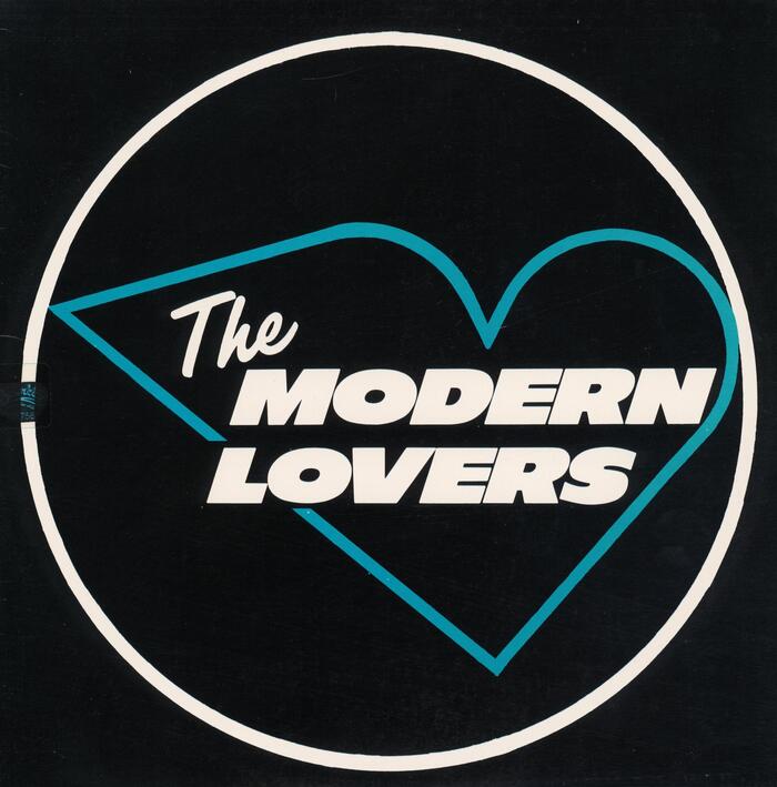
The Modern Lovers – The Modern Lovers album art
Source: archive.org Internet Archive. License: All Rights Reserved.


The 1976 release of The Modern Lovers, compiled from recordings made earlier in the decade, for an aborted LP for Warner Bros and other sources. The sleeve is a triumph of minimal design, adapting an aerodynamic heart logo that the band used on an early business card, rendering it in the stark, precise form of a neon sign glimpsed on a dark night.
Filmotype Lucky is effortlessly evokes this mid-century aesthetic. Ebony was enjoying a renaissance at the time (see also Blondie’s 1976 debut) – the emerging punk movement favouring clean, strong letterforms over the ornamentation of psychedelia and after. Further examples include Franklin Gothic on Ramones and Gill Sans Extra Bold on the “Neat Neat Neat” single sleeve, both likewise from 1976. (Jamie Reid’s “ransom note” style which would become a cliche of punk design developed independently).
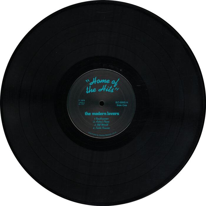
The neon motif is continued in the use of Kaufmann, with its continuous line representing neon tubing, for the LP credits, supported by Gill Sans. The band logo that appears on the labels as well as on the flyer reproduced on the back in in all-lowercase City Bold.
Jim Blodgett is credited with “LP co-ordination”, which may or may not include the sleeve design.

Source: archive.org Internet Archive. License: All Rights Reserved.
Back cover. The reproduced flyer for a gig at Gloucester High Auditorium additionally features Futura Black.
Source: archive.org Internet Archive. License: All Rights Reserved.
This post was originally published at Fonts In Use