Modal Digital website

Source: www.modal.co.uk License: All Rights Reserved.


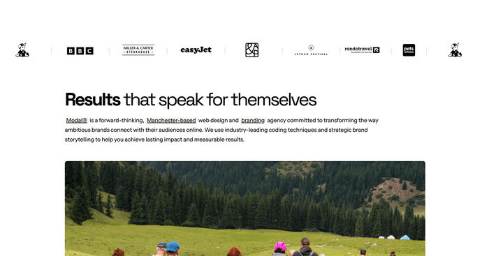
Modal is a forward-thinking, Manchester-based web design and branding agency committed to transforming the way ambitious brands connect with their audiences online. We use industry-leading coding techniques and strategic brand storytelling to help you achieve lasting impact and measurable results.
We recently rolled out a full website redesign to better reflect who we are as a digital agency—modern, sharp, and confident. Central to the new look is our choice of typography, which plays a crucial role in shaping the user experience and reinforcing our brand’s visual identity.
For this redesign, we paired Space Grotesk with Instrument Sans, two fonts that strike a perfect balance between expressive personality and functional precision.
Space Grotesk, designed by Florian Karsten, is a proportional sans-serif rooted in the classic Space Mono. It brings a futuristic but grounded tone, ideal for headlines and standout moments across the site. Its geometric structure offers strong legibility, while its quirky details lend a distinctiveness that aligns well with our brand’s creative edge.
Instrument Sans, from Instrument Studio, serves as the workhorse for our supporting text and interface elements. It’s a neutral, highly legible sans-serif designed with clarity and versatility in mind. Its unobtrusive aesthetic ensures our content remains front and center, making it the perfect partner to the more expressive Space Grotesk.
The overarching design language is minimal but structured, with careful use of white space and a strong grid system to guide the eye. Space Grotesk leads in top-level navigation and headlines, establishing tone and hierarchy. Instrument Sans supports with quiet consistency—handling body copy, UI labels, and form elements without drawing undue attention.This typographic pairing allowed us to craft a design that feels both confident and considered, without overwhelming the user. The fonts complement the visual identity across breakpoints, preserving legibility and impact from desktop to mobile.
The new Modal.co.uk reflects our evolution as a digital agency: bold, collaborative, and precise. By combining Space Grotesk and Instrument Sans, we’ve created a typographic system that expresses personality while maintaining focus. It’s a foundation we’re excited to build on—and one that speaks clearly to the kind of work we strive to do.

Source: www.modal.co.uk License: All Rights Reserved.

Source: www.modal.co.uk License: All Rights Reserved.

Source: www.modal.co.uk License: All Rights Reserved.
Source: www.modal.co.uk License: All Rights Reserved.
Source: www.modal.co.uk License: All Rights Reserved.
This post was originally published at Fonts In Use